Choose industry from list
Fresh constructor of warmth
Colorographic concept
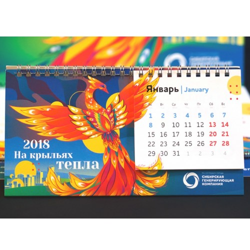
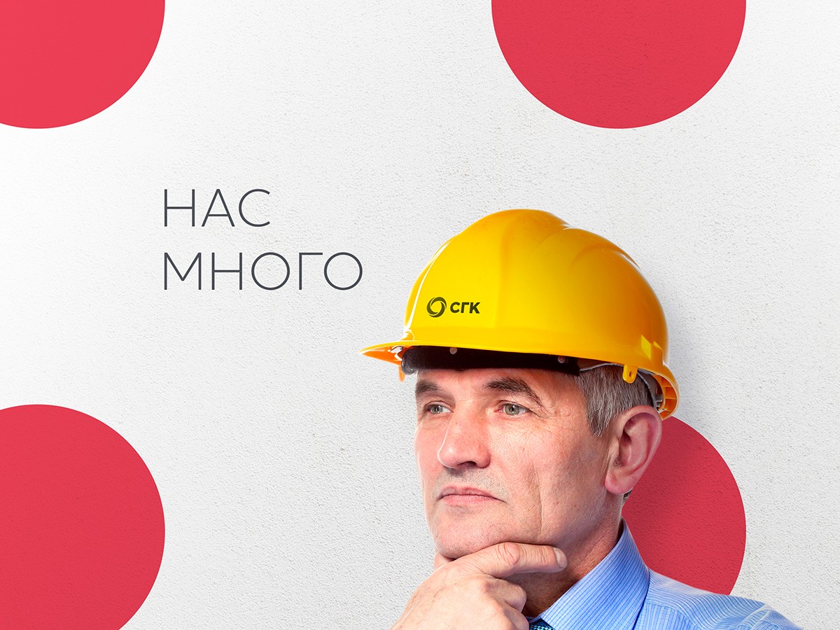
The sphere of energy, movement and development, the endless cycle of life, heat and light, the shining of the sun and the power of the earth, the cold – the heat – hot. Energy of heat, energy of electricity, human comfort. People who create warmth and give it to people. All this is reflected in the updated brand block and in the original graphics of the SGK.
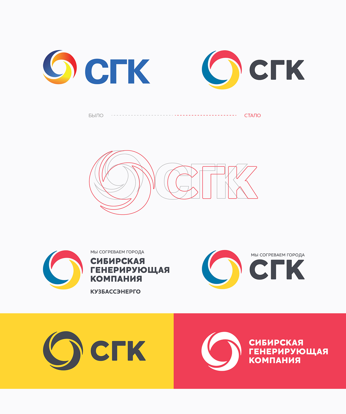
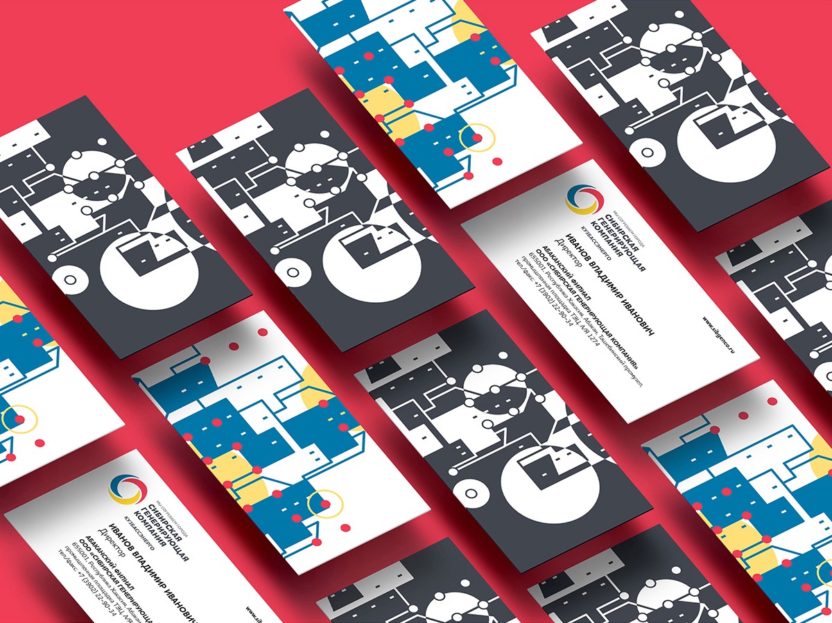
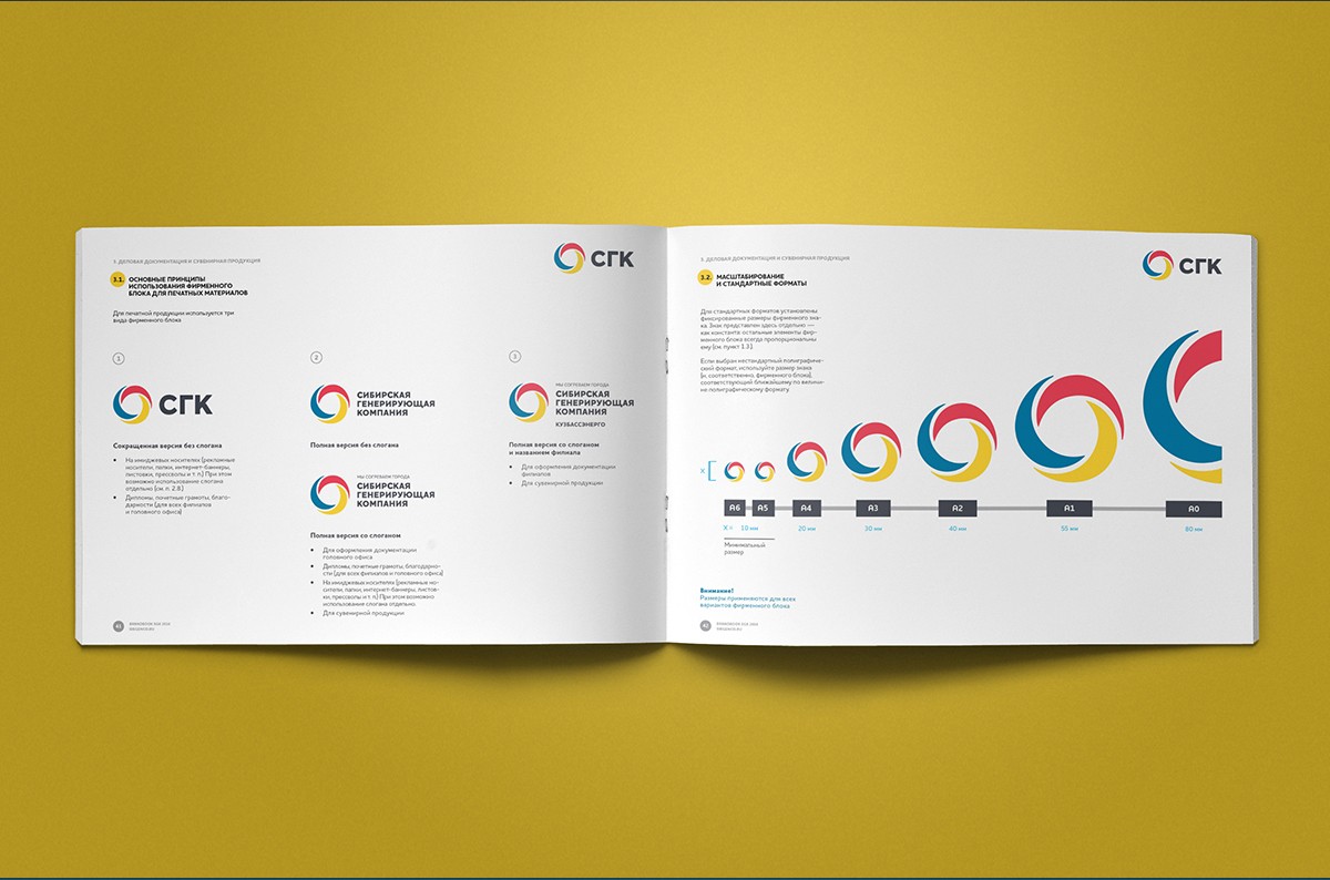
Updating the brand block
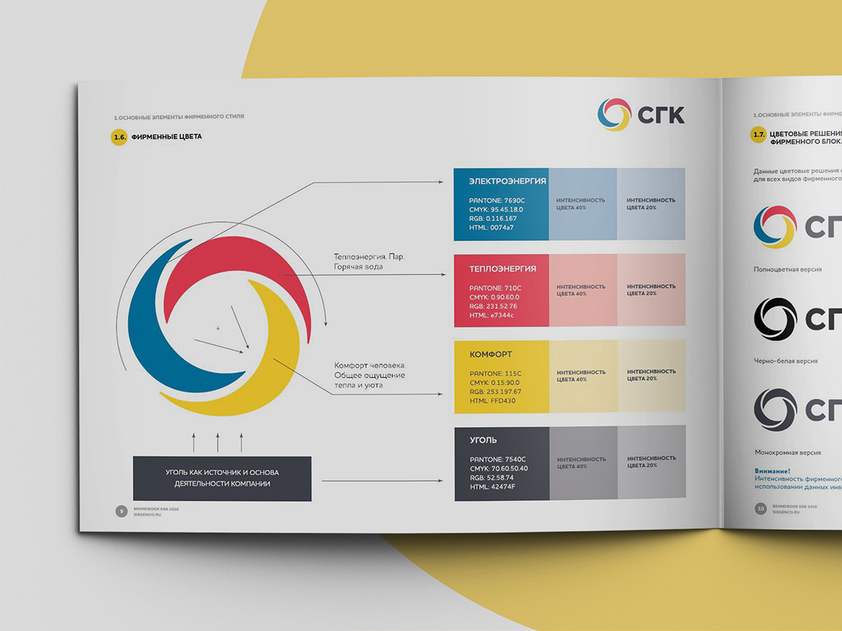
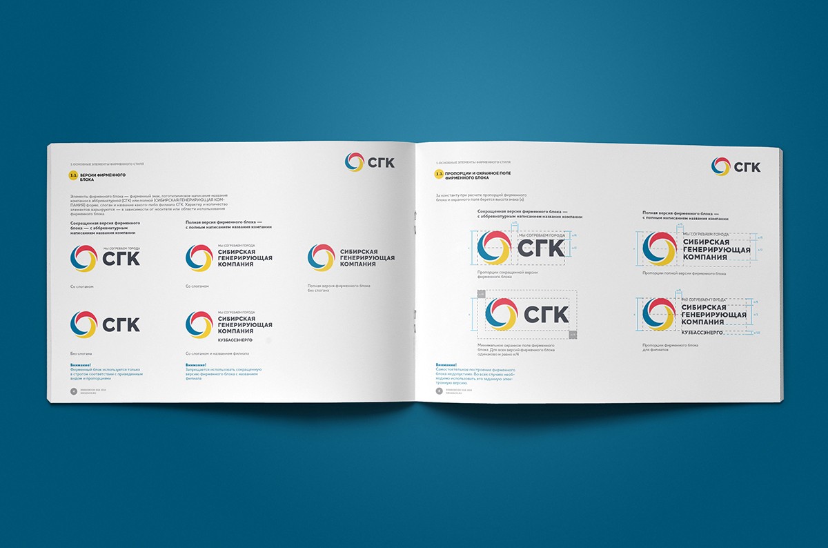
At the first stage of the project, we updated the basic elements of the brand – the brand block and the color gamut. We came from the symbols of the corporate sign of the SGC, which, on the one hand, is fairly obvious and readable, on the other, needed actualization, greater clarity and imaginative wholeness.
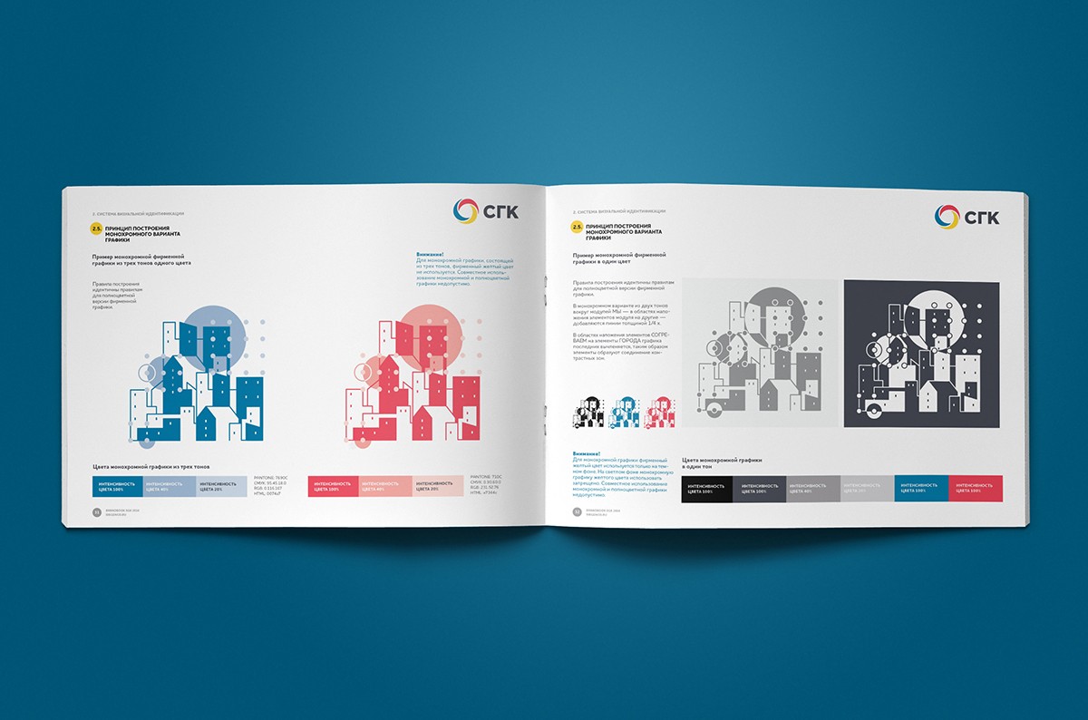
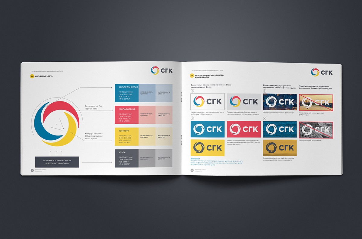
Editing led to the compositional balancing of the elements of the brand block, as a result of which it became slender and collected. In the color scheme, we got rid of the gradients, the colors were made lighter, more modern, and their combination is more harmonious.
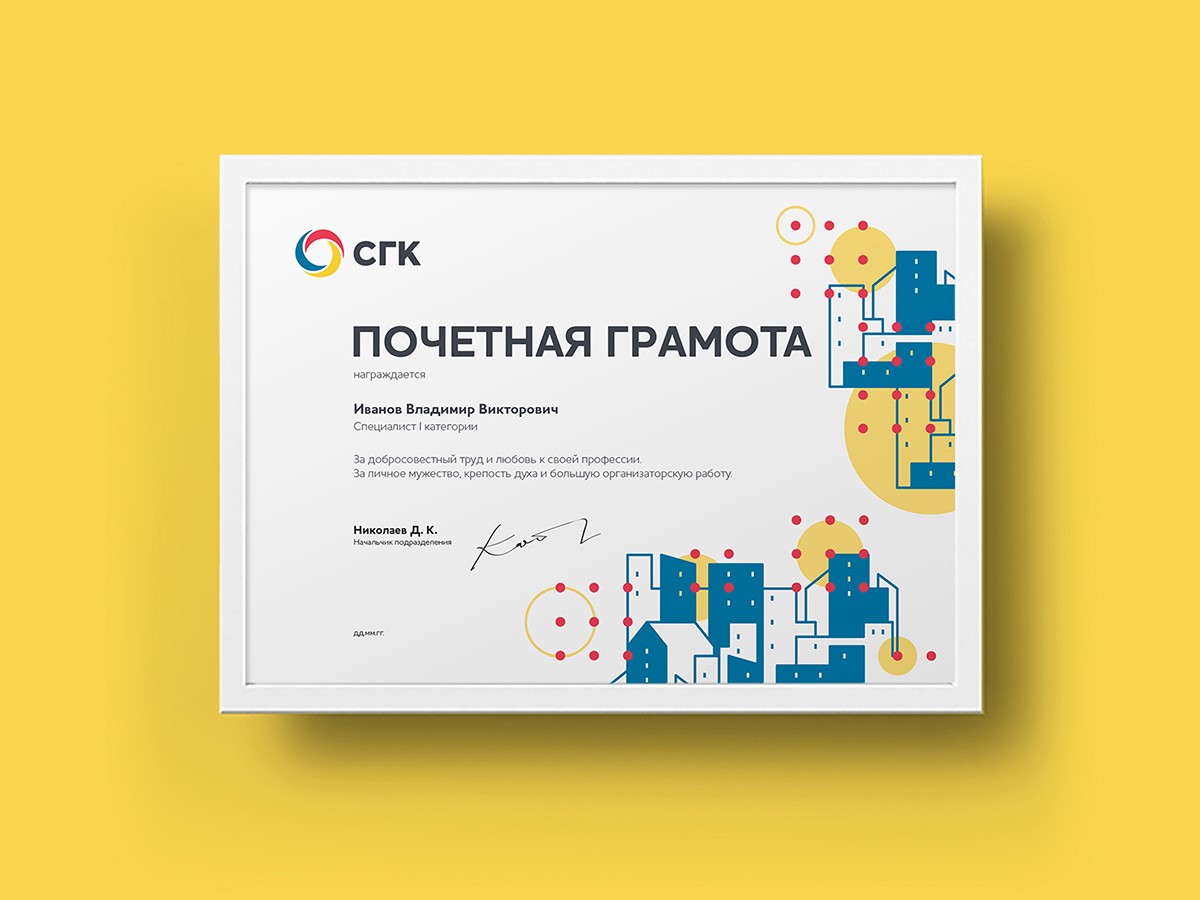
Corporate graphics
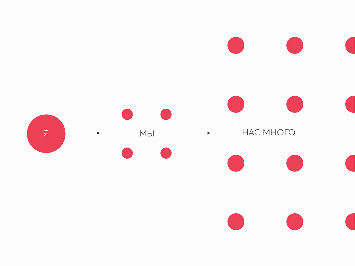
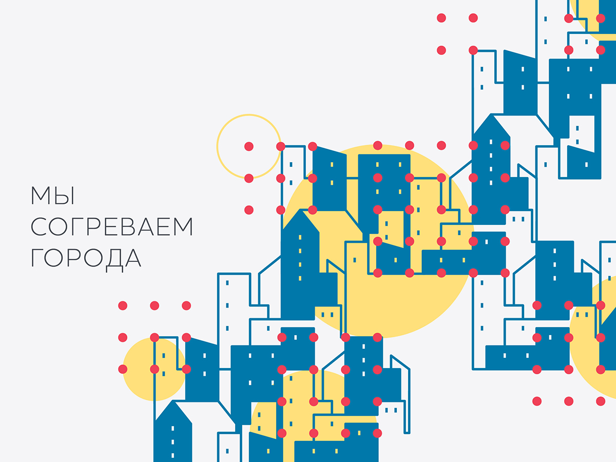
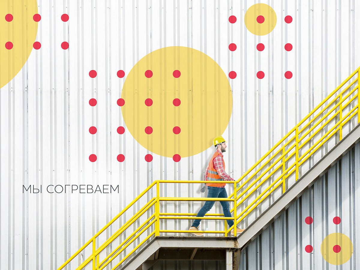
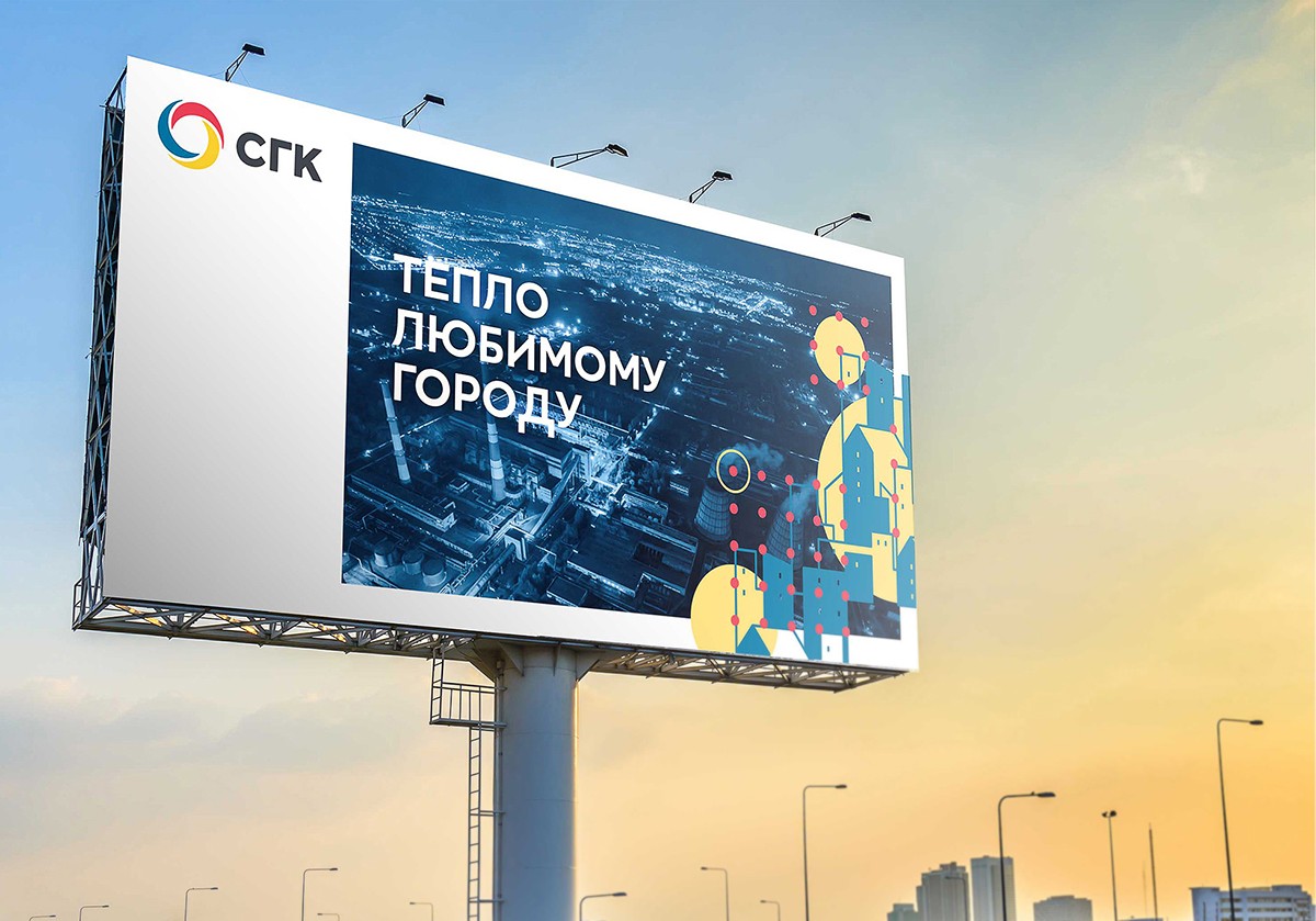
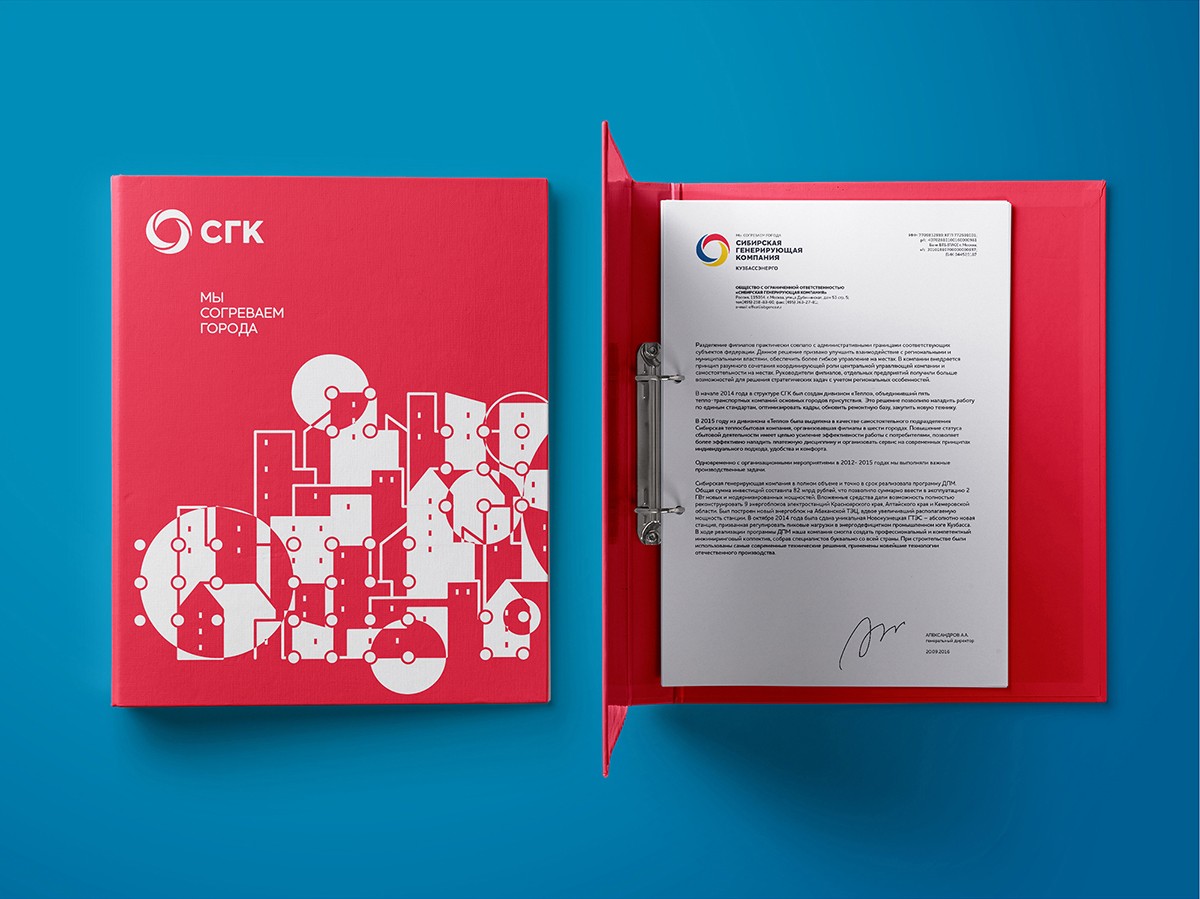
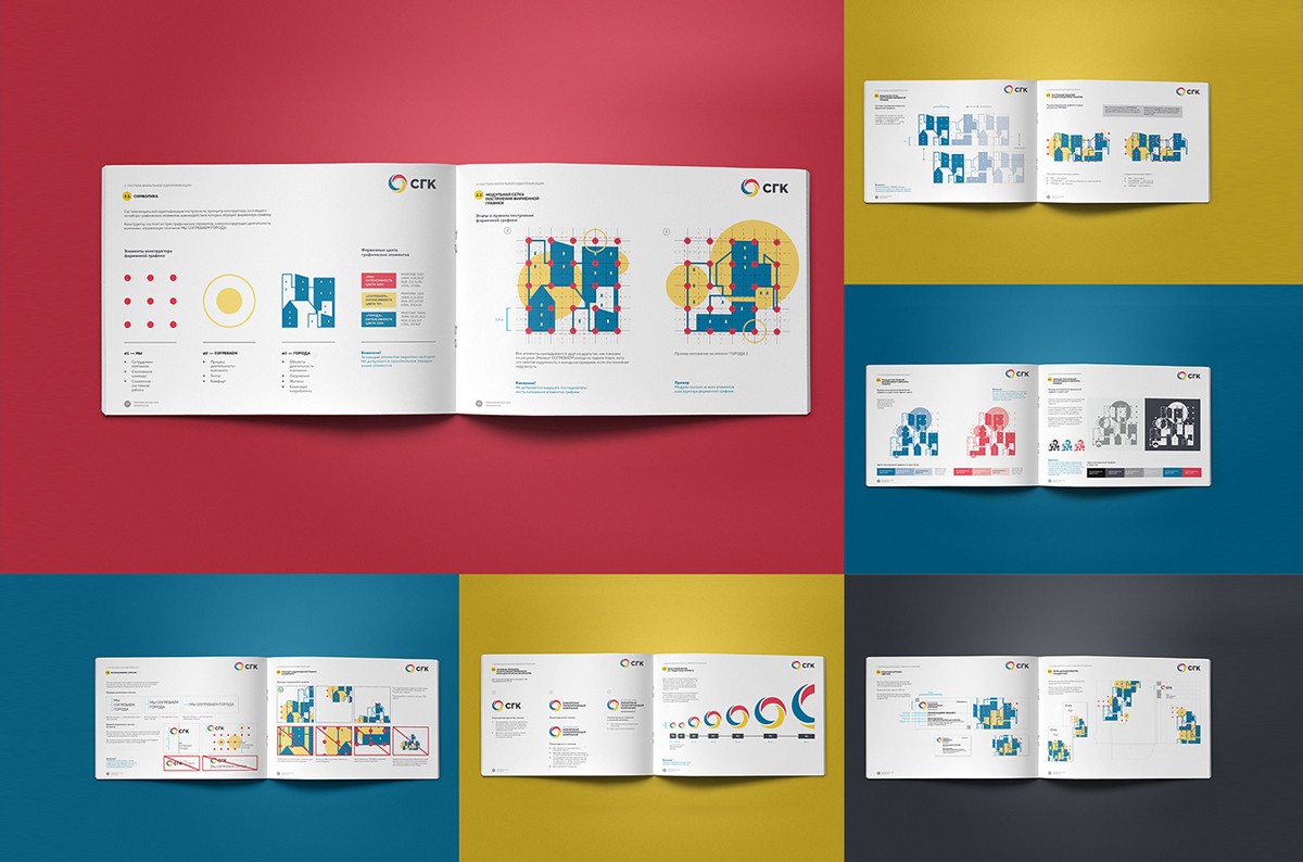
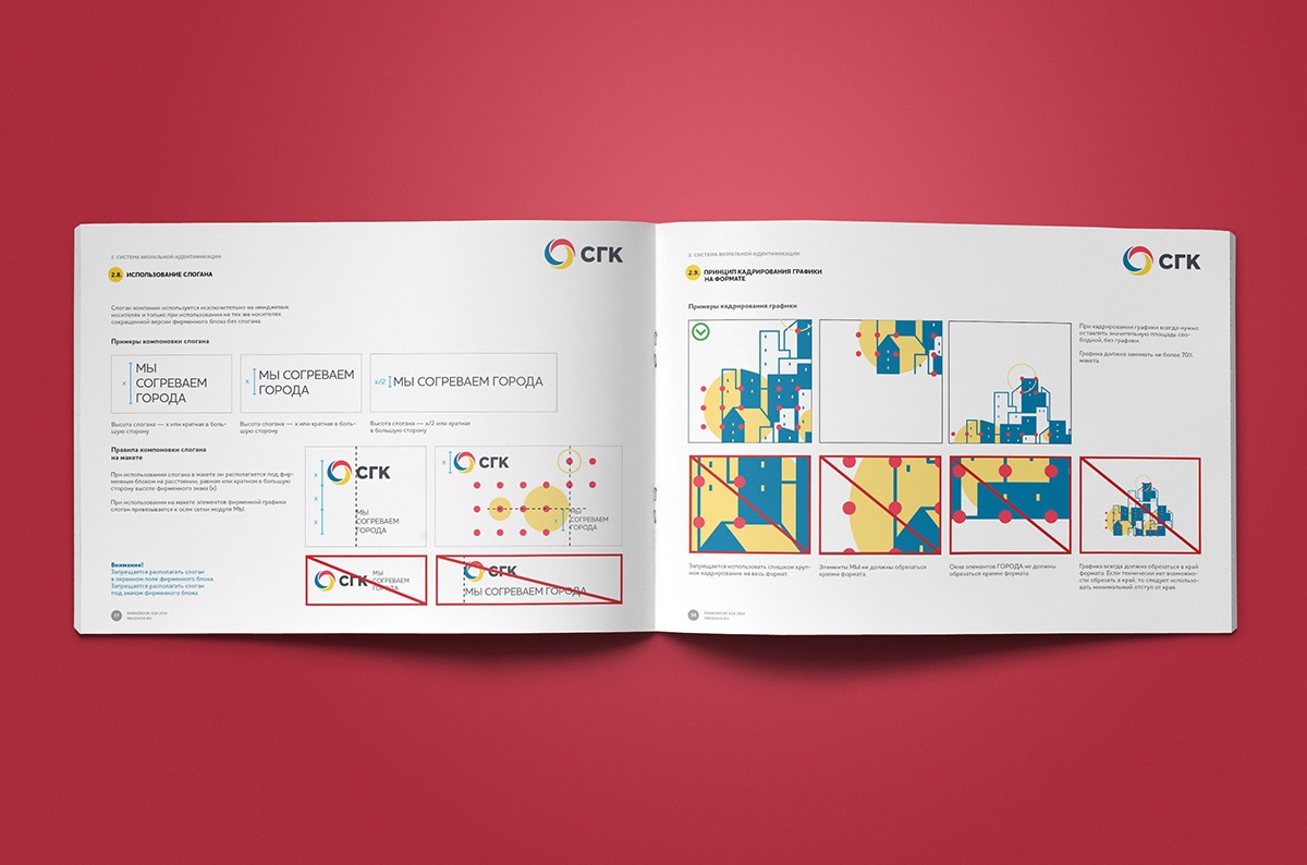
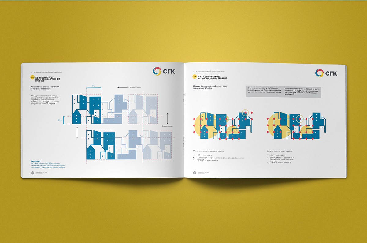
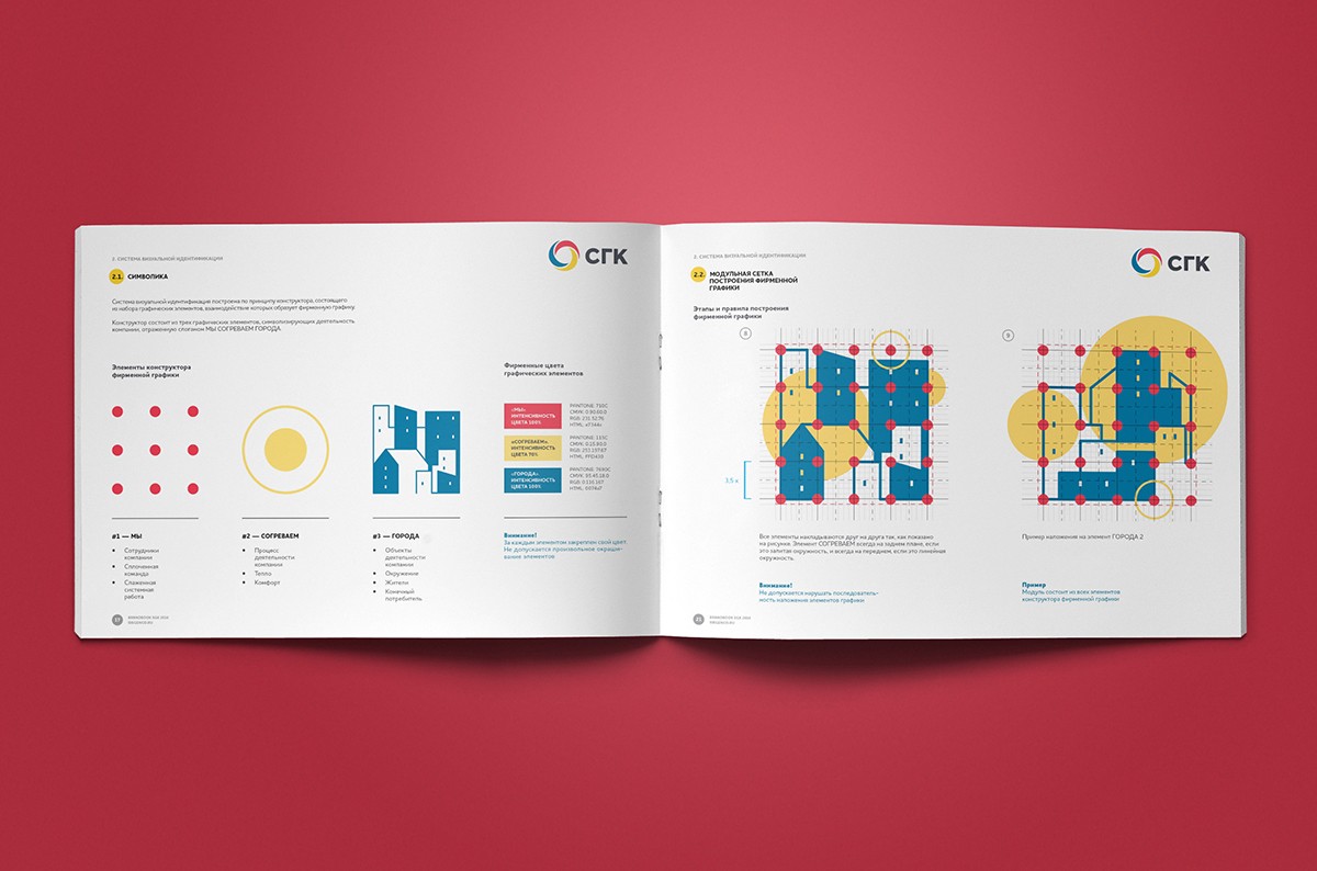
The second stage of the project was the creation of a visual identification system – corporate graphics of the SGS. We created a system built on the principle of a constructor: it consists of a number of elements that carry in part adjacent values, correlated with the message of the company's slogan.
The points collected in the modules reflect the notion of "we", people – both employees and clients of the SGS. Circles are symbols of warmth, comfort, that is the essence of the company's activities, its goals and mission. Finally, the image of many houses becomes an illustration of objects of attention of the Siberian Generating Company – cities and their inhabitants.

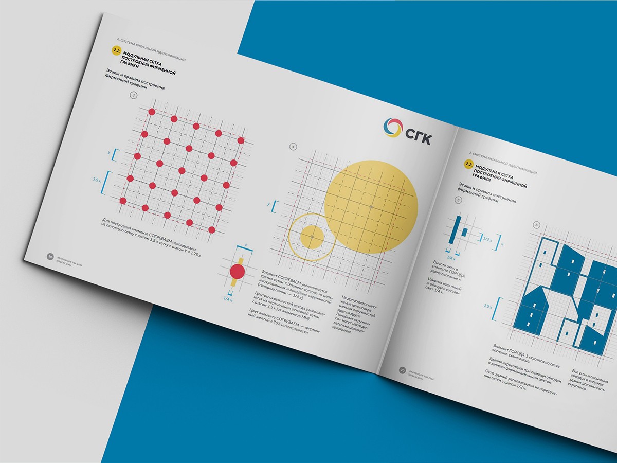
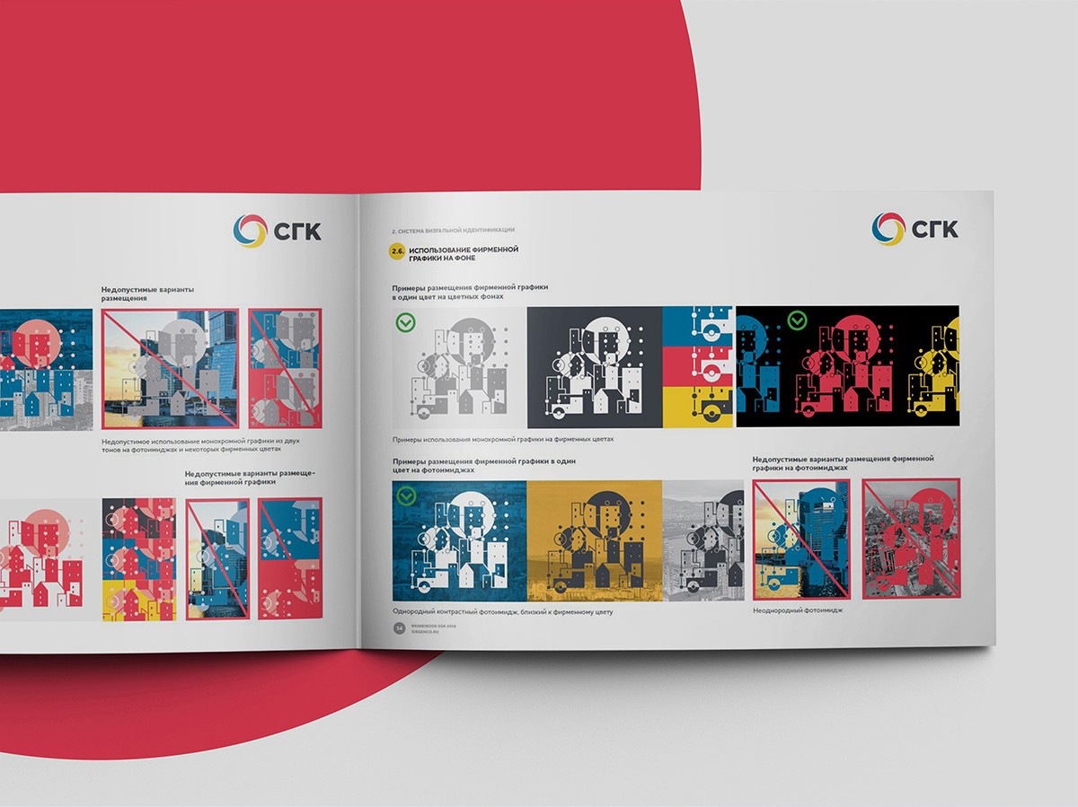
Guideline
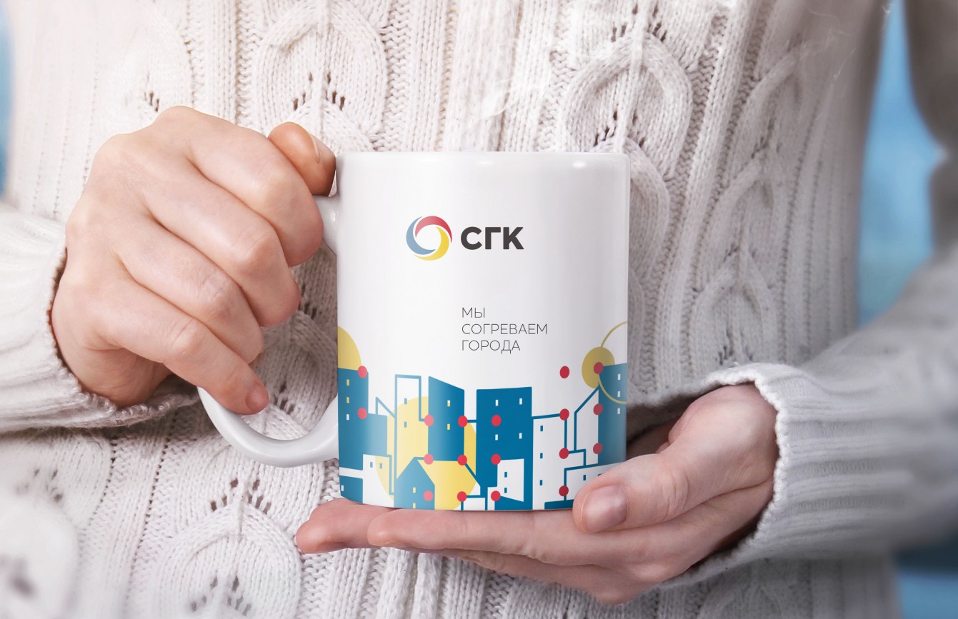
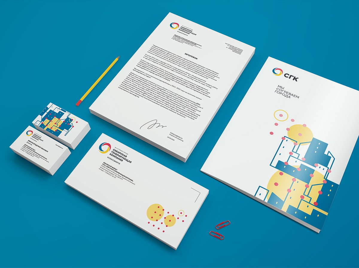
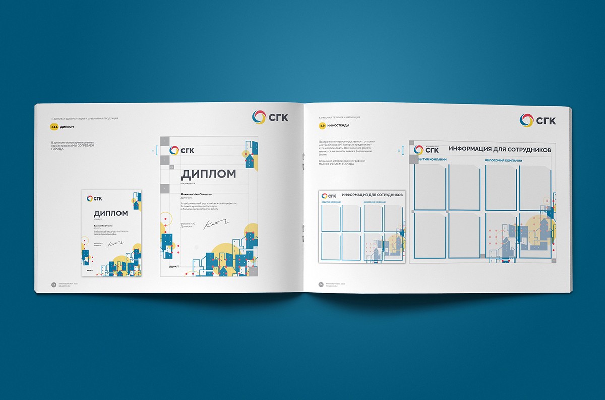
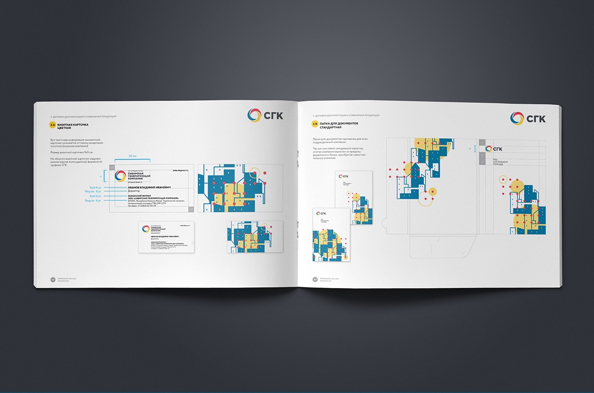
An essential part of the project – the creation of detailed guide to the use of corporate identity elements and the design of all kinds of media – from documents and advertising layouts to SGC employees uniform.
The guide gives readable and clear rules and recommendations, easy to use – this is a fundamental difference from the guide book, existing in the SGC, logical, terminological and structural shortcomings of which the company tried to exclude in the new guideline. That was done as a result of our cooperation.


Creative team
Art-director
Irina Shmidt,
Andrey Chigarev
Daria Erasova
Copywriter
Anton Borisov
Designers
Andrey Chigarev,
Elena Ivanova
Aleksey Borovkov
Project Manager
Anna Dokunina
Another projects for this client