Choose industry from list
Driving force and its development
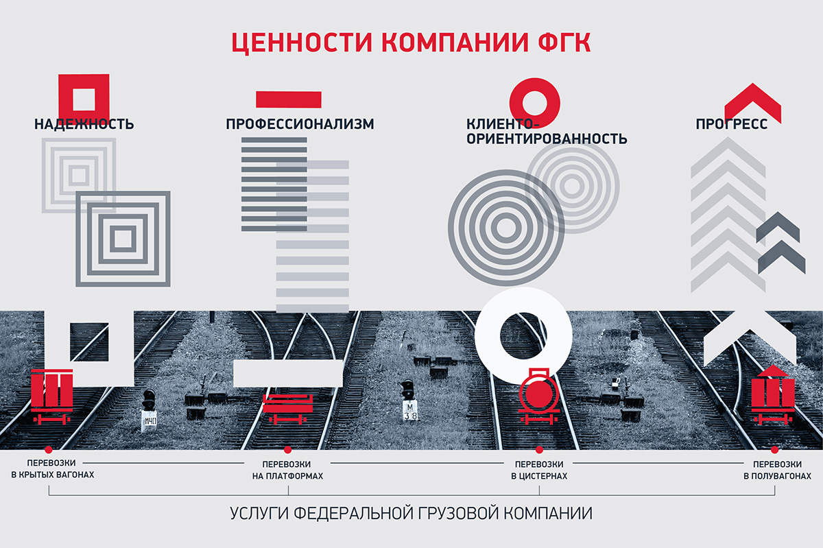
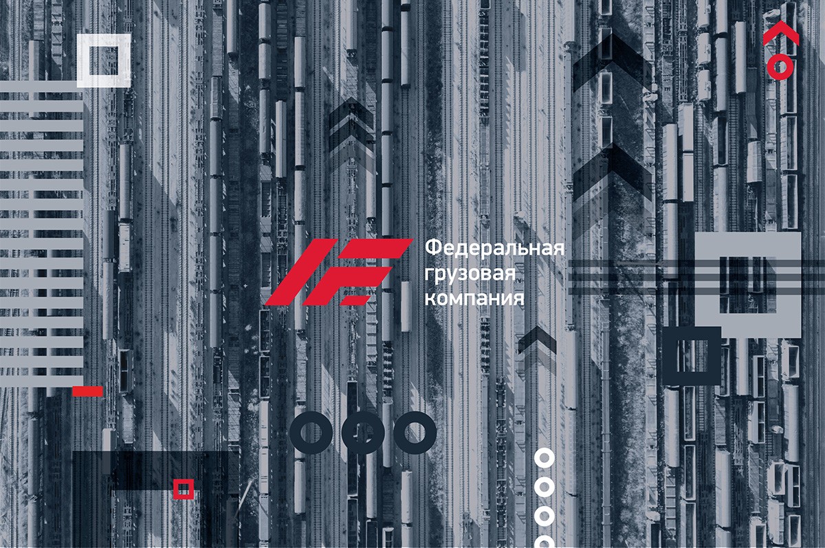
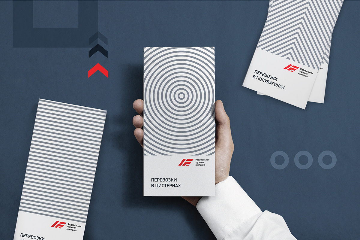
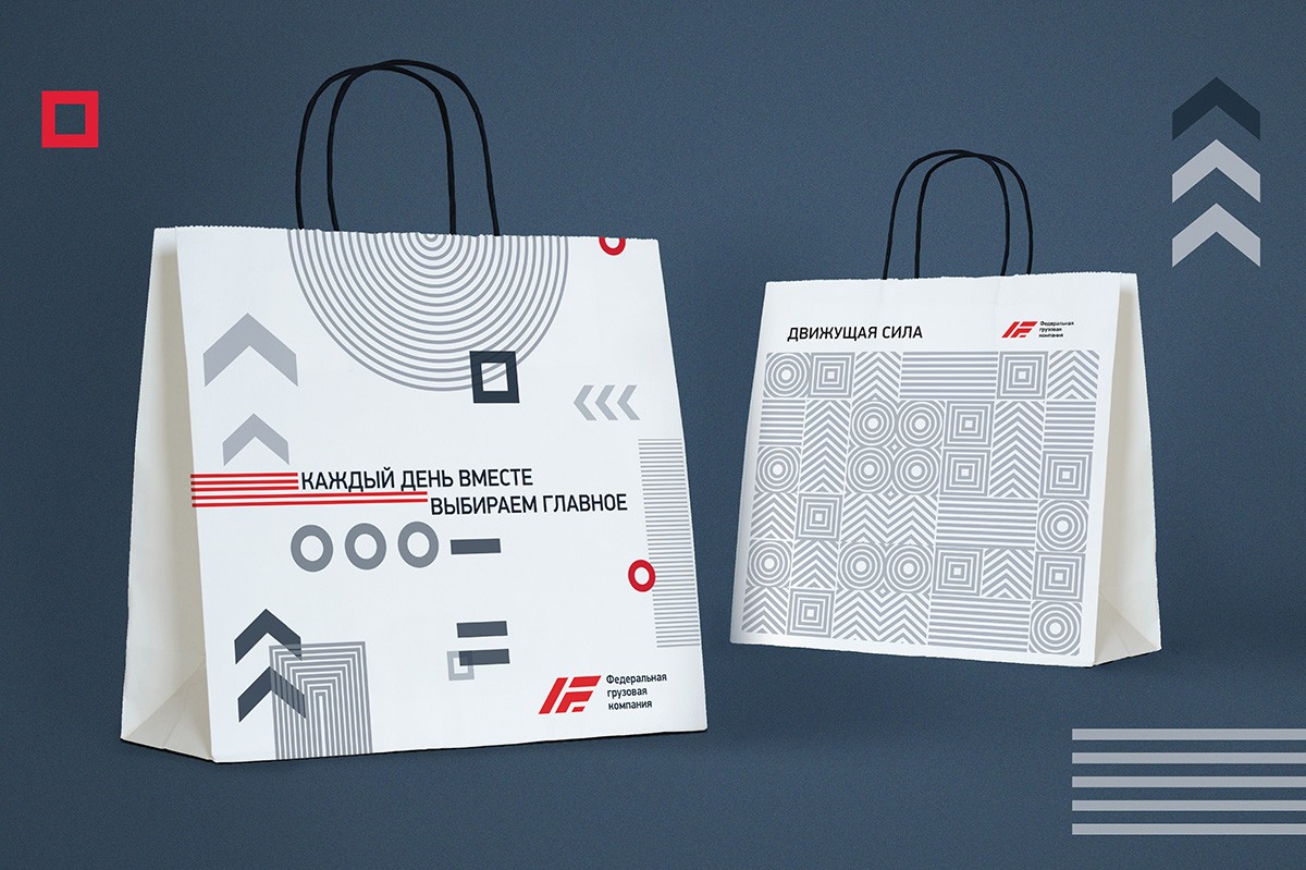
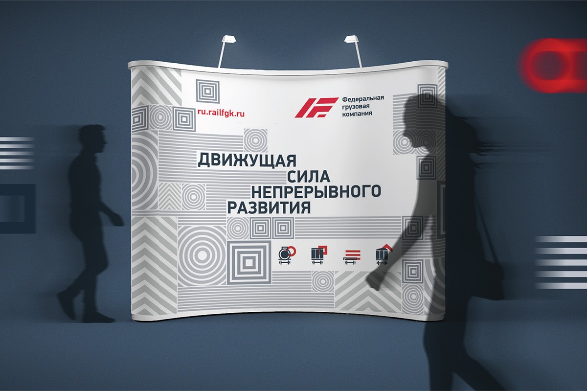
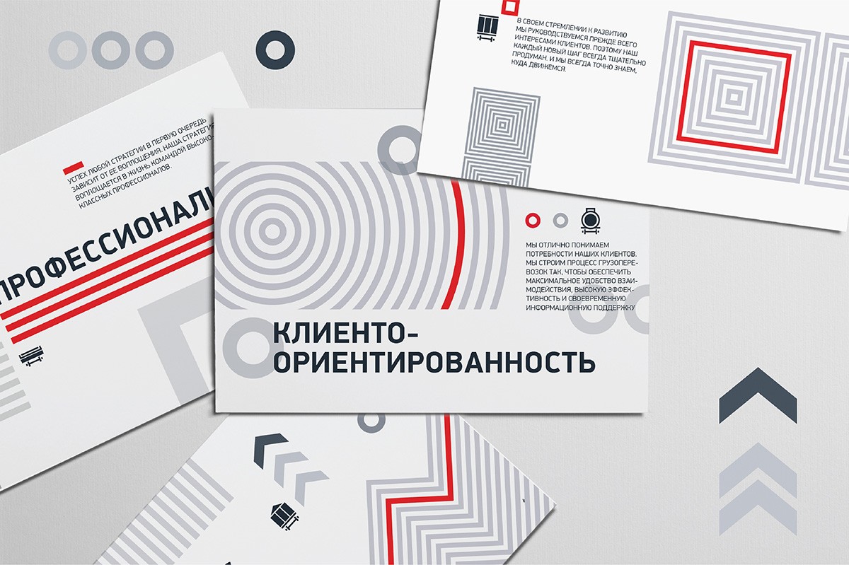
The concept of identity was defined by a clear geometry of the FGC brand sign. The conceptual basis is four simple and understandable geometric symbols, which, conditionally denoting both directions of the company's activities, and types of wagons, simultaneously serve as a reflection of the values of FGC: responsibility, customer-oriented, professionalism and progress.
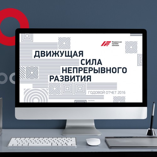
The interaction of symbols gives rise to the effect of movement and this is supported by the company's general slogan - "The driving force". And in the development of the sign series, an integral flexible graphic system is formed with wide possibilities for transformation and adaptation to various proprietary materials, carriers, and communication media.
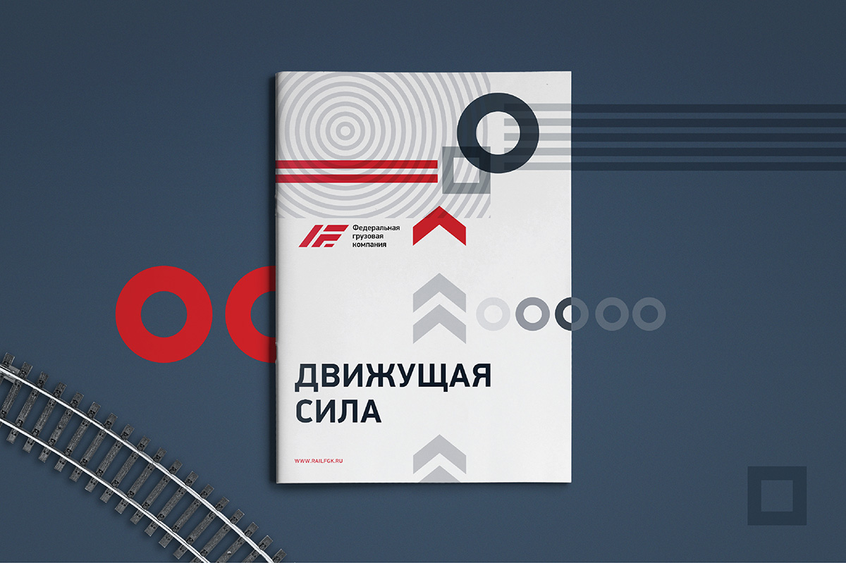

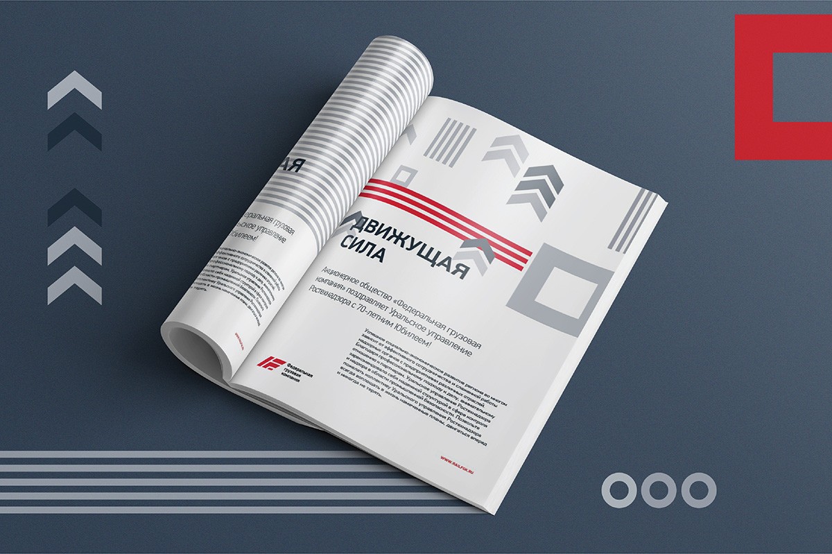
FGC immediately felt, understood and adopted a new system of symbols: the developed identity dominated the presentation brochure and the company's annual report.
Creative team
Art-director
Irina Shmidt
Brand Strategist
Daria Erasova
Copywriter
Anton Borisov
Designers
Nadezhda Polomoshnova,
Olga Samofalova,
Irina Shmidt
Anton Nekrasov
Project Manager
Anna Dokunina,
Aleksandr Petrosyan
Another projects for this client