
Choose industry from list
Emotional reload of NTK
First of all, we identified and formulated the essence of the NTK brand. Bright and active information environment, giving an emotional reload and a positive charge. Now it was required to find new means of channel design. Which will reveal and convey this essence.
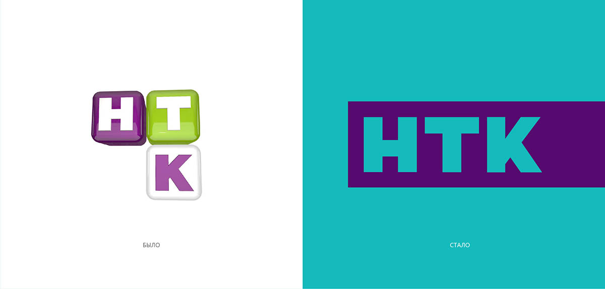
The audience didn’t connect NTK logo with the channel and didn’t remember it. Besides, as we already mentioned, biggest part of the audience NTK had associations with channel for children. The reason was in pronounced naivety and the logo like a toy or a candy.
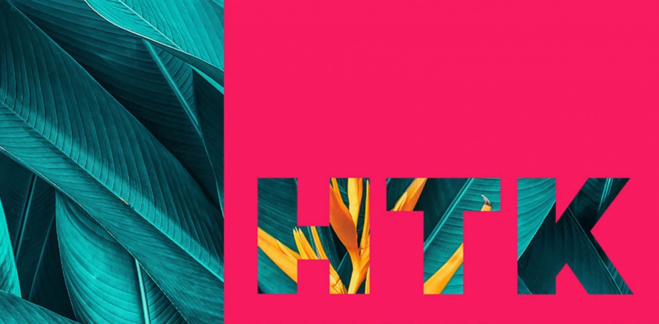
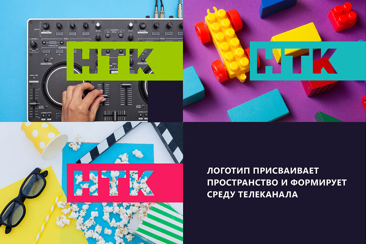
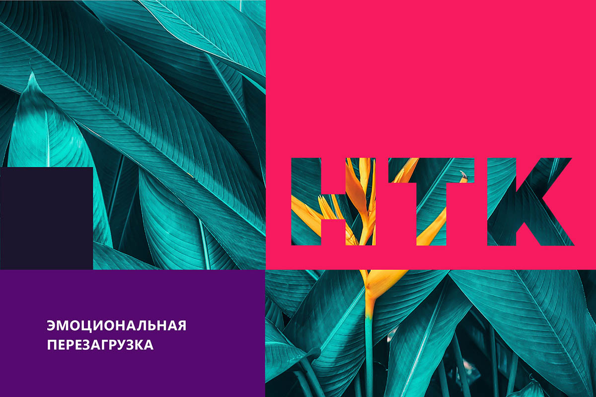
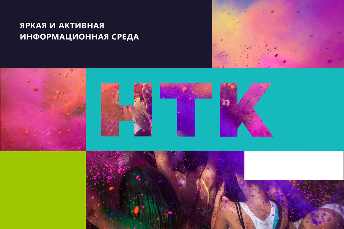
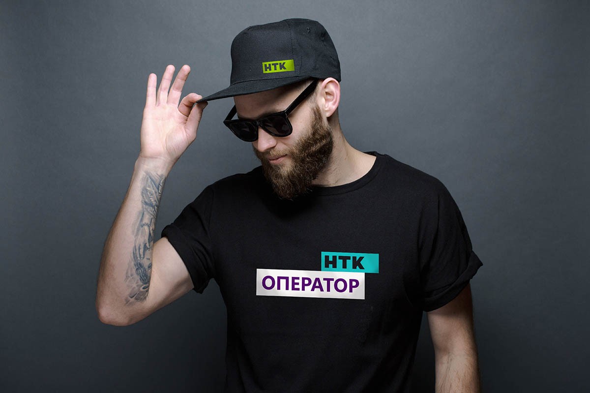
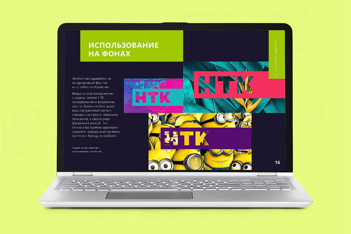
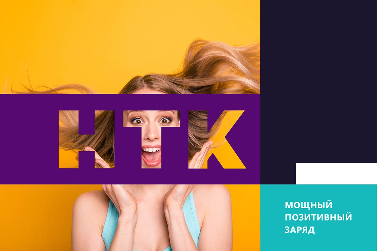
Our version solved both problems. The simple laconic clear logo obviously matured. And it became well readable. And its performance, cutting down on a plate, answered the key question of recognition, memorization. The logo is revealed in interaction with the content: it assigns a broadcast space. Placed on any backgrounds and images, the logo absorbs them, becomes an organic part of the picture. And the viewer sees and remembers the inextricable link. Content with brand and brand with content.
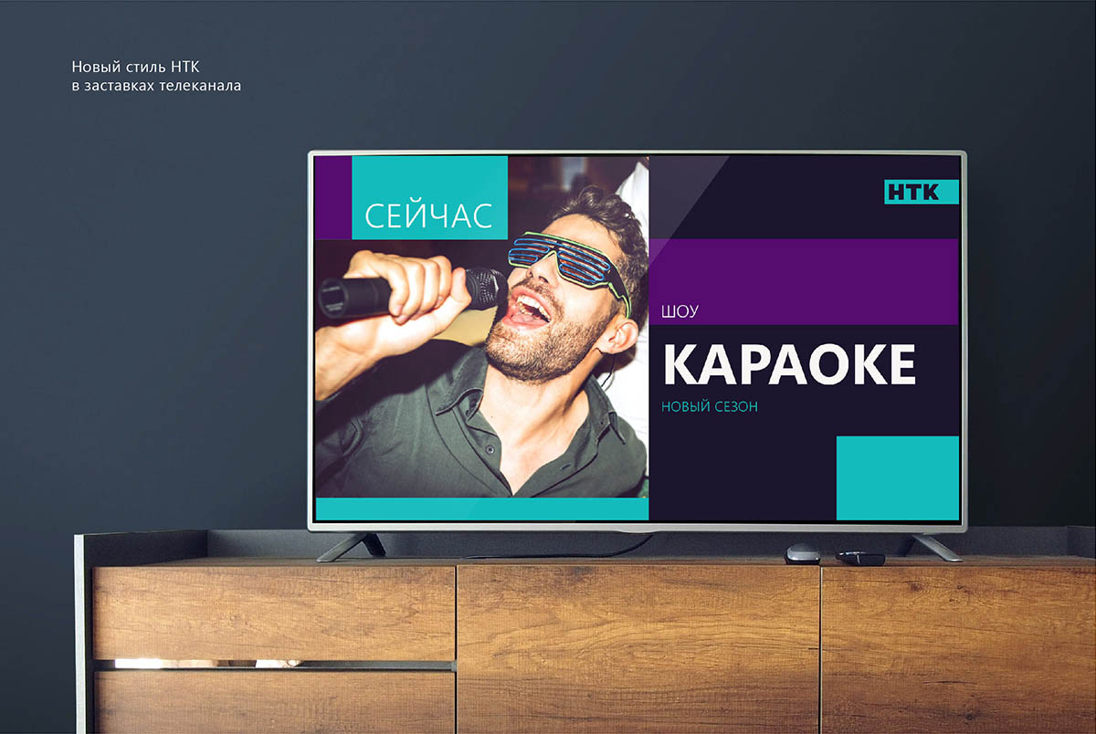
The project was not limited to a logo. It was necessary to decide what to do with the submission of information blocks, screensavers, jingle marks, announcements and other things. After all, this basically forms the style of the channel. In our case – updated, active and matured.
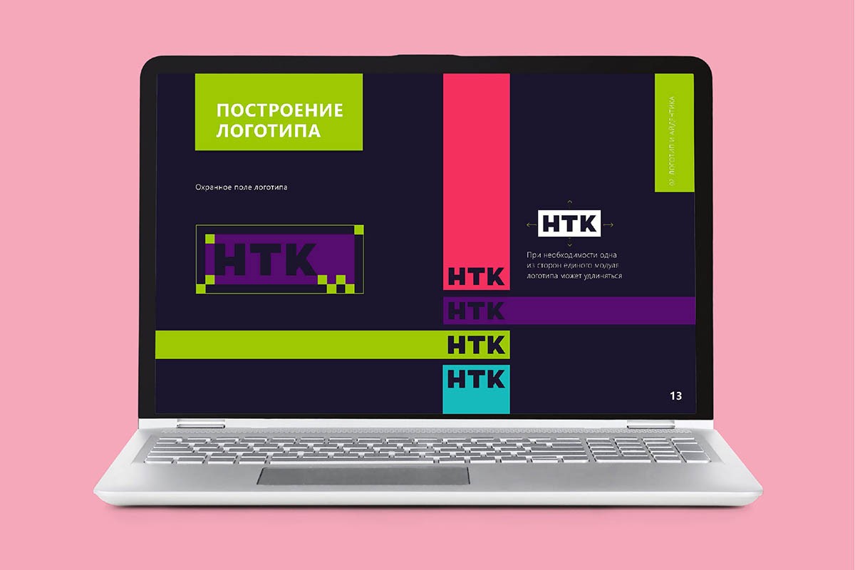
The solution was found in the logo itself. Friendly dynamic colored dice, connecting on the screen on the principle of a modular designer, became the basis of identity. They have activity and movement, energy and contrast. A rational side is the structure and expressiveness, clarity and readability.
A simple and understandable guideline with the principles of using the updated style has become the traditional final step of the project.
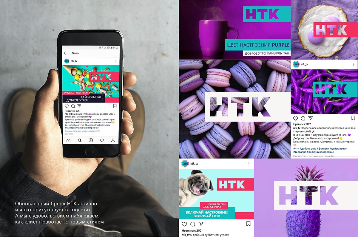
The new NTK, a unique and universal channel for a wide audience, has brightly and vigorously entered the screens and monitors. It actively presents in social networks. Uses the updated style everywhere. And does it well. To our undisguised pleasure.
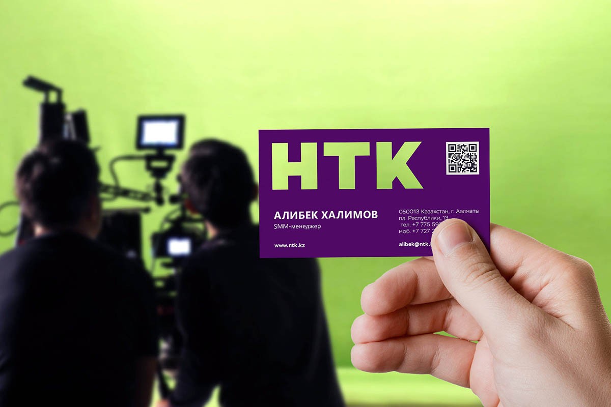
Creative team
Ilona Koltinyuk
Art-director
Irina Shmidt
Brand Strategist
Daria Erasova
Copywriter
Anton Borisov
Designers
Elena Ivanova,
Ekaterina Starodumova,
Irina Shmidt,
Daniil Yarcev
Roman Titovec
Project Manager
Anna Dokunina,
Aleksandr Golomolzin