
Choose industry from list
Logo and Packaging for Specialty Coffee
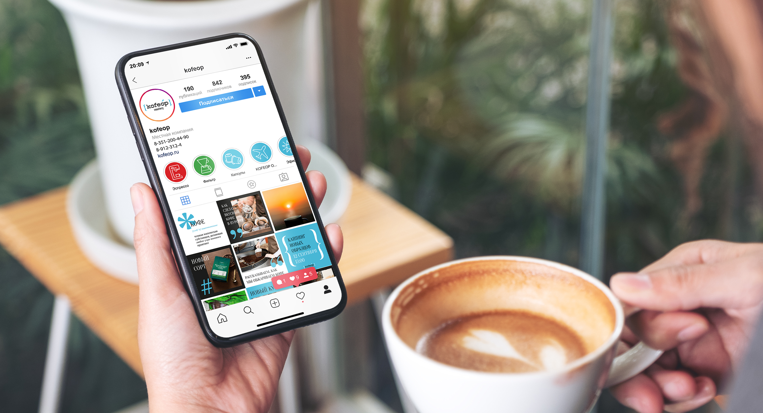
Coffee in your language
The brand sees as its audience not only experienced gourmets, but also ordinary lovers. Those who go to a coffee shop for tasty coffee, thinking that it is difficult to make it at home. Those who have already switched from instant to natural coffee, but still buy it in retail chains.
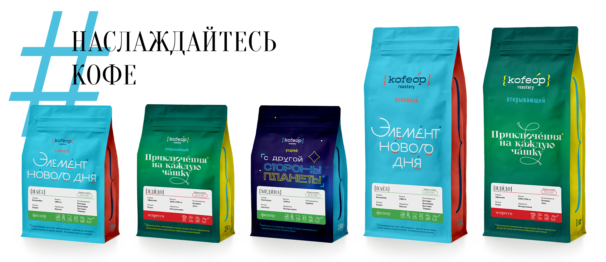
The brand stands for the democratization of knowledge, so the team abandoned the idea of dividing the ranges into filter and espresso, considering it a legacy of professional subtleties. The Kofeop assortment is shaped to introduce people to the nature of the coffee that awaits them in the pack:
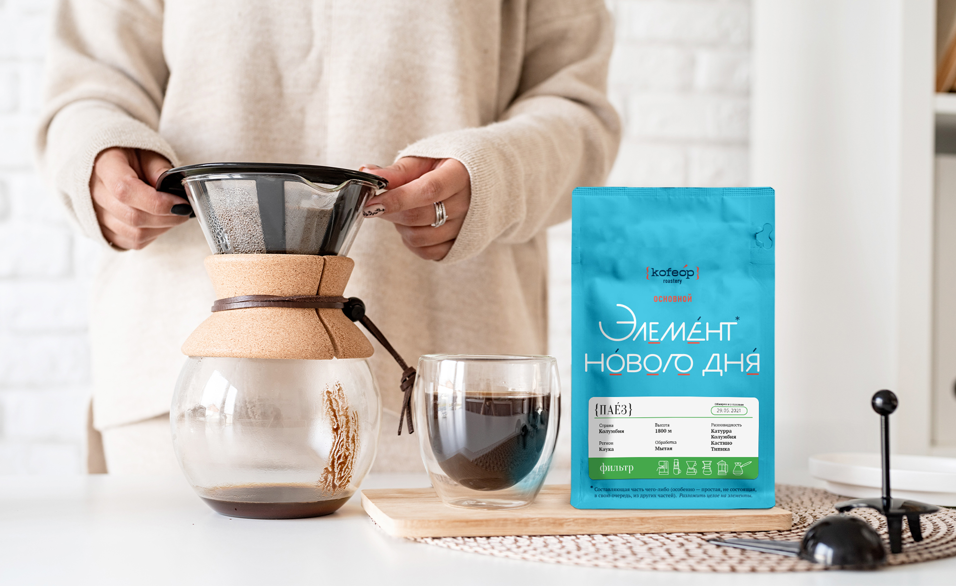
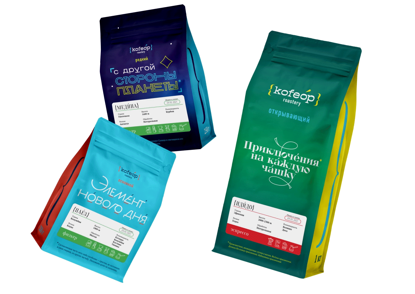
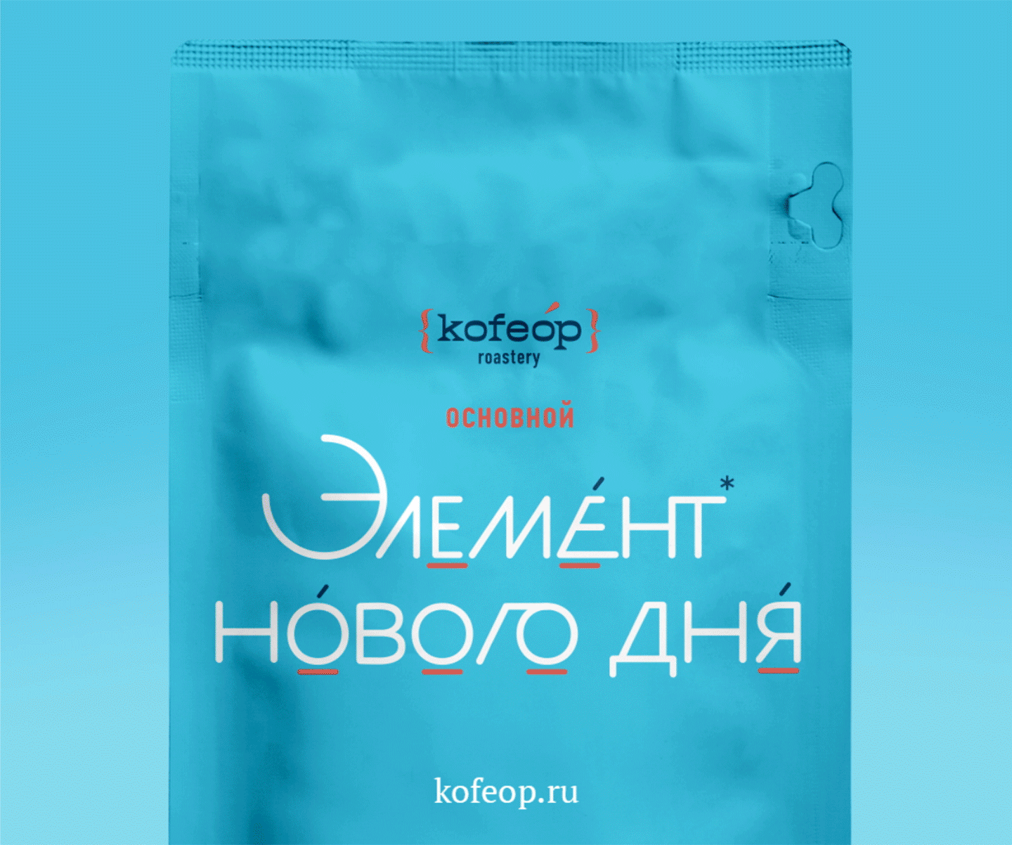
- Based ― lots of traditional flavors. Versatile, balanced, familiar coffee for everyday drinking.
- Discovery ― lots of bright and different flavors. Coffee for people who are ready to experiment.
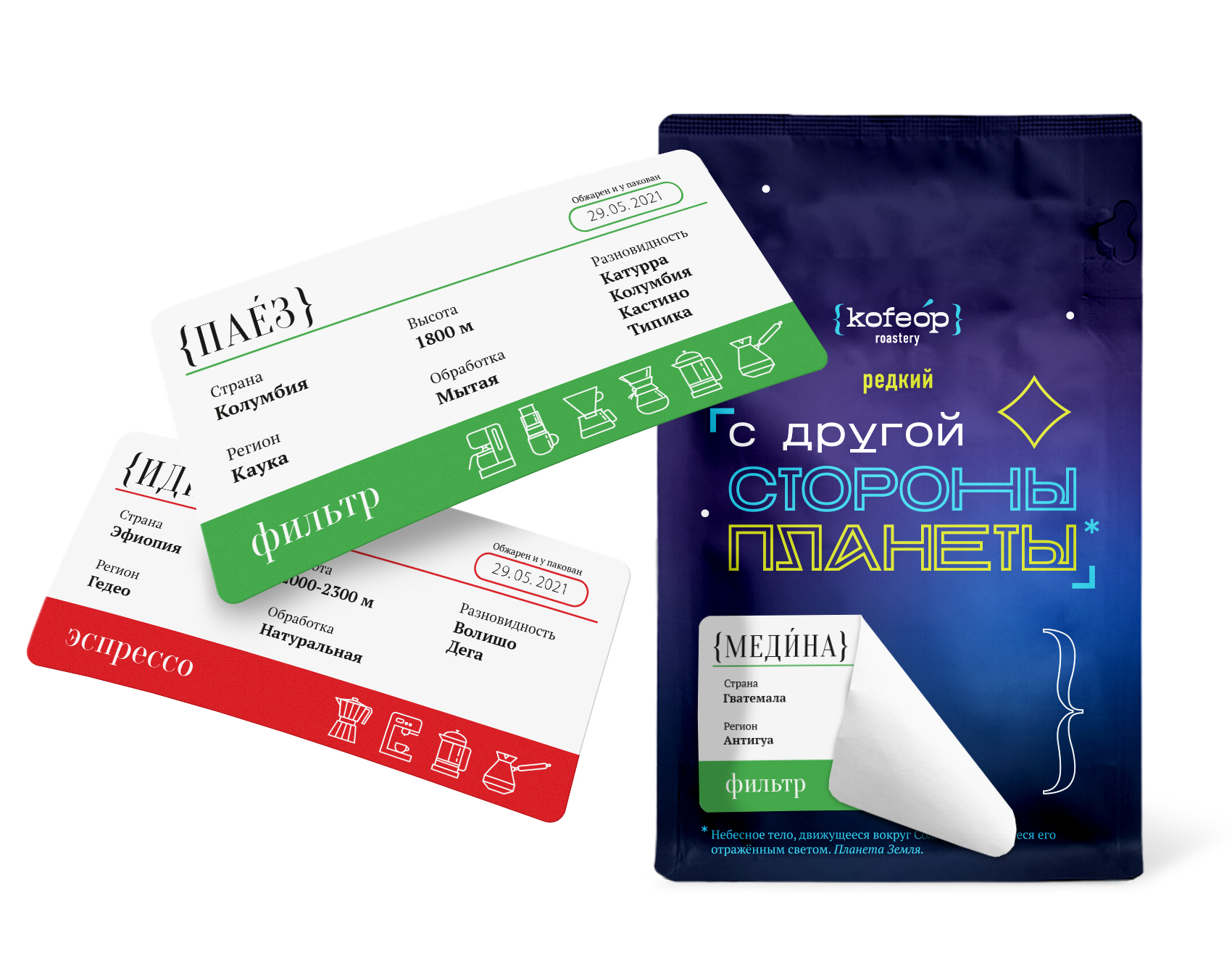
- Rare ― extraordinary lots that may only appear once on sale. For those looking for a unique coffee.
Этот подход транслирует ценность продукта и формирует правильные ожидания, показывая, что спешелти-кофе не обладает одинаковым и постоянным вкусом.


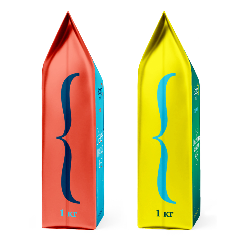
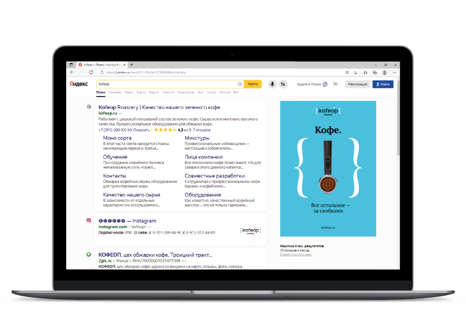
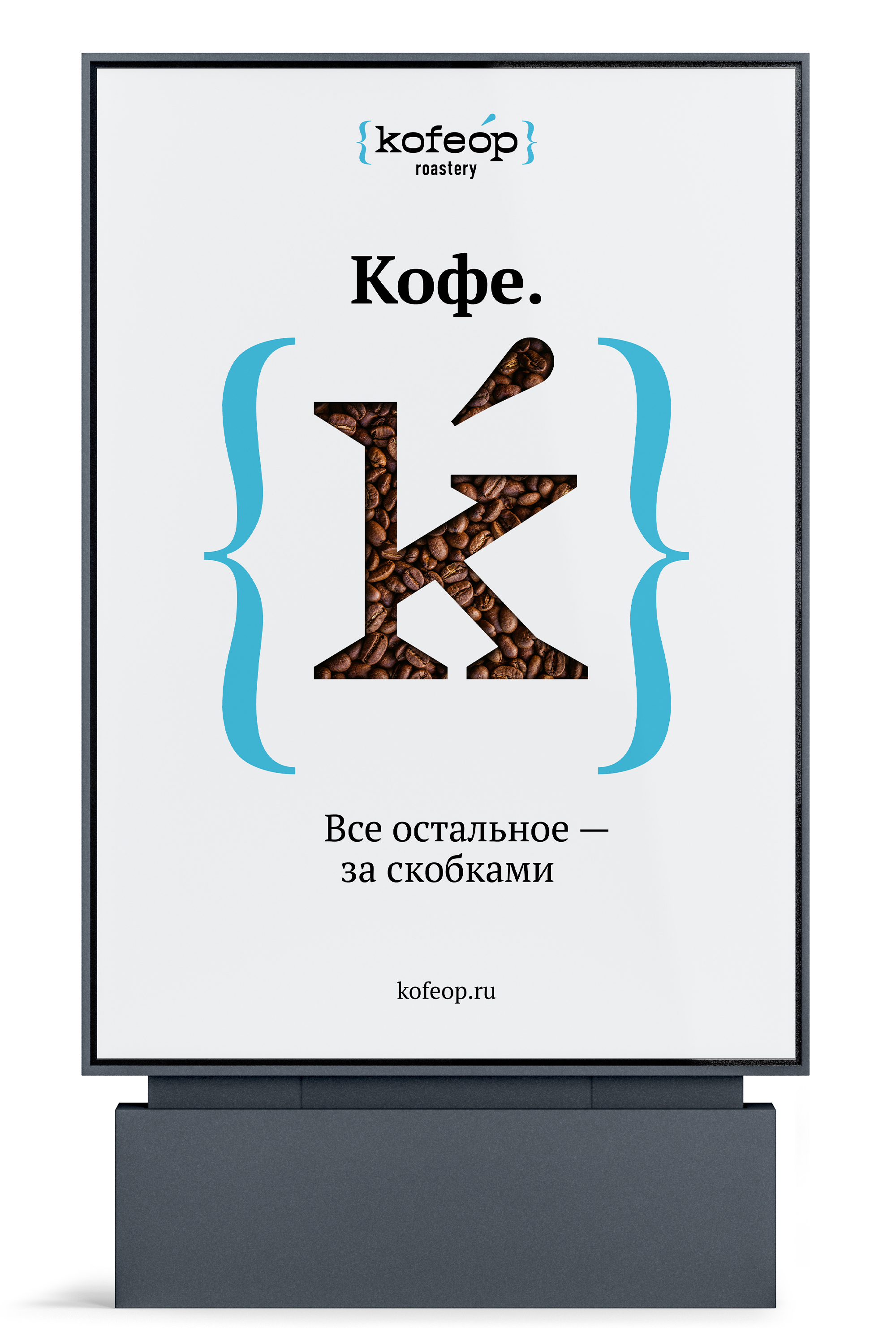
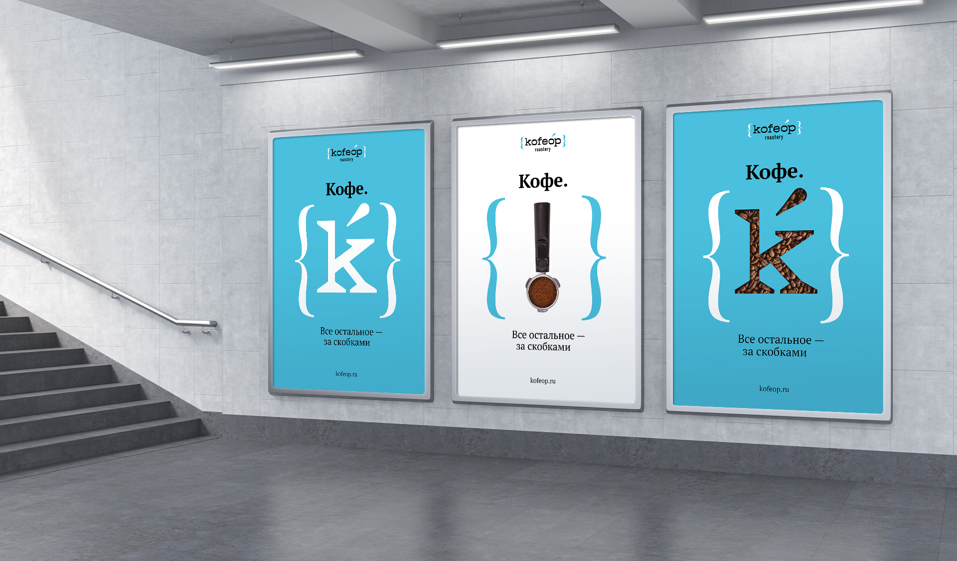
The identity is constructed on a variety of typographic symbols. The idea of the logo refers to the brackets and the accent, stylized symbols of transcription.
The brand's corporate color is blue, and additional colors are used for package design.
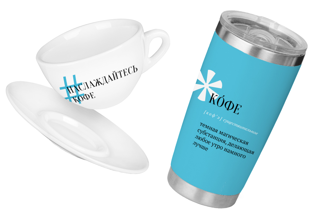

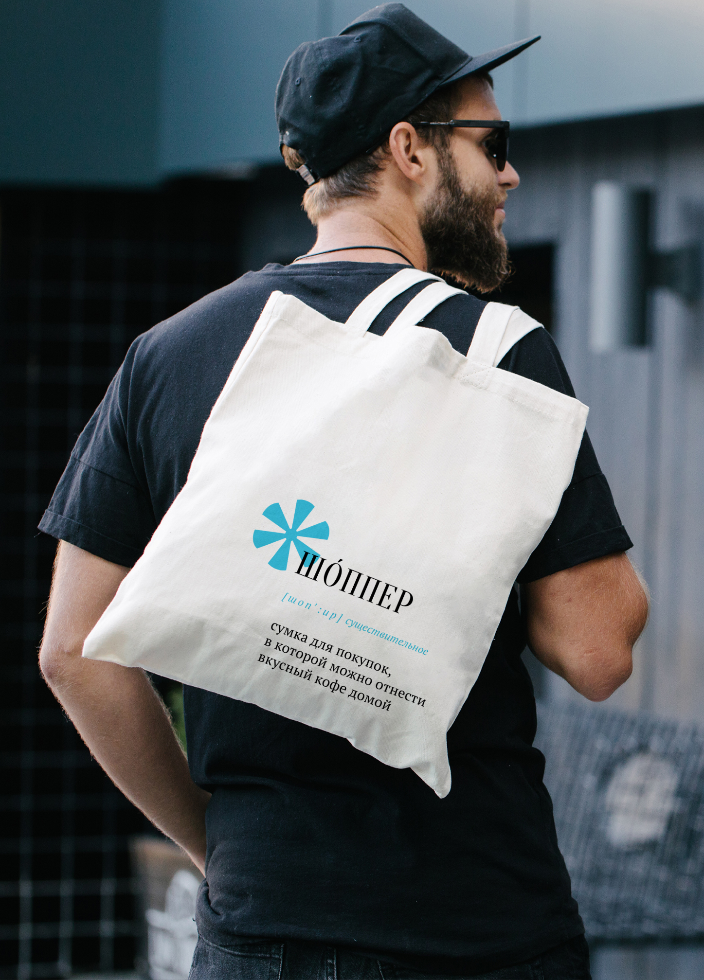
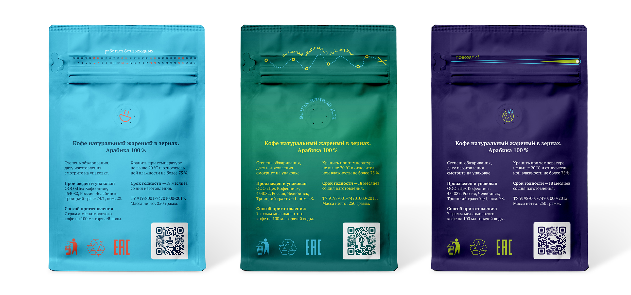
The package design is based on a laconic typographic solution. The phrases on the front side talk about each line with the help of metaphors, and the Kofeop brand thus acts as a translator for people ― from industry to lively and figurative language.
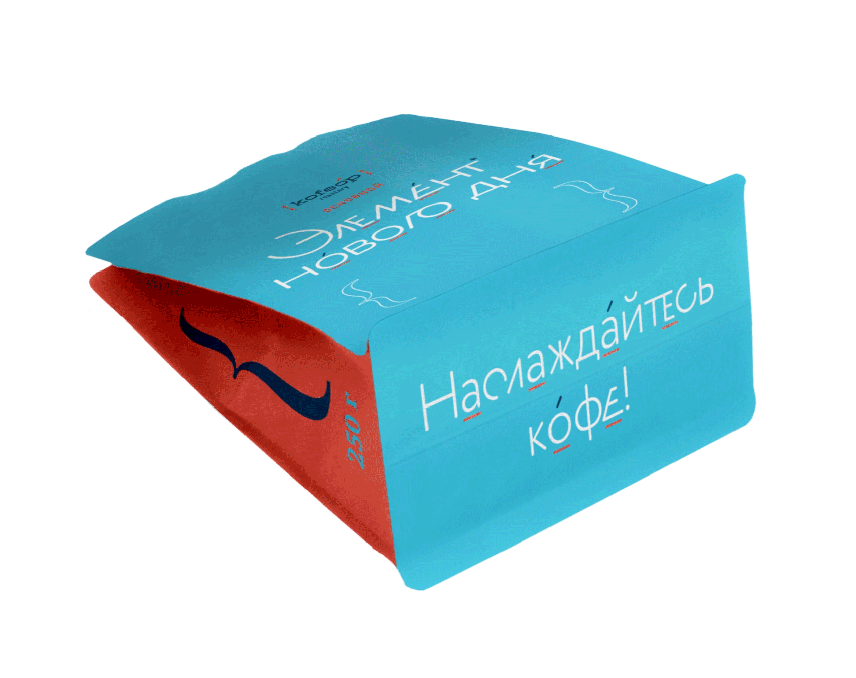
● Based New Day Element
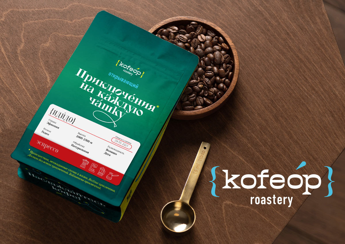
● Discovery An adventure for every cup
● Rare ― From the Other Side of the Planet
The design engages all sides of the package. There is a brand message on the bottom end. The shaped brackets on the sides are a recognizable element that opens opportunities for visual merchandising.
The sticker contains information about the lot, roasting date and method of preparation. The color division into filter and espresso has a functional purpose: the colors help warehouse workers not to confuse packs with different roasts.
Typography in the identity was the starting point
for the advertising concept.
We say that coffee is more important than everything else, and leave everything else out of brackets. In support of the general idea of playing with typographic symbols, some of the objects enclosed in brackets are among other things. For example, coffee beans assembled into a letter, or a portafilter resembling an exclamation point.
Creative team
Art-director
Sergey Samofalov
Brand Strategist
Irina Mokrousova
Copywriter
Anton Borisov
Designers
Sergey Samofalov,
Tatyana Savchuk,
Sergey Koger
Project Manager
Anna Artemova