
Choose industry from list
More serious, confident, fresh
Since the client did not want cardinal changes and asked for the maximum continuity of the updated logo to the existing one, we presented him three variants of the logo – with changes from very small to very big. The fourth was an option that we considered too radical in terms of upgrade for the client, but included in the feed – because we liked it and even at least to the place of the "creative bonus" could claim. To our pleasant surprise, the client chose this option.
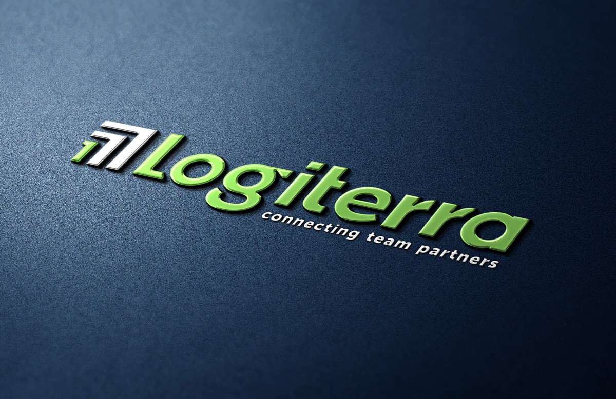
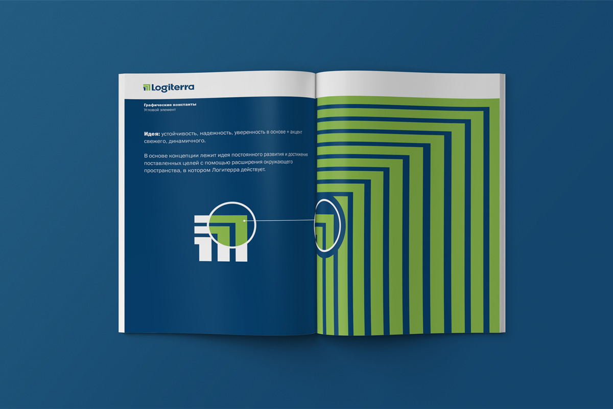
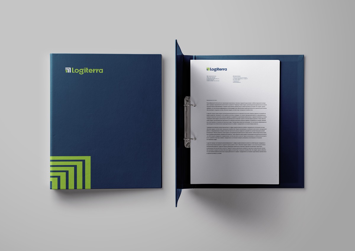
The concept of the logo was explained as follows: "the arrows of the sign are directed up and to the right, and the first of them is the number 1: the sign indicates the company-leader that occupies firm positions due to development, growth and expansion of borders. The geometric logo with a straight outline is quite serious, it reflects the theme of stability and reliability. Its deep saturated basic color is confidence and consistency; and contrast and fresh additional - friendliness, dynamism and efficiency of the company, safety of cargo throughout the delivery."
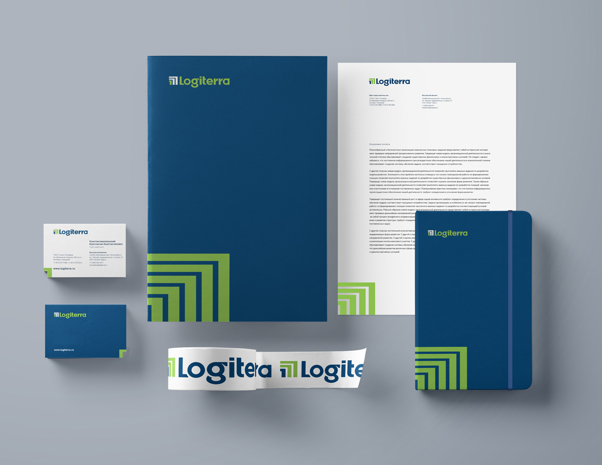
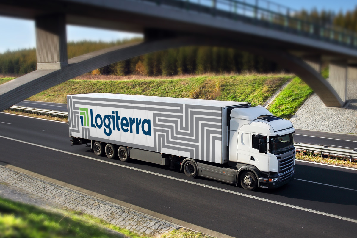
Further development of corporate identity has gone from the graphics of the corner element (arrows), which has become a proprietary pattern that supports the same concept of sustainability and confidence combined with fresh energy and dynamics, the theme of development and expansion. New identity already on the website
Creative team
Art-director
Daniil Yarcev
Daria Erasova
Copywriter
Yulia Bibisheva
Designers
Nadezhda Polomoshnova,
Daniil Yarcev
Project Manager
Marta Bekker