Choose industry from list

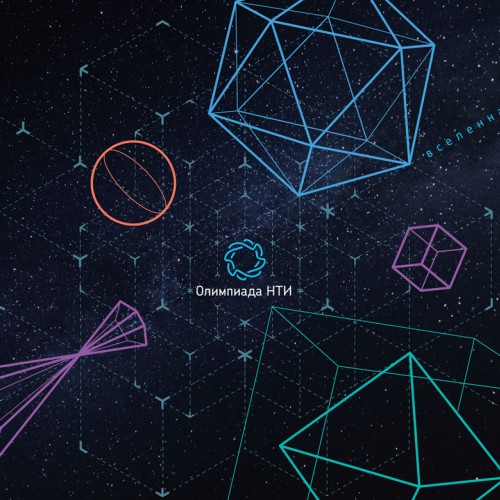
Global space of updating
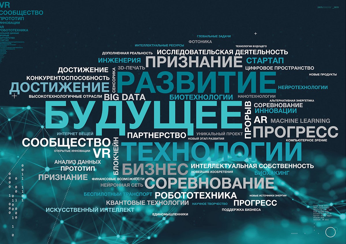
The project was comprehensive, it began with an analytical stage, as a result of which we offered the client an optimal subbrand brand architecture and a fairly emotional positioning uniting the themes of Russia's global technological leadership, supporting innovative solutions, the excitement of inventions and discoveries.
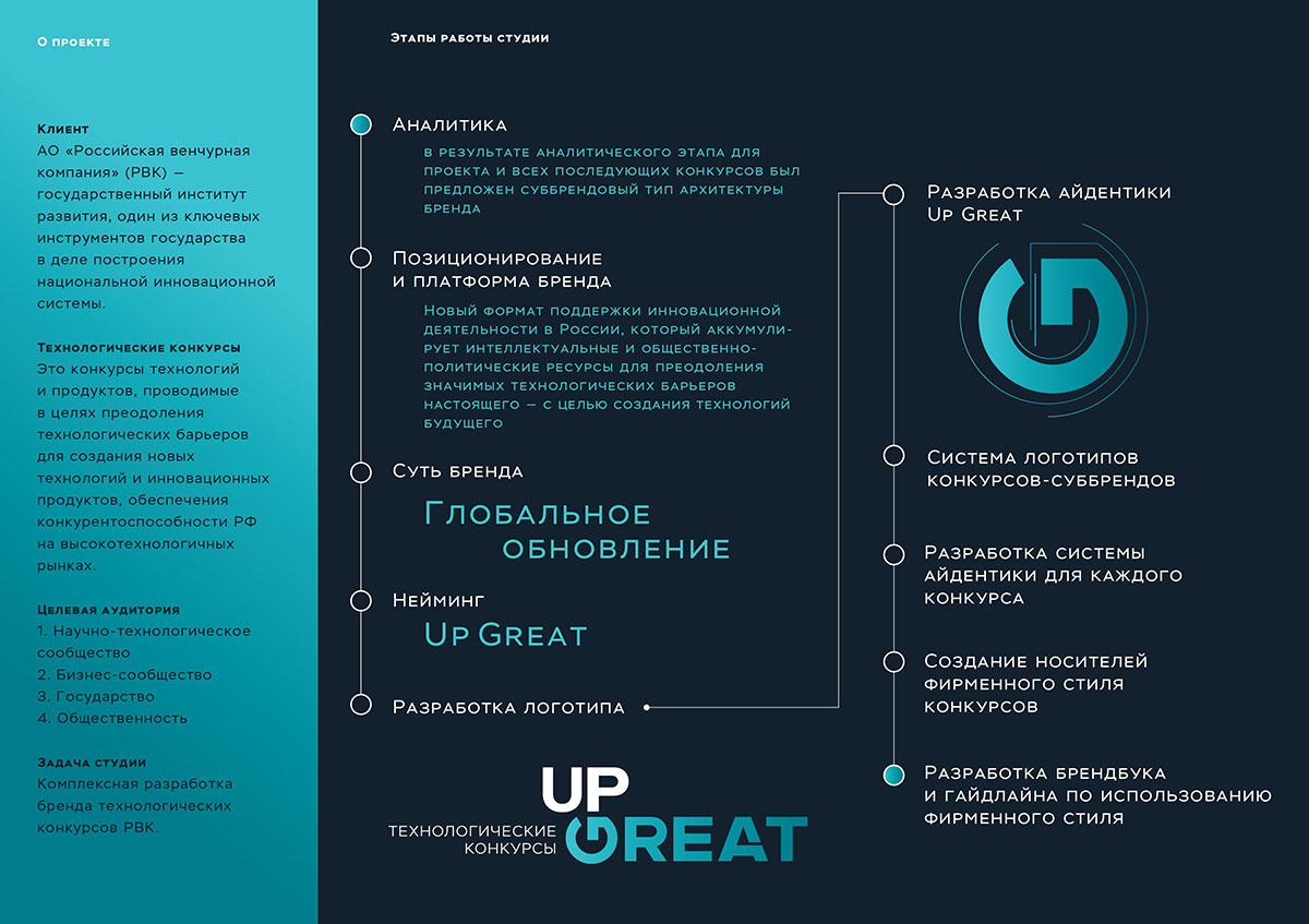
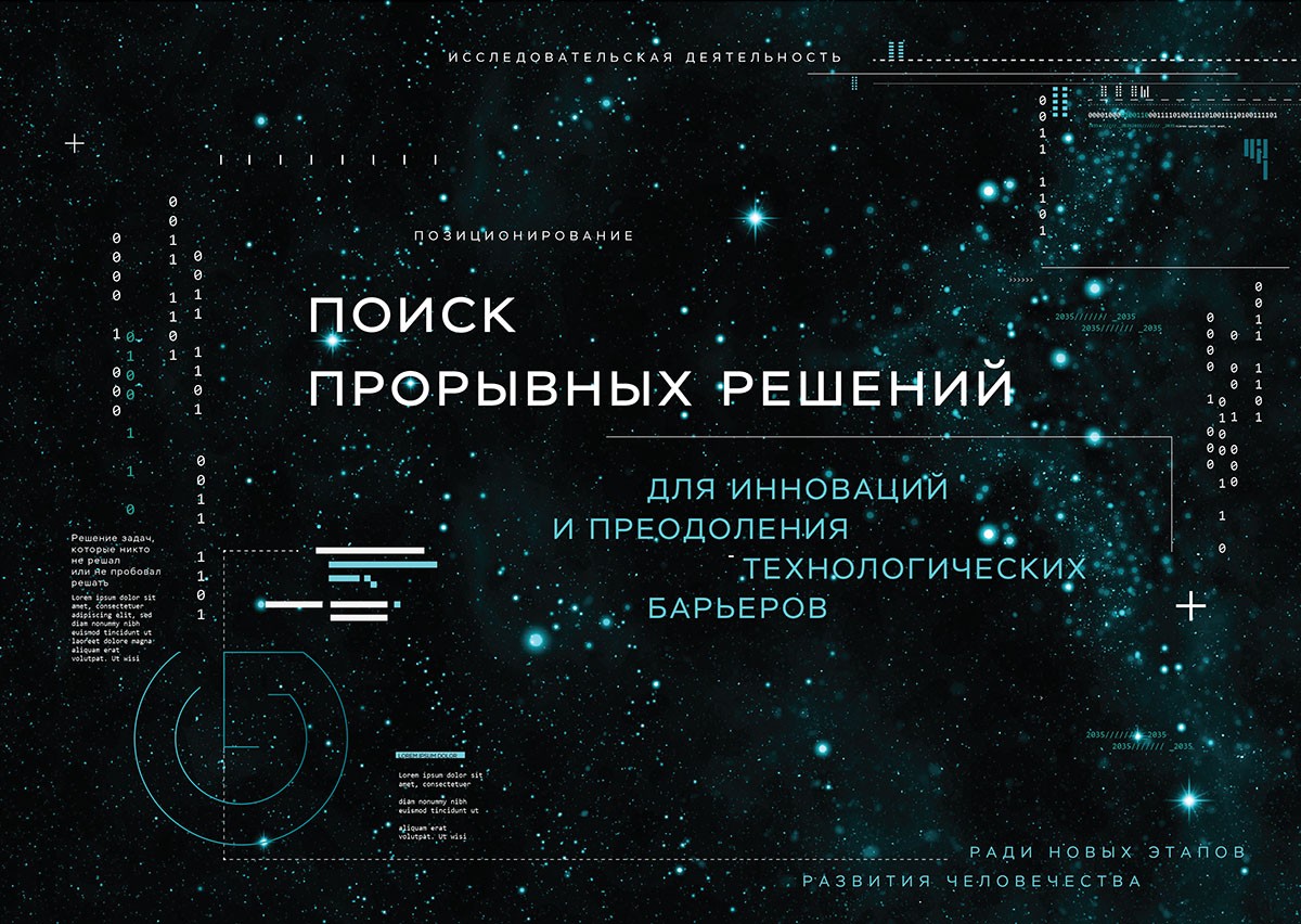
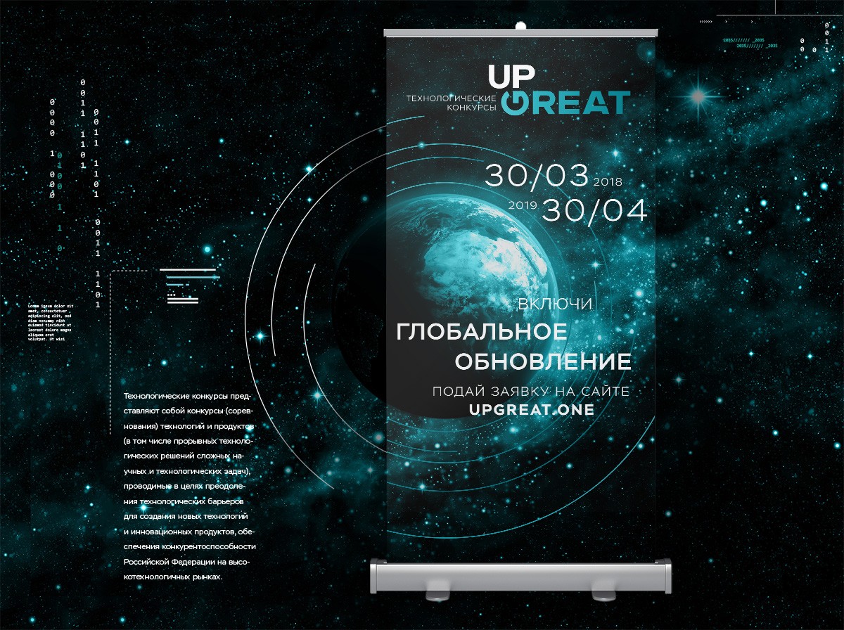
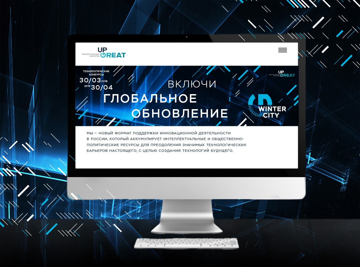
From positioning, the essence of the brand – "Global update" – is used as the general slogan, brandline. The name of the first level was Up Great – formed from the initial “upgrade” and saying that the purpose of the competitions is a constant increase of the technological bar.
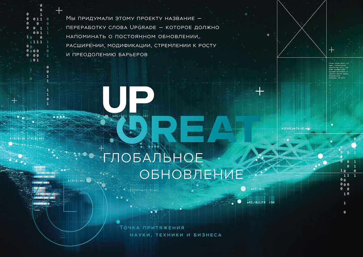
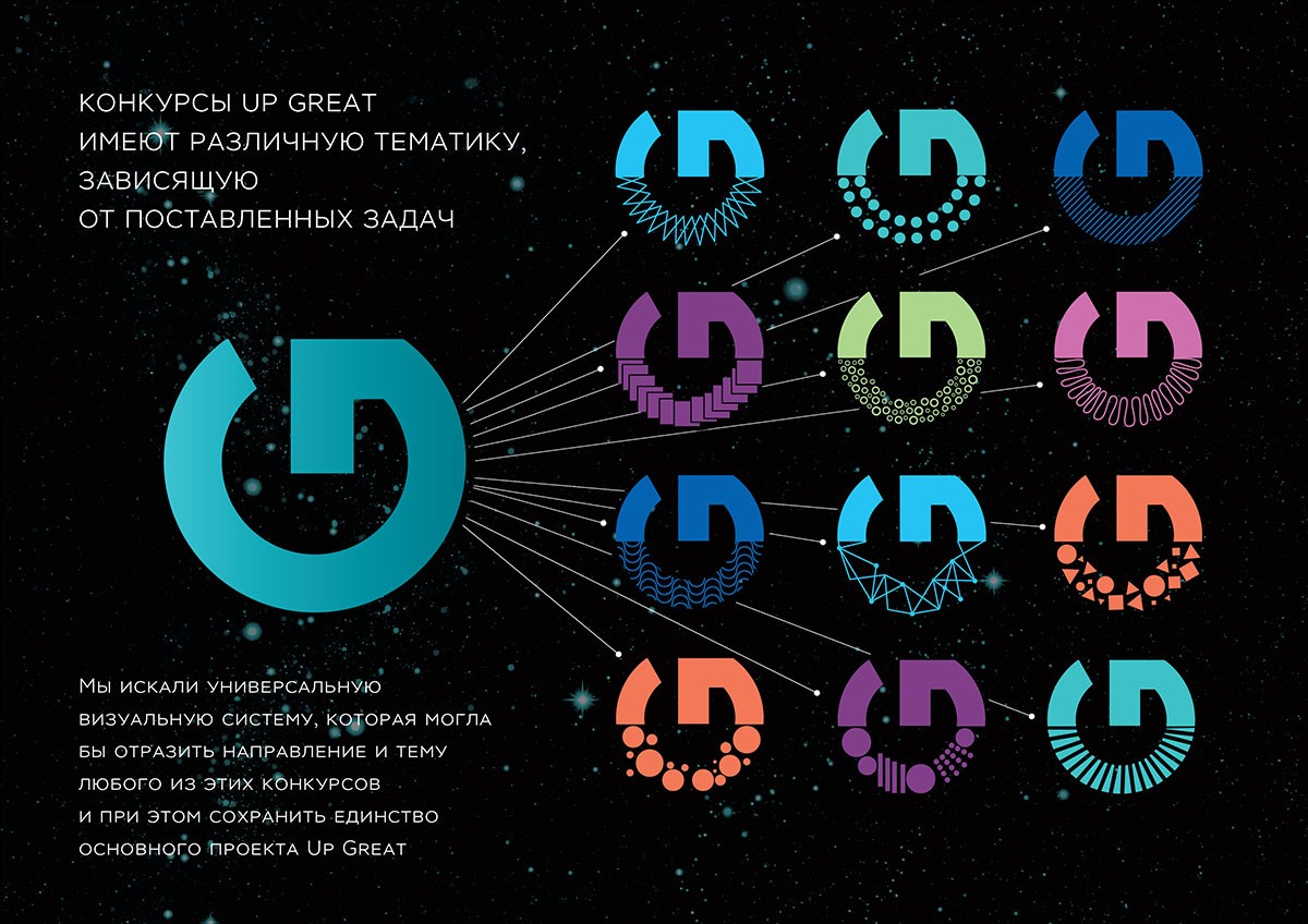
We made the letter G, resembling the button power, the main identifier of the brand. It is a symbol of start, launch, inclusion of global renewal, energy and changes.
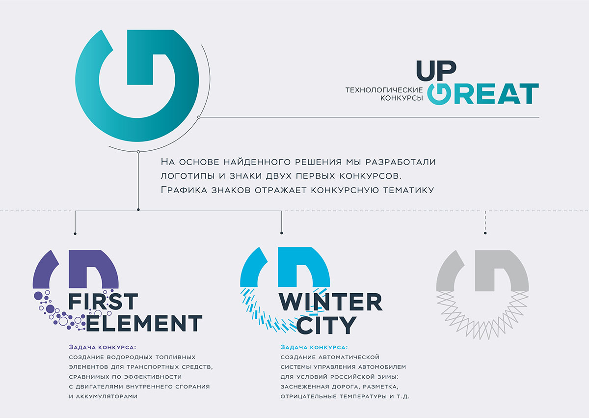
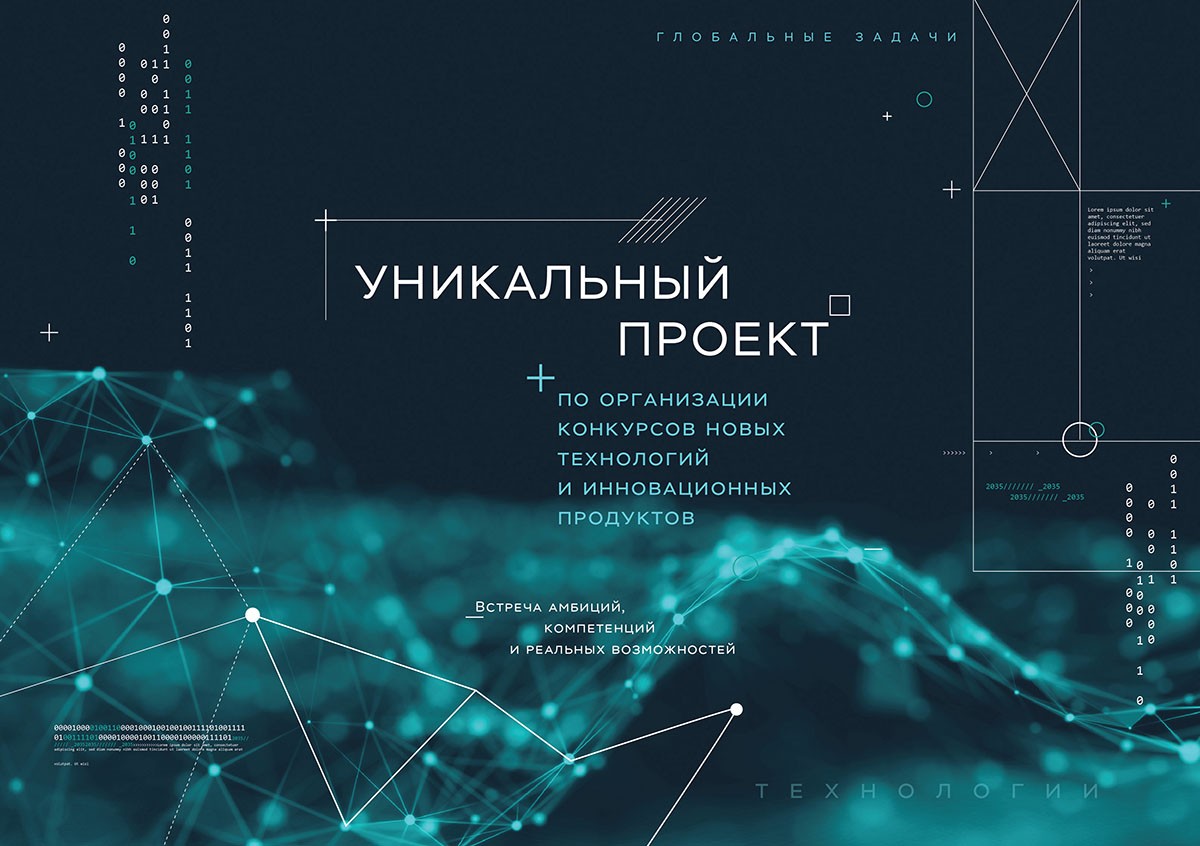
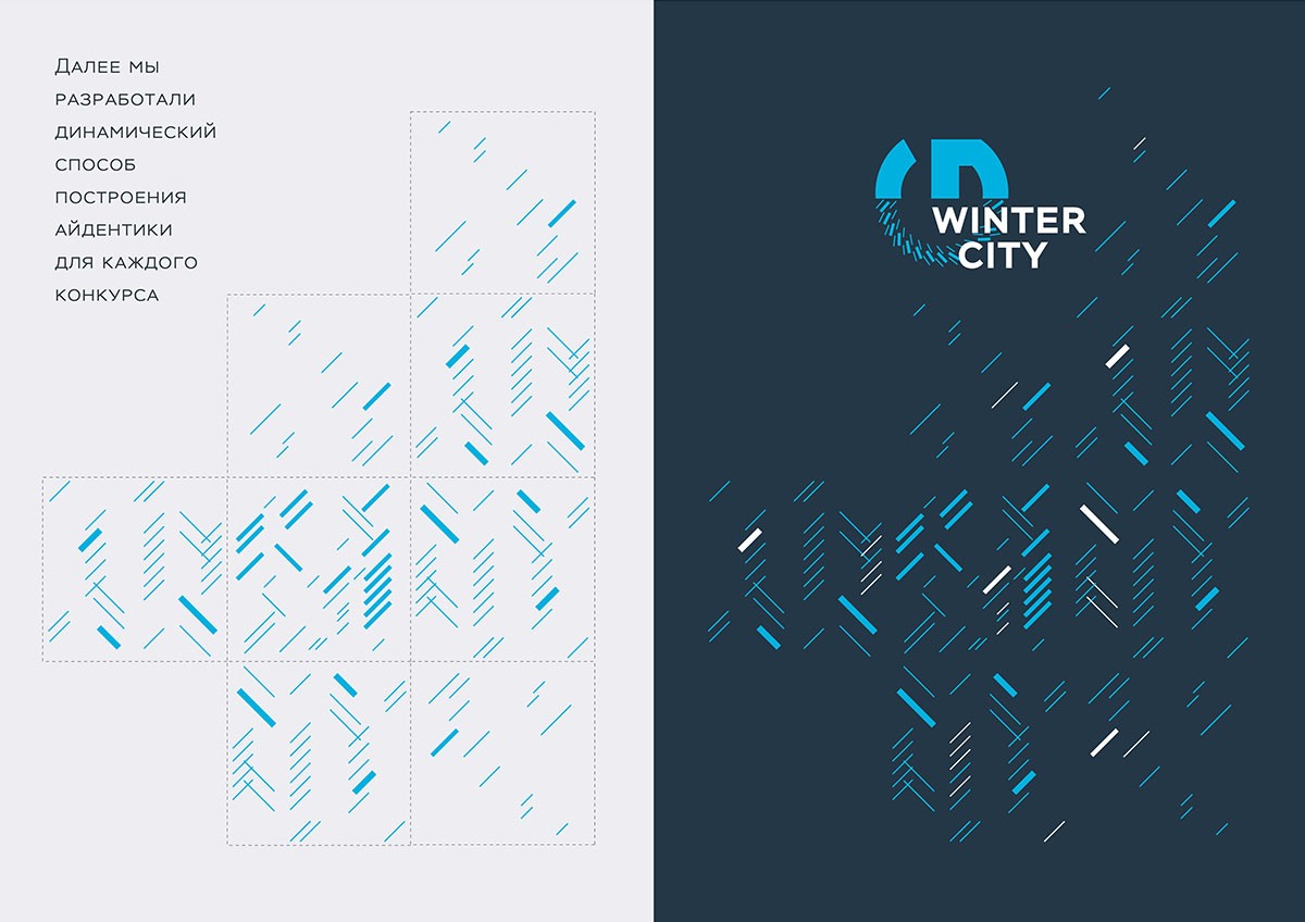
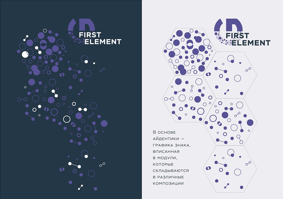
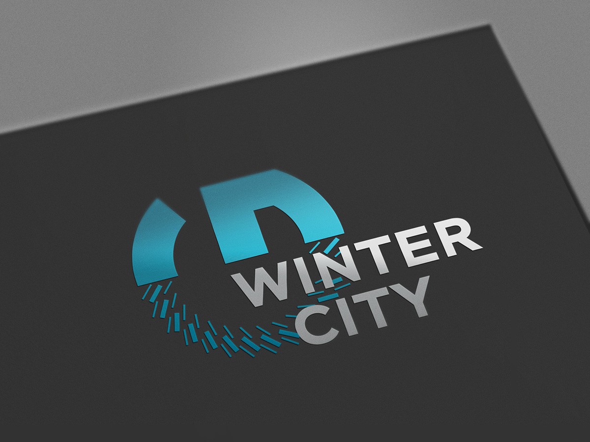
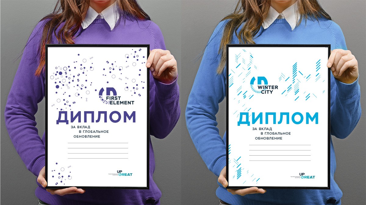
Further our task was to develop the identity of subbrands – specific technological competitions. Using the principle of transformation of the basic identifier, we have built a visual system, the elements of which reflect the theme and direction of each competition in an independent form, and together they form a single whole – the dynamic identity of the Up Great brand with the associative series of open scientific and technological space, the space of intellectual search, the depth of understanding and the novelty of solutions.
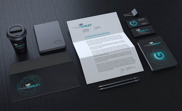
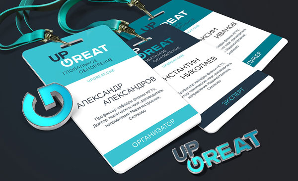
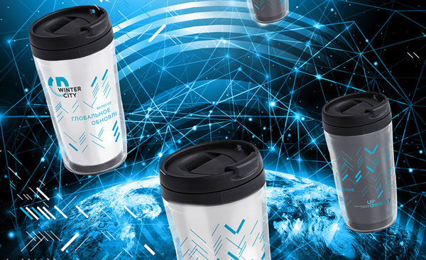
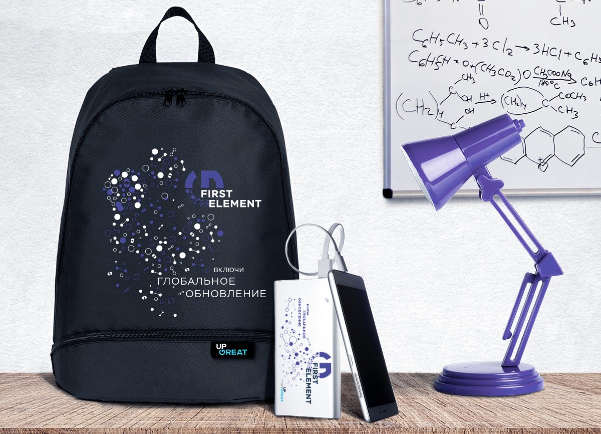
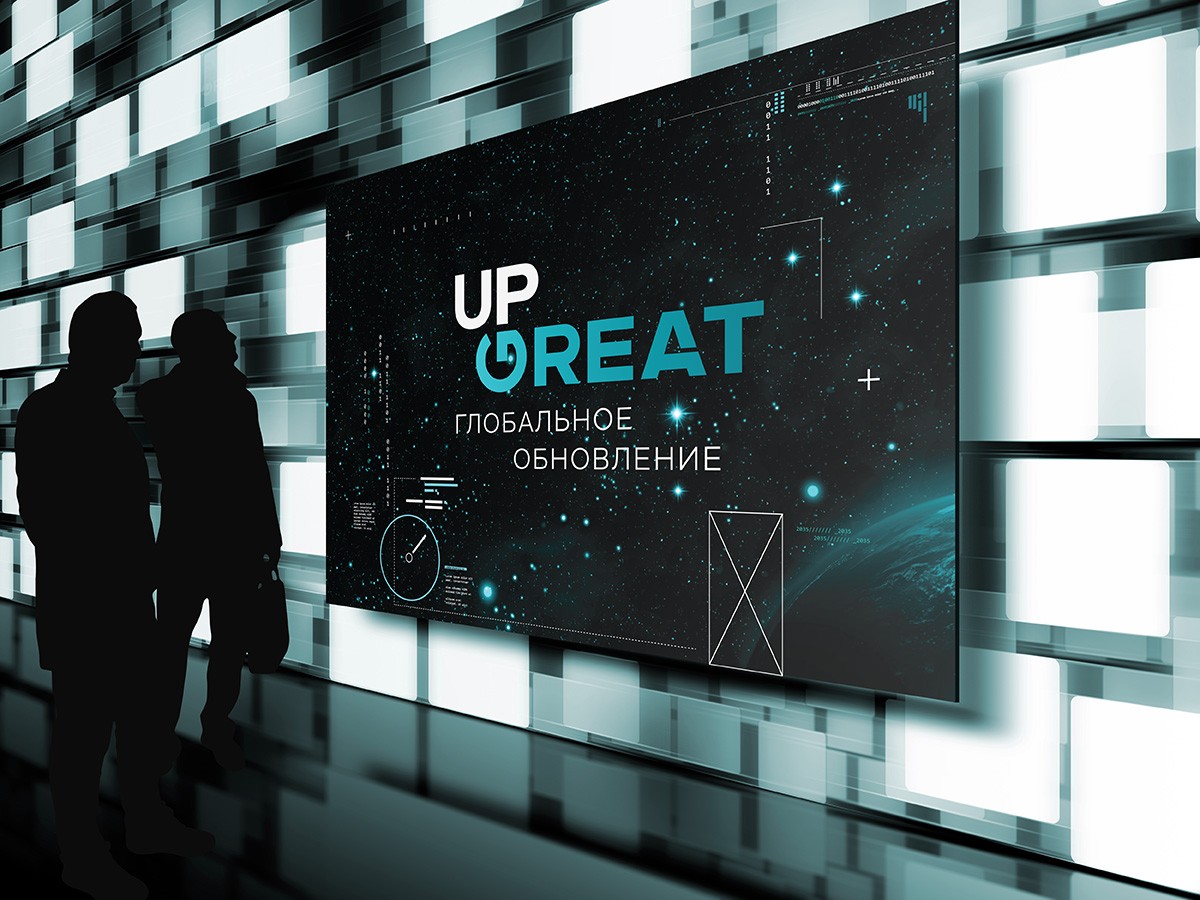
In conclusion of this large project, we have designed a variety of carriers of the corporate identity Up Great and developed guidelines for the use of style constants. Now the project is already launched and announces the first competitions.
Creative team
Art-director
Irina Shmidt
Brand Strategist
Daria Erasova
Copywriter
Anton Borisov
Designers
Ekaterina Starodumova,
Olga Samofalova,
Irina Shmidt
Roman Titovec
Project Manager
Anna Dokunina,
Aleksandr Golomolzin
Another projects for this client