
Choose industry from list
Rebranding a logistics company

The emotional component helped the company stand out, but over time top management questioned the relevance of the style and nature of this approach. The brand did not reflect or translate all the drive and excitement with which the Glavdostavka team was charged.

Our task was to make a brand refresh: to update its essence, the tone of communication, develop positioning, logo, brand identity and other attributes.
The Glavdostavka team was ready for a total refresh. The only thing the client wanted to keep was the message about love. When we asked company owner Vitaly Gorbatyuk why love was so important, he answered with a question to a question, "What could be more important and stronger than love?" And then love happened already to us.
Brand positioning and essence
Based on an analysis of trends and cases in the logistics market, as well as a review of direct and indirect competitors, we formulated the rational and emotional benefits of the Glavdostavka brand for two segments of the target audience: franchisees and customers (buyers of services).
Glavdostavka is not just a company, but a cross-service platform. It is complex, systemic and technological inside to be simple and convenient outside - for its partners and customers. It is a team of people in love with their business and eager to share their love, experience and spirit. This is how Glavdostavka understands service.

The essence of the brand was born by itself:
Delivery is not the main thing. The main thing is inside.
Of course, we knew right away that this was a provocative idea. It takes a lot of bravery to put into the essence of the brand the message that the main activity of the company is not the main thing. Our client does have something to give partners and customers (in addition to quality and speed of delivery). We thank the Glavdostavka team for the determination with which they agreed on the new essence of their brand.


The design of the essence gave development to the system of slogans. They became dynamic because the essence can change depending on the objectives of communication:
Delivery is not the main thing. The main thing is love.
Delivery is not the main thing. The main thing is team.
Delivery is not the main thing. The main thing is technological.

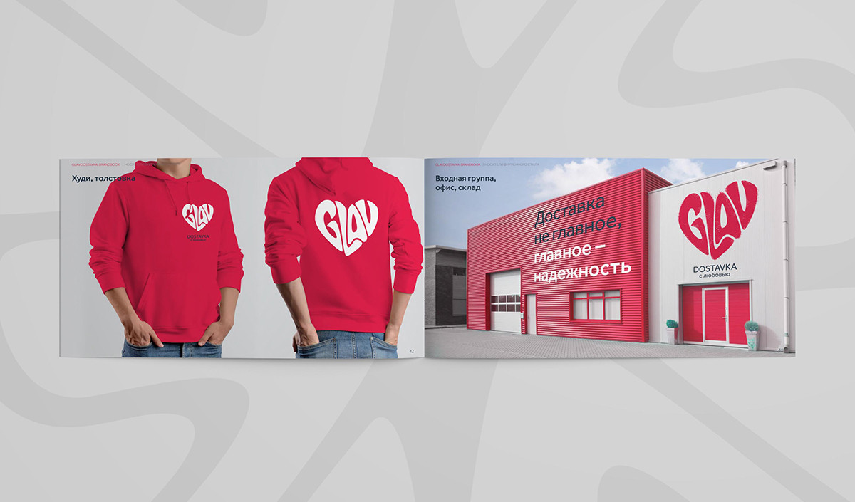
Sign and identity
The task of the sign is to demonstrate what is most important for the company. The creative team began searching for a suitable metaphor for love. We found a lot of cool options, some of them were almost approved during the project... but we still had the feeling that love did not happen to the client with any of the options.
It happens sometimes, but that's no reason to stop looking. After a series of meetings at internal art councils, we realized that it must be very simple.


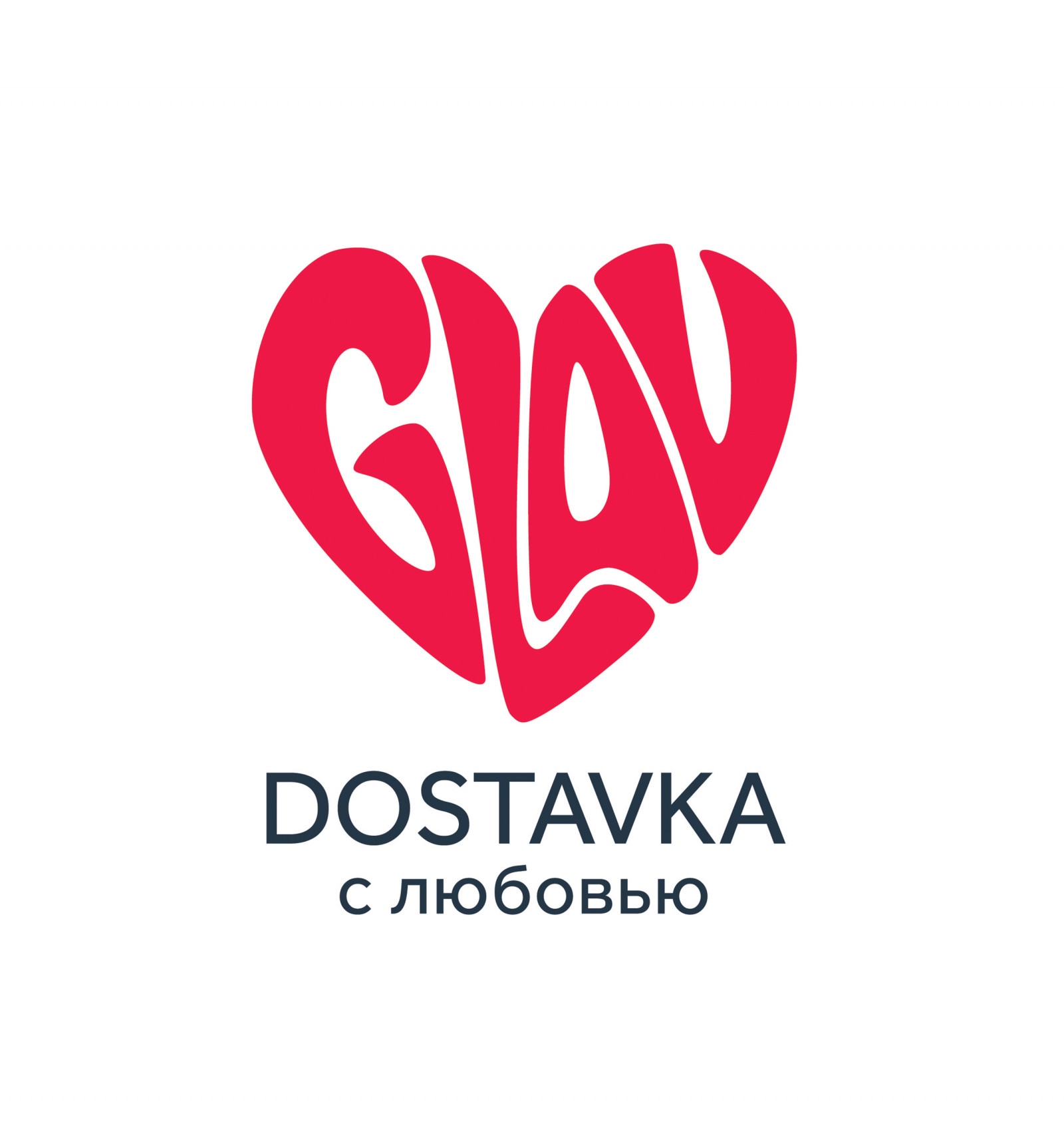
Real love doesn't need to be explained metaphorically. When there is love, you can see it with the naked eye. And with anything else it can’t be confused. That's why the sign for Glavdostavka was a heart made of the Latin letters GLAV.
Lettering is stylized like graffiti, which shows the friendly and at the same time rebellious and venturesome spirit of the company. The company nicknamed this sign Glav-heart.
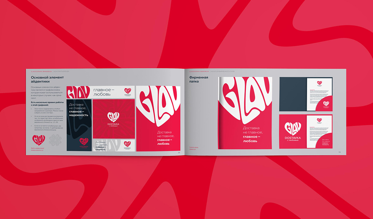
The main element of the icon is the graphics of the sign, which can be used in some cases as ornamentation.

Website design
Updating the corporate identity entailed the task of updating the company's website. As part of the project, we also developed a prototype and website design for the updated Glavdostavka brand


Conclusion
As a result of the project, Glavdostavka received a logo and brand identity that reflect the updated essence of the brand and its positioning. The Glavdostavka brand is still not about transport, logistics, and hubs, but about people, trust, and love. But it looks new.


Creative team
Ilona Koltinyuk
Art-director
Irina Shmidt
Brand Strategist
Daria Erasova,
Irina Mokrousova
Copywriter
Anton Borisov
Designers
Andrey Chigarev,
Sergey Samofalov,
Irina Shmidt
Roman Titovec
Project Manager
Anastasia Antonova
Особое спасибо
Владимиру Лишневскому за жар, град, гром. И учащенный пульс!