Choose industry from list
Rebranding of IDDIS — sanitary ware manufacturer
In 2020, market and audience reasons were added to them, including:
- increasing confidence in online shopping by people who used to buy only offline;
- increased demand from young people who have reached the age of renovation;
- a new level of normality because of the digitalization of shopping (faster search, the ability to compare, buy cool and interesting).
We decided to move step by step and during the first stage we set out to actualize the benefits of the brand, its values, character, and essence. And then to create an identity reflecting the renewed brand values.
Relationships of new experiences
We began our work on the project by studying the current context — the impact of the pandemic on consumer behavior and brand preference — as well as analyzing competitors, their values, advantages, themes for communication and approaches to promotion.
There are many players on the plumbing market, competing mainly on price rather than value. Those players who do invest in brand development use a characteristic technique: through stereotypical associations - German reliability, French chic, Scandinavian aesthetics — attach the sanitary brand to the brand of the country of its birth.
The tone of communication and visual style are designed to set brands apart from each other. But the main themes of communication on the Russian market are still focused on the product - its design, quality and innovative aspects.
However, in order to remain relevant, to be visible against the backdrop of economic and social turmoil, it is important for brands to consider changes in people's behavior and expectations, to change approaches to branding and communications.
Trust and loyalty in the new economy will be awarded to brands that can develop their emotional intelligence and get closer to the audience on a physical and mental level.
These moves determined the vector of strategic developments.
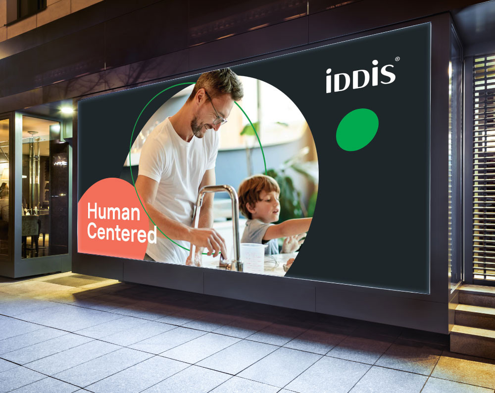
IDDIS: Personalization
The brand personality is built around the Sage archetype. A practical, action-oriented brand, where it is not so much important for it to excel in the market, but to be useful and needed by people.

IDDIS is an expert brand with a human face, someone you can rely on. A true master of his craft, who does not tolerate dilettantism in any matters. Does not promise too much and inspires confidence. Not indifferent to people, able to listen and show care and support.
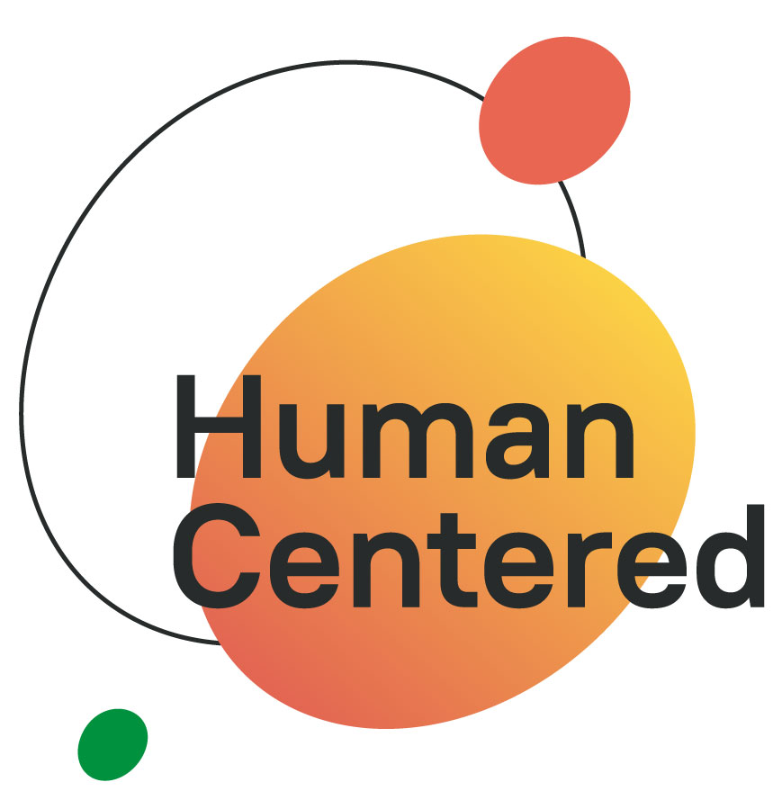
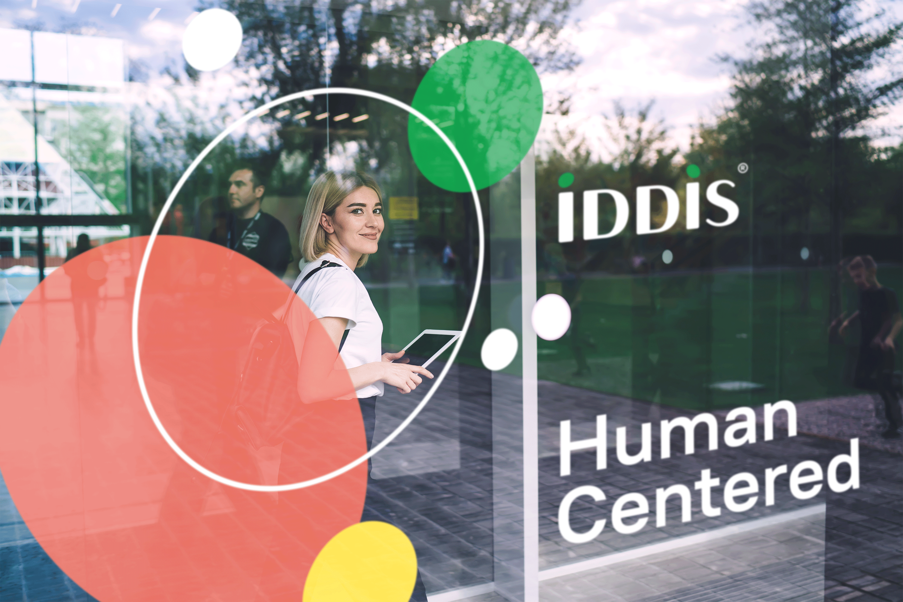
We also moved away from the product essence of the brand, talking about reliability, to a human formulation - human-center (in focus — a person).
The point — is the beginning
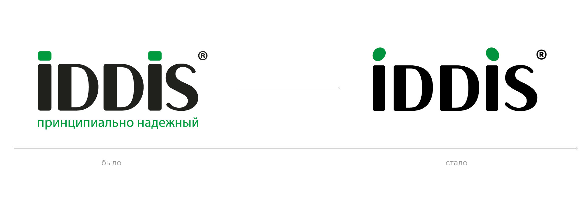
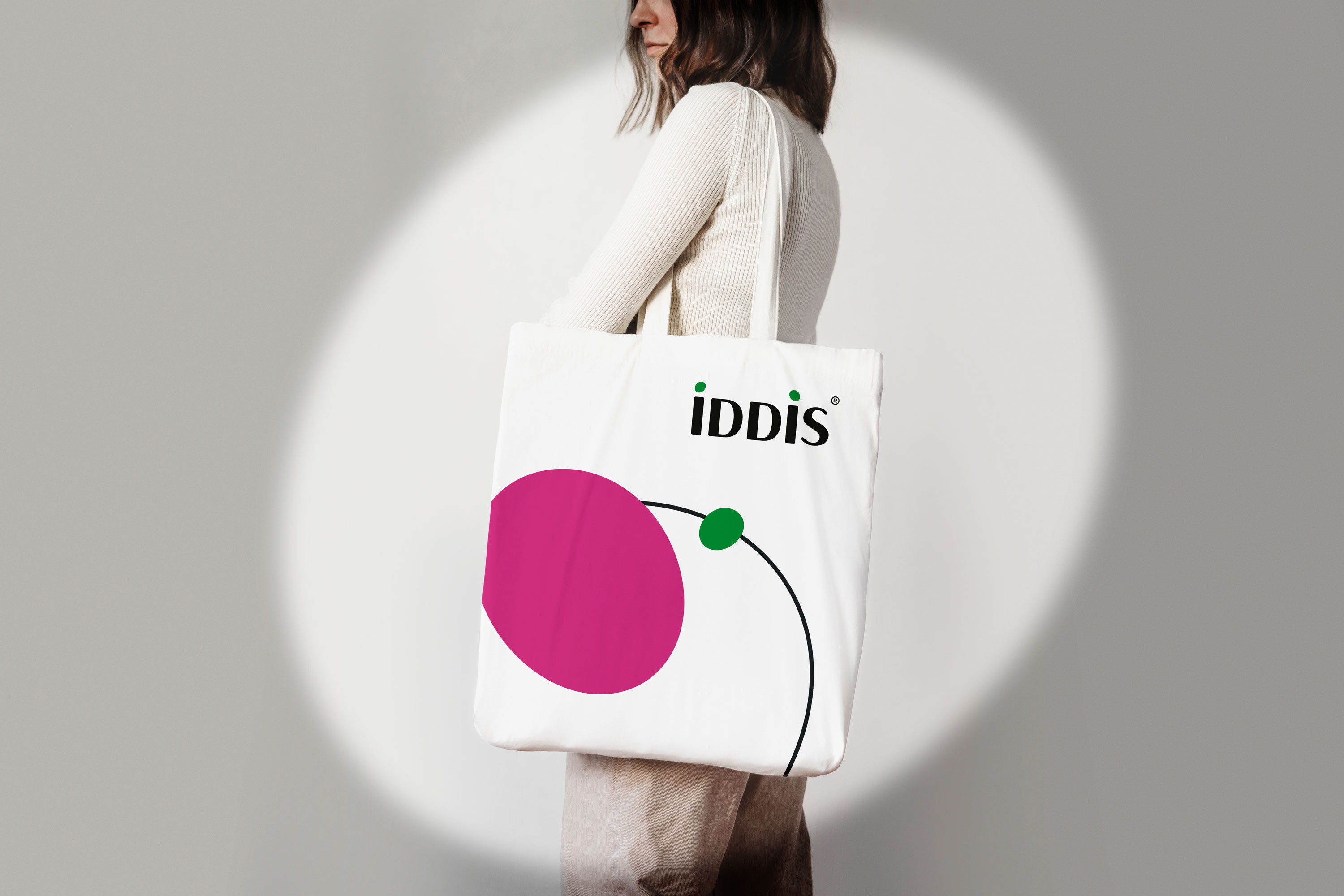
The client decided not to change the logo cardinally, so our font designer fixed the letters and corrected the position of the registration icon. The changes affected two features of the logo — the dots above the letters i. In the new version, they remind of the heads of people facing each other.
In this way, the logo carefully reflects the empathy and humanity that have become the main messages of the brand.
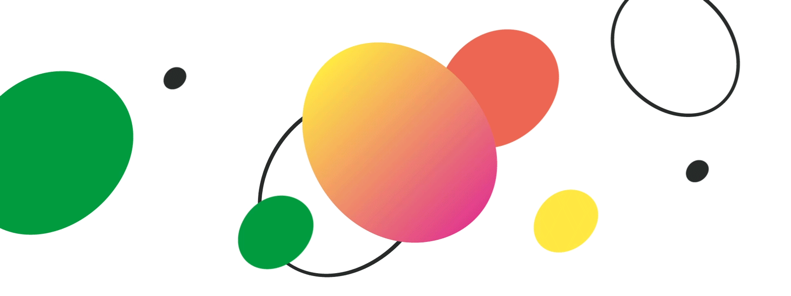
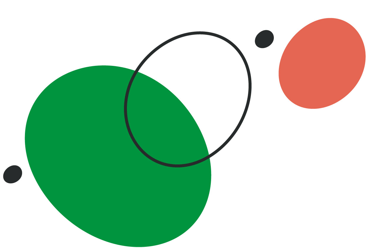
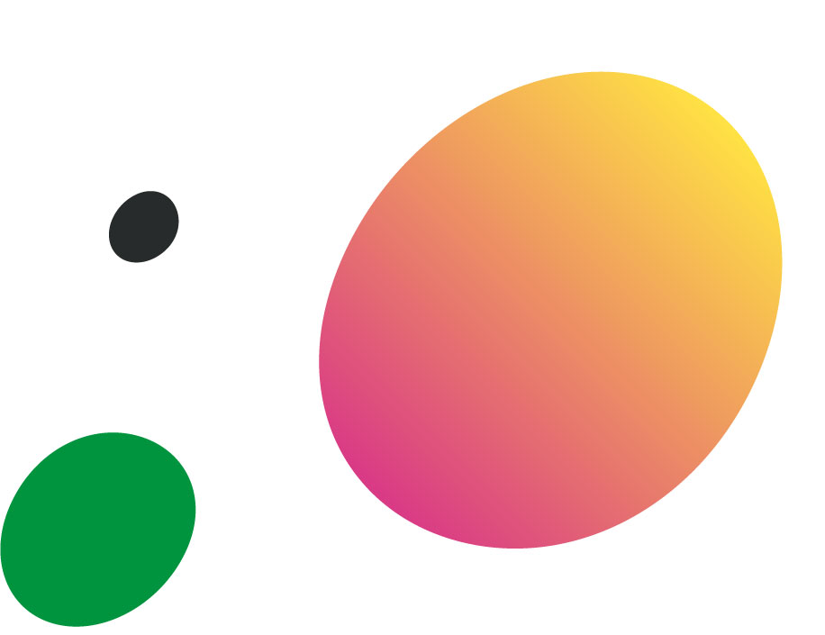
Colors and shapes of personality
DEZA designers have developed two color palettes - primary and secondary. The primary colors are intended for the design of printing, souvenirs, signboards, booklets, and other external communications.
Additional colors are useful for creating visual accents, as well as will be used in internal communications: in the design of office space, design of motivational posters, training materials.
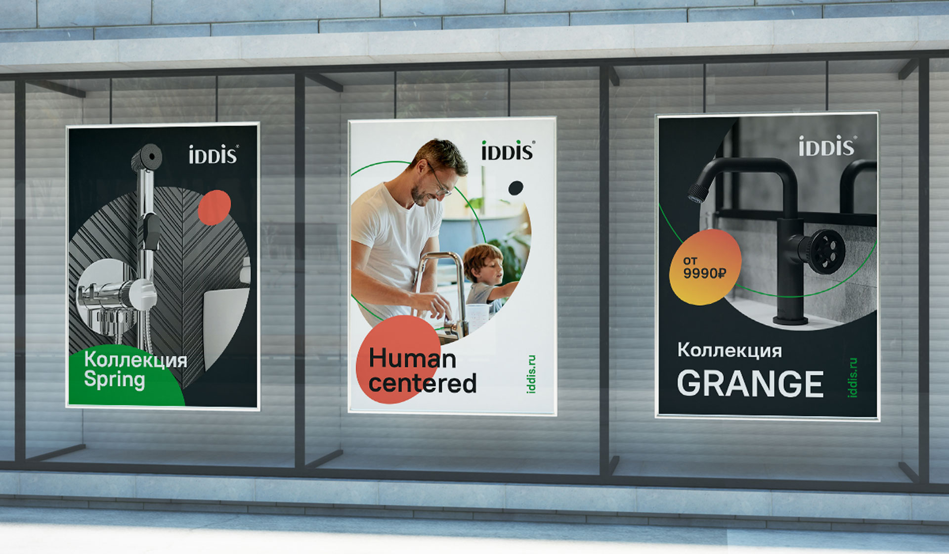
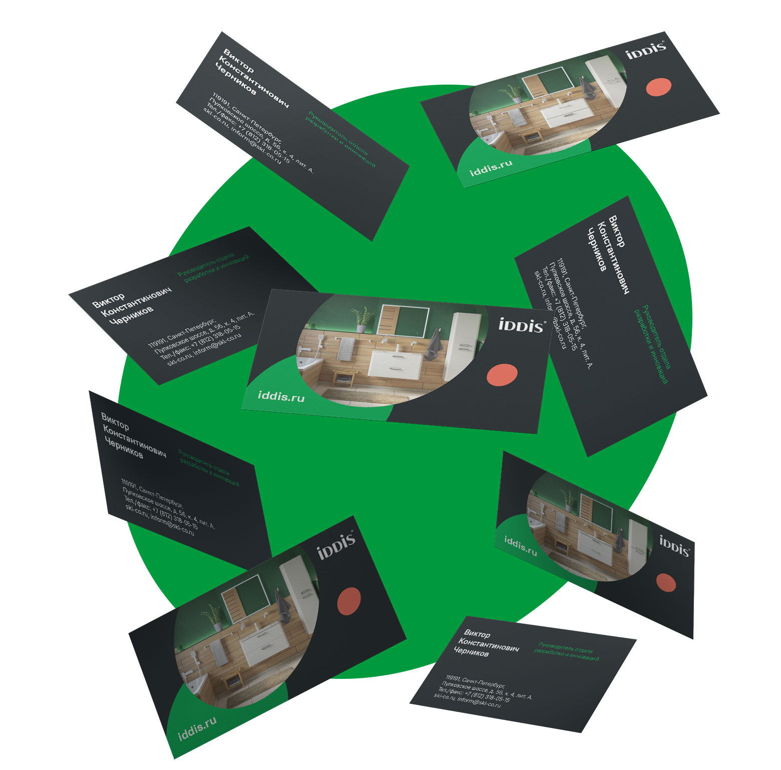
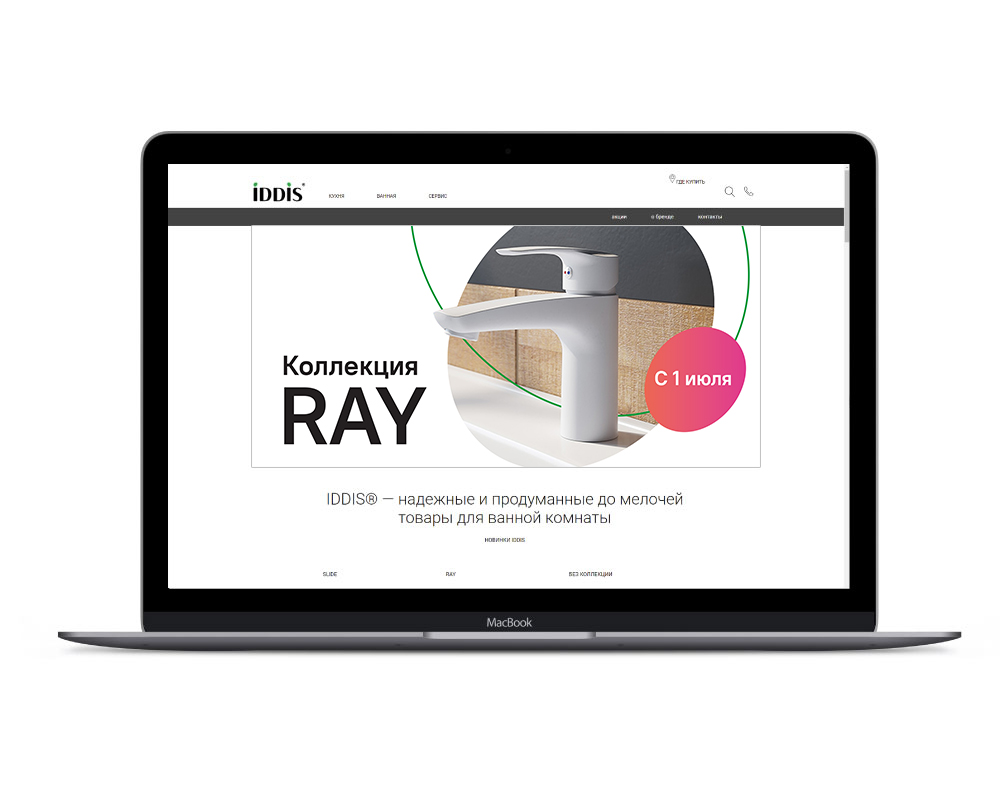
New identity
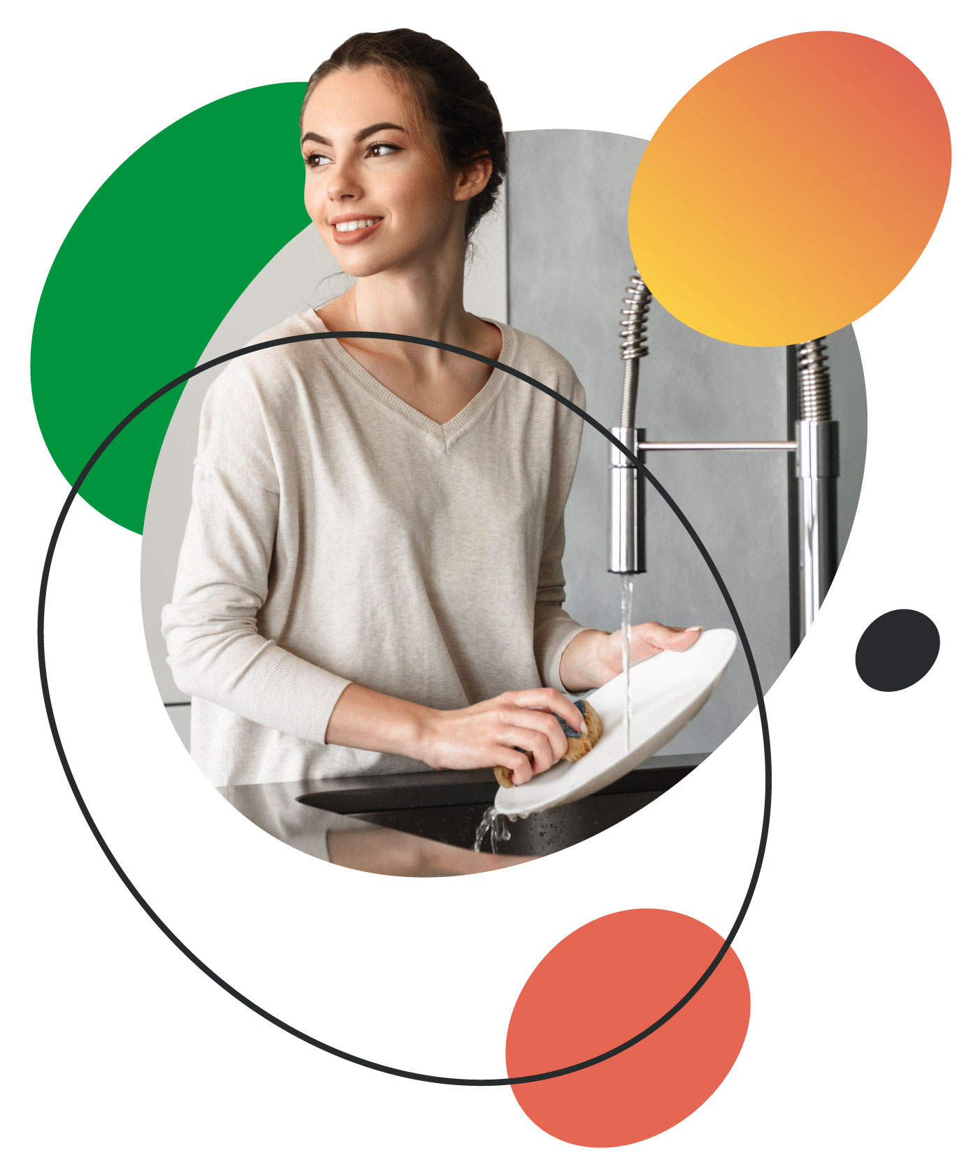
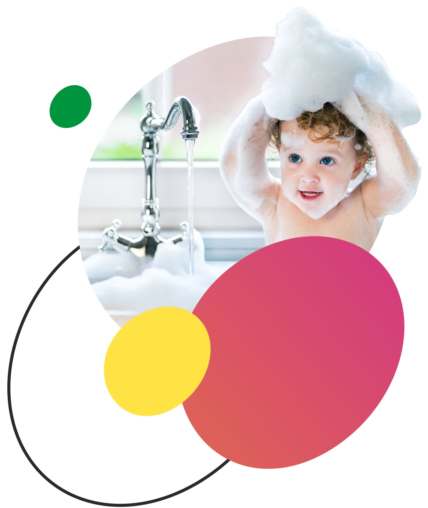
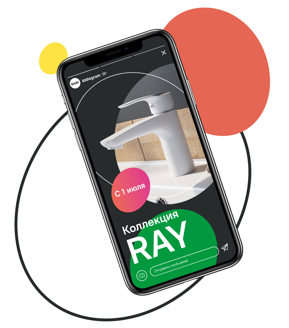
The new IDDIS identity consists of two levels. The first level is used for product layouts, and the second, which extends and complements the visual communication, is used in image layouts.
The design team completed its work on the identity with recommendations on photostyle. Thus, in image communication, it is important to focus on people and select lively photos that convey a sense of attention and care.
So, IDDIS focuses on the human being and becomes more human itself. This is reflected in the brand identity system.


Conclusion
As a result, IDDIS has the benefits for different audiences, values, character and essence, a refreshed logo and brand identity. The updated emotional component will help the brand form a strong bond with its audience.
Creative team
Art-director
Irina Shmidt,
Sergey Samofalov
Brand Strategist
Irina Mokrousova
Designers
Sergey Samofalov
Project Manager
Marta Bekker,
Anna Artemova
Another projects for this client