
Choose industry from list
Rebranding of TEK-KOM industrial holding
Client Situation
In 2022 the company entered a new round of development, which affects changes in both internal and external processes: targeted management, reorganization of the business structure, going online, development of retail areas. To translate all the changes, the company needed to break the gap in its perception: to build a unified brand of the federal level, as well as to refresh its image, make it relevant and convey to the audience the differences from other players.
Project objectives:
- formulate a brand idea that can be used to convey the meanings and principles of decision-making to employees;
- design a logo and corporate identity that will create a modern brand image and help build communication with external and internal audiences.

On the sense level
After a competitive analysis and a study of the characteristics of the company itself, we formulated the reasons for trust.
These include:
- protection against fakes and federal infrastructure;
- specialization, experience and expertise;
- objective and comprehensive coverage of its industry.
TEK-KOM uses modern approaches to doing business and solving customers' problems and plans to create
an e-commerce division.


This brand is not an aggressive leader, but rather a starter, which picks up trends and brings a fresh breath to the category. In character, it is a calm and wise partner.
He is like a senior partner — by virtue of his expertise and wisdom, he confidently does his job without conflict, keeping to himself, but being visible.
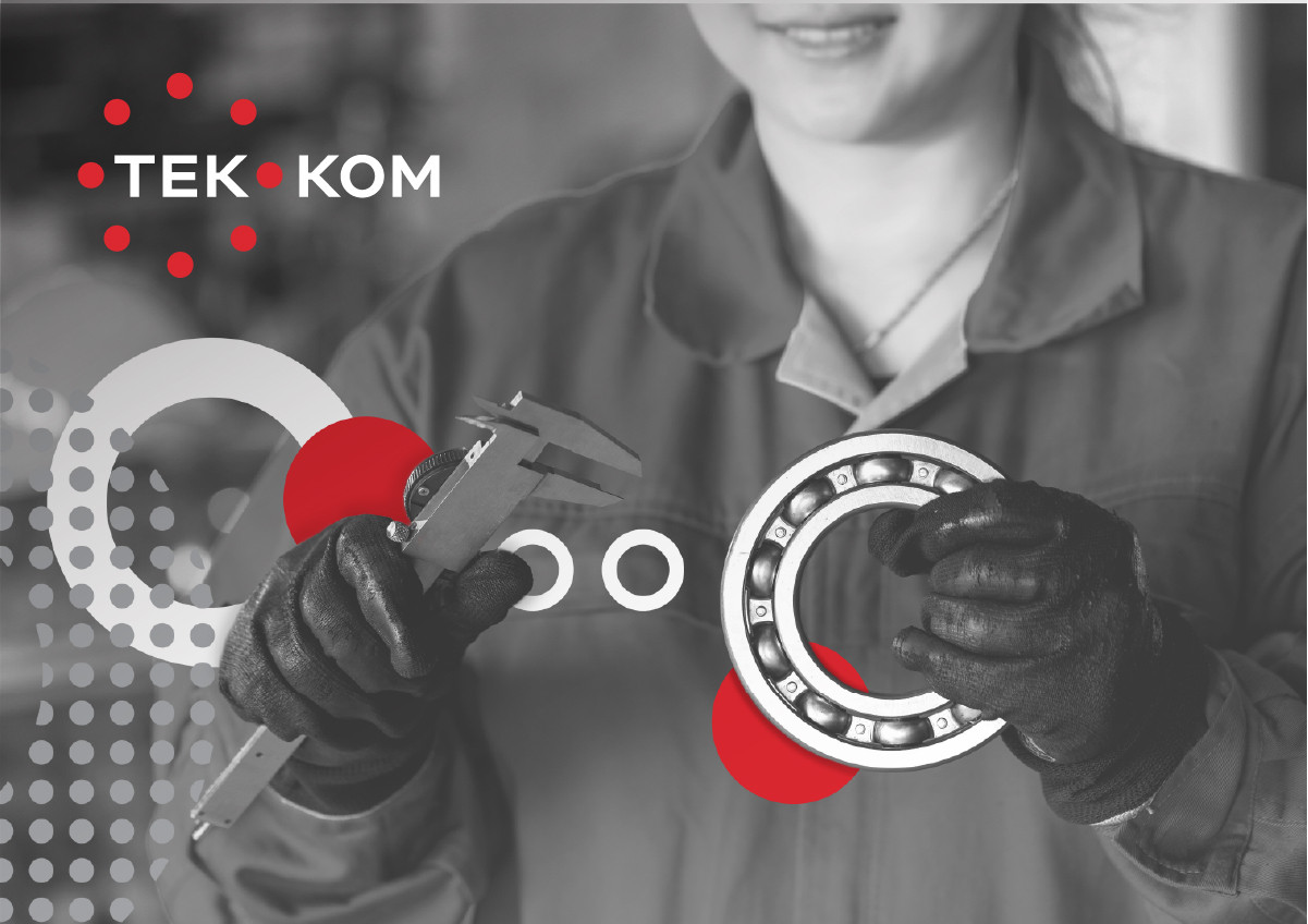
Laconic movement
At the center of the sign is the laconic image of the bearing, the flagship product category of TEK-KOM: we move away from manufacturing specifics to the expansive symbolism of movement and constant circulation.
We organically integrated the sign into the logo — so that one of the balloon elements takes the place of a hyphen, while the size and color do not allow it to be mistaken for one of the letters of the word. The moderately light, yet austere solution to the logo makes it modern, relevant to the audience. The logo and mark have been given a clean, dynamic feel while keeping an appropriate weighting.


The circle becomes the starting point of the identity. Corporate graphics is built on the connection, interaction and compositional rhythm of different circles.
Such graphic compositions look alive and speak of constant movement and development. At the same time, there is a sense of clarity and structure — due to the regular and orderly compositional rhythm.


The new identity is two-part.
The first level of identity is used on corporate media, reflecting the seriousness and professionalism of the company.
The second level should produce a more emotional impression — these are image media, internal communications, advertising materials.


The main corporate color is red, the color of energy, bright ideas, and leadership.The second, gray, is the industry and production classic, steel.
And the contrasting black brings color accents, enhances the dynamics of the style.

The result of the project is an updated sign and logo of the company, a system of differentiation of directions, as well as a new identity that speaks of movement, development and dynamism.
All these attributes create the right image of the brand, ready for the challenges of the new times — whether it is the entry into e-commerce or a complete restructuring of the business.


Creative team
Art-director
Irina Shmidt
Brand Strategist
Irina Mokrousova
Designers
Viktoria Pohilko
Project Manager
Marina Andreeva