
Choose industry from list
Rebranding the manufacturer of baby stuff
Project tasks
The market for children's goods in Russia and around the world is developing rapidly. The portrait of the consumer and his behavior are changing. This requires children's brands to take new approaches to communication with the audience. The company Lubby turned to us to update itself.
As part of the Refresh project, we solved the following tasks:
- Shape the brand platform and its positioning.
- Update the essence of the brand and the tone of its communication.
- Update visual attributes: logo, corporate identity, product packaging.

Audience
Lubby's audience is young mothers who live in the here and now. They do not sacrifice themselves for their baby, but continue to live the life that both their baby and themselves like. It's important to them that baby products are not only comfortable and safe, but also fashionable. They don't see motherhood as a boring daily routine, but as a cool new experience.
Therefore, the Lubby brand should not only reflect the benefits of the product, but also engage moms in a dialogue, demonstrating that it speaks the same language as them, understands their desires and creates a special, recognizable mood.


Brand positioning
After a competitive analysis and study of the features of the company itself, its values and philosophy, we formulated the accents of positioning.
- Personal responsibilityLubby knows how important it is for moms to be confident in choosing products for their baby. That's why the brand feels personally responsible for the quality and safety of each product. That's why all Lubby products undergo the strictest checks and certifications, and any low-quality goods are replaced by new ones at the customer's request.
- Understanding.Lubby understands that it is important for mothers to feel confident in their baby's first years of life. That's why the products are designed so that moms have more time and opportunities to take care of their baby and themselves.
- Harmony and care. Lubby strives to turn the duties of young mothers into little daily joys which create a bright mood for both mother and baby. Lubby fills life with a sense of comfort and well-being.
- Positive Impressions. Lubby is a brand that attracts and radiates positive emotions, dispels fears and doubts, relaxes and energizes, allows you to share experiences, inspire and be inspired by wonderful moments.
Lubby tells its audience: "We created a brand in which we combined the wonderful experience of modern moms — touching and cheerful, caring and attractive, active and gentle — for our beloved babies. And also to be inspired by the energy, strength and charm of each other. And to enjoy every detail of life, even the tiniest, but so wonderful.


The essence of the brand was born by itself: "To be a mom is Lubby"
Being a mom means expressing your individuality and implementing bold creative ideas, enjoying yourself and your life, setting an example for others. Here Lubby becomes a concept like friendly or trendy, the definition of the lifestyle of a modern active mom. Being such a mom is cool, easy and interesting. To be such a mom — that's what Lubby is.
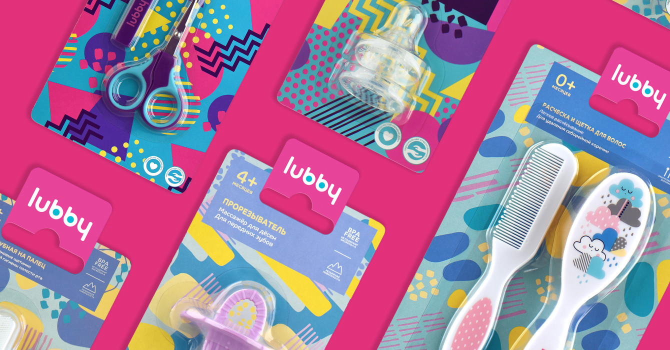
Updated visual brand attributes
Based on the essence of the brand, we created elements that become the basis of the Lubby brand identity and key attributes.
The design concept is revealed through bright patterns that symbolize different moods, many possibilities for young mothers to express themselves. We have developed a whole system, a constructor, each time giving a new unique pattern. It is a metaphor for the emotional uniqueness of motherhood, its brightness and the possibility to approach it creatively.
Lubby products are divided by age categories using colors and graphic elements: for the babies the patterns are smoother and quieter, for the older kids - brighter, more active, bolder. This approach makes it possible to create any "art composition", conveying the essence of the brand.


The new multi-faceted brand identity complements the world of beauty, joy and individuality around the baby and mother.
And the packaging of Lubby products now becomes a kind of fashion accessory, part of the "Lubby mom" lifestyle and confirmation of the key idea: motherhood is Lubby.


Conclusion
Through updated positioning and visual attributes, we conveyed the company's desire to create safe and comfortable, bright and attractive children's products, and also to be a true friend and helper.
The combination of communication means makes it possible not only to convey the rational advantages of the products, but also to create an emotional connection between the audience and Lubby. The project resulted in a charming, attentive, friendly and energetic brand that thinks and cares about mothers and babies.

Creative team
Ilona Koltinyuk,
Irina Shmidt
Art-director
Evgenia Dzhurinskaya
Brand Strategist
Daria Erasova
Designers
Elena Ivanova
Project Manager
Marta Bekker