
Choose industry from list
Refresh DEZA
Why we did it?
We weren't just based on feelings and desires that it was time to change something. The decision on the need for refreshing was influenced by a lot of internal and external factors.
There were changes in the structure of our work. Renewal and creation of many processes from scratch led to a rethinking of the DEZA brand. Therefore, everyone needed an updated, clear and understandable system of visual and verbal coordinates for transmission to the external environment.
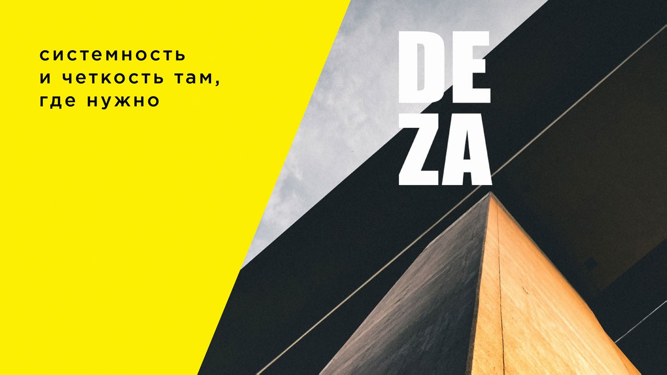
Proceeding from the existing prerequisites, we defined the main qualities of the new positioning of the studio: honesty, openness, consistency, service.
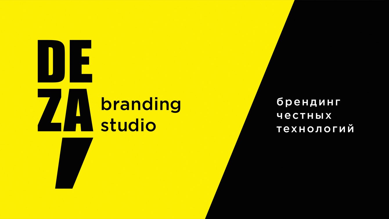
Our new positioning sounds like this: honest technology branding.
Today, the high quality of the result as such has become a market qualifier, a musthave. Attention and expectations shift to the quality of the process. We know how important open relations, clear understanding and substantiation of the project stages, their cost and results are for our clients. Of course, without fanaticism and immersion in all the details of branding kitchen.
Tone of voice or how we communicate with the world
DEZA — is a team, not just a company.
We do not have a dialogue with the company, but with people. Humanly, boldly, directly and temperamentally.
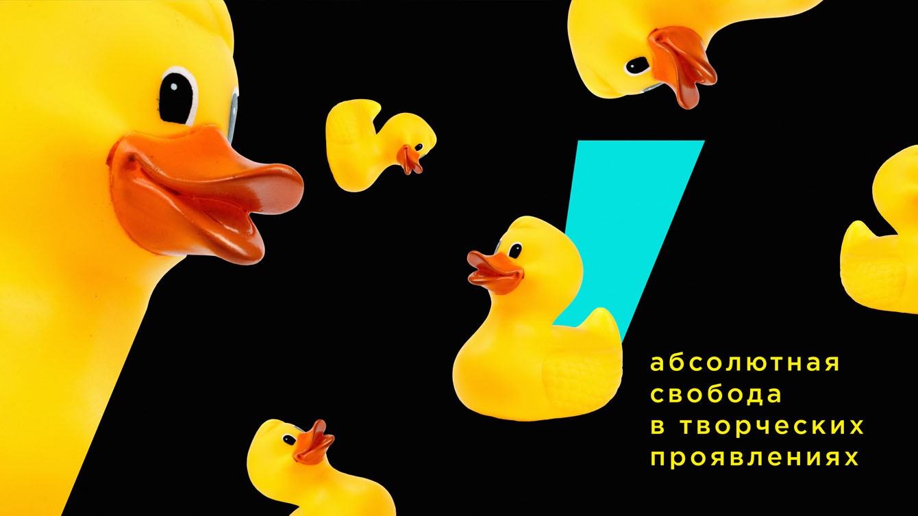
It is easy and interesting for us to work together and enjoy the process, exchanging experiences and filling in new knowledge in an atmosphere of openness and friendliness. We are free in creative manifestations, and very clear and systematic where necessary.
We sincerely talk about what we believe in. And we believe in what we are talking about.
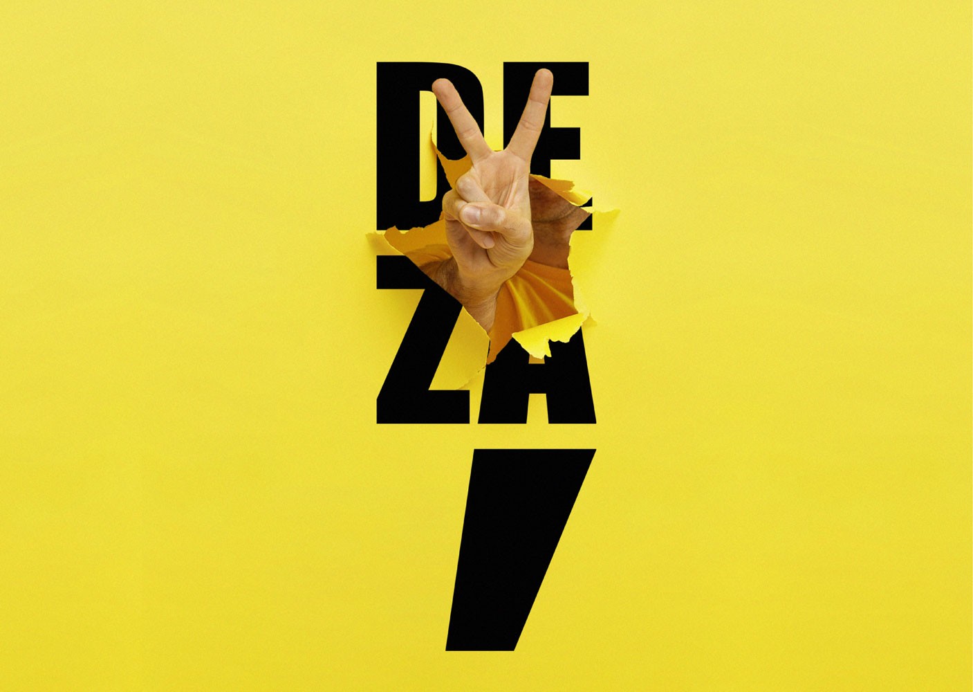
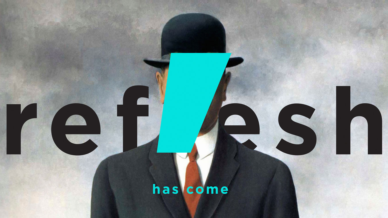
Obviously, our previous logo not only visually, but also in terms of meaning did not convey the character of the updated DEZA.
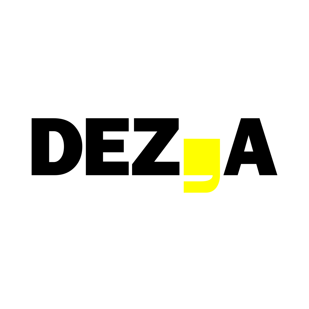
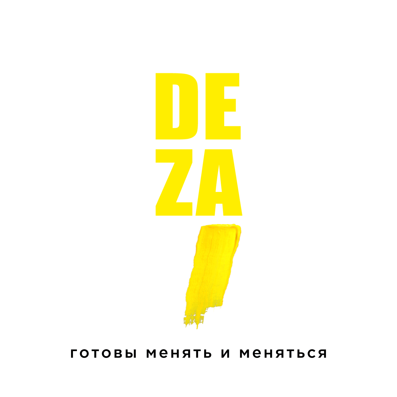
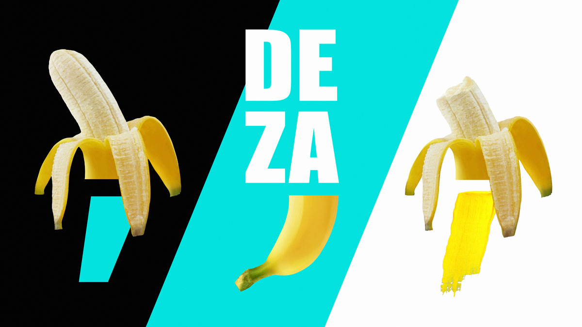
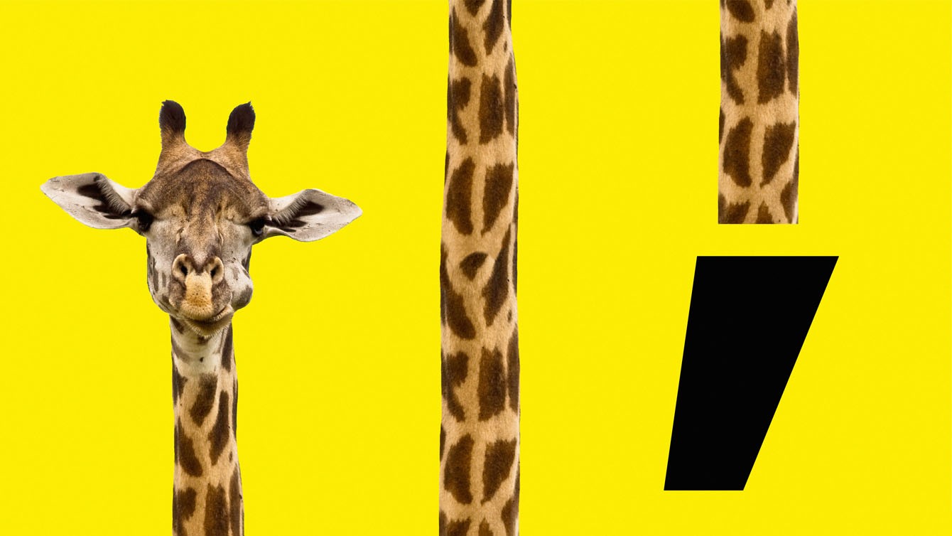
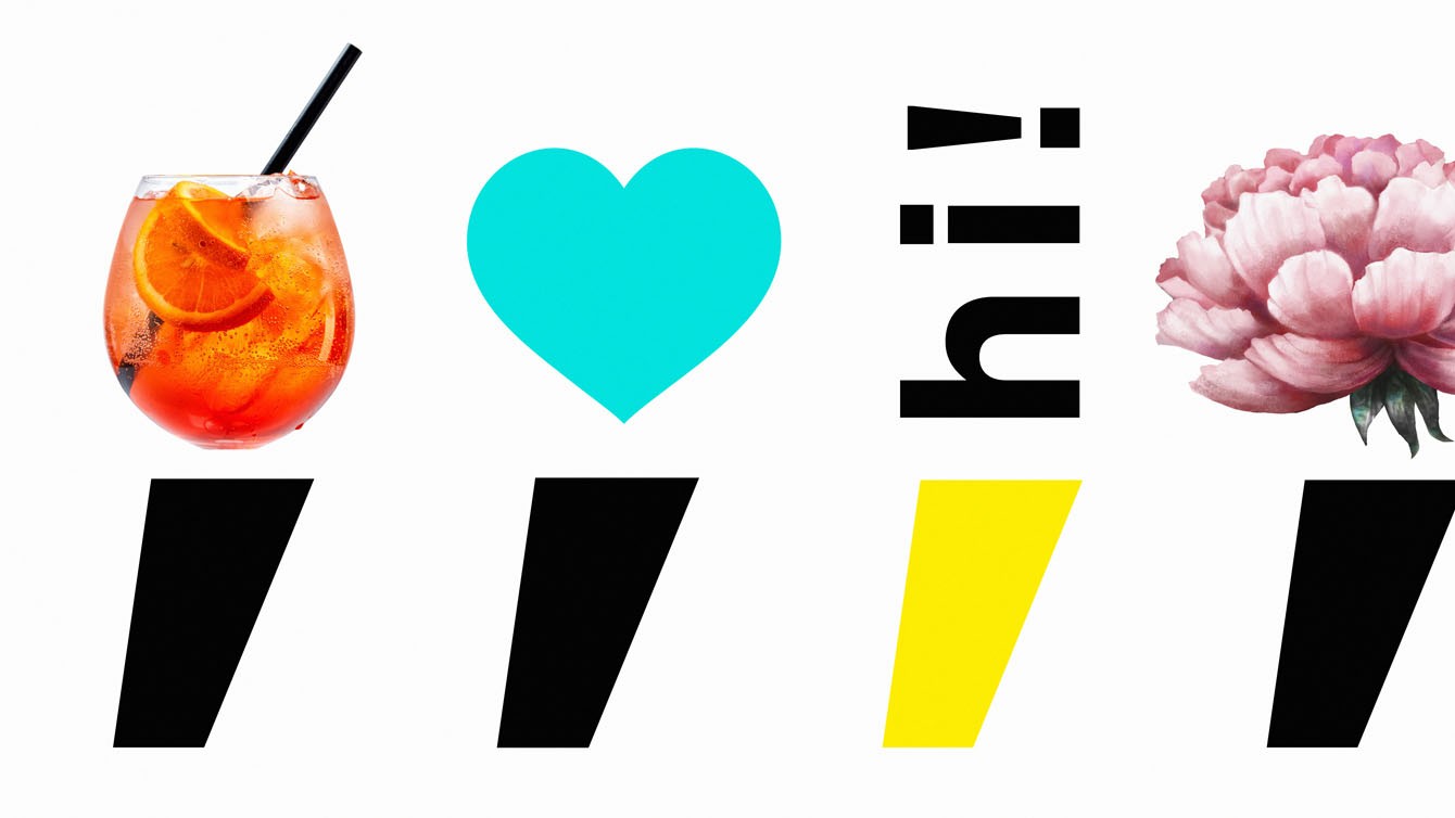
In the process of searching for solutions, the most attractive was the vertical version of the logo, where the whole emphasis is shifted to the comma. The comma is an essential attribute of "Dezza", we did not want to give it up. In the new logo, "Dezza" becomes the comma. We have become more open, energetic and direct about who we are, what we do and what we do is great.
The idea of a two-part logo was based on the fact that the comma consists of two parts: the head and the tail. The head is just a point, a point of departure; the tail is a further movement. Considering the meaning of the comma and the fact that it is divided into two parts, we decided to make our new "acquaintance" the same. Both parts of the new "Desa" sign are dynamic and in constant motion. Each part can change depending on the message or our desire (both parts are always together), carry or not carry meaning - this is what the creative freedom of our team is reflected in.
It seems to me that the new logo and style really represents the real us: new, fervent, audacious, eager to develop, absolutely united guys.
Olga Samofalova,
designer and author of the new Deza style
Turquoise is the new
We have added a new color to the identity — turquoise. On the one hand, it gives freshness and lightness, diluting the usual black and yellow colors. On the other hand, it symbolizes the movement of the studio towards the status of a "turquoise" company. There is also a third reason: this is the favorite color of our art director.
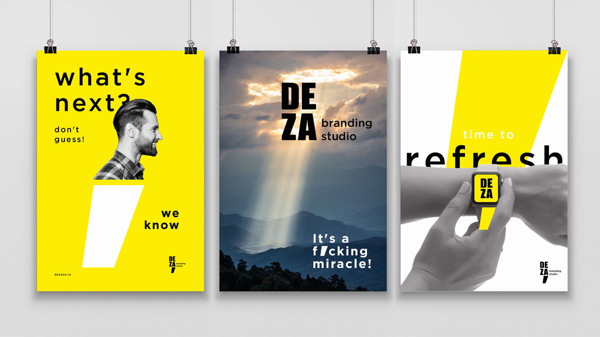
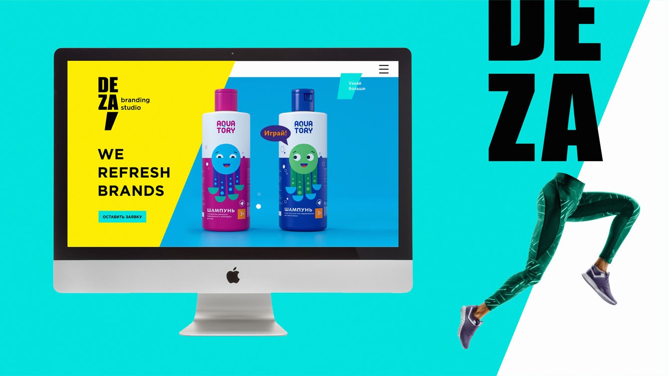
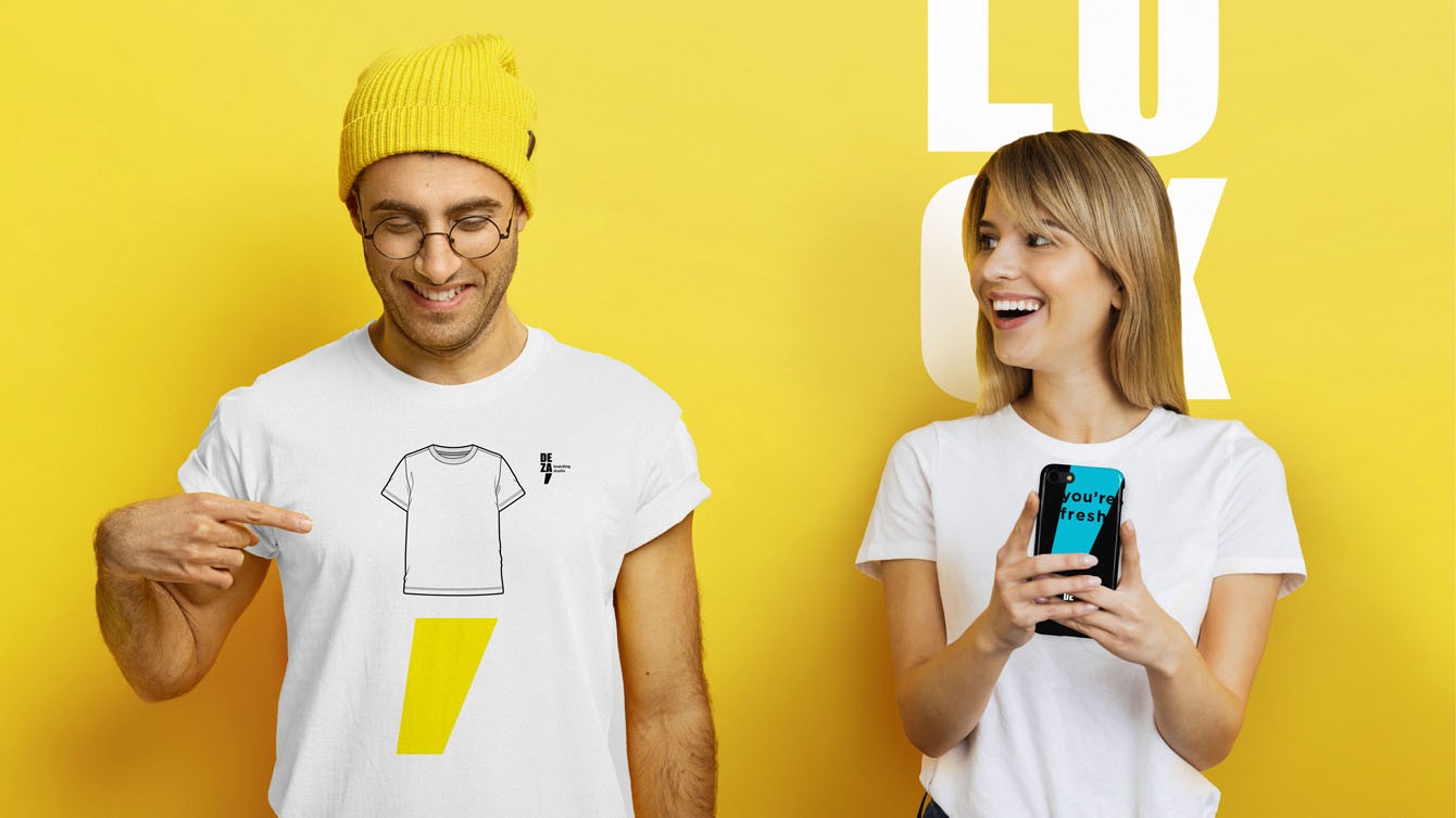
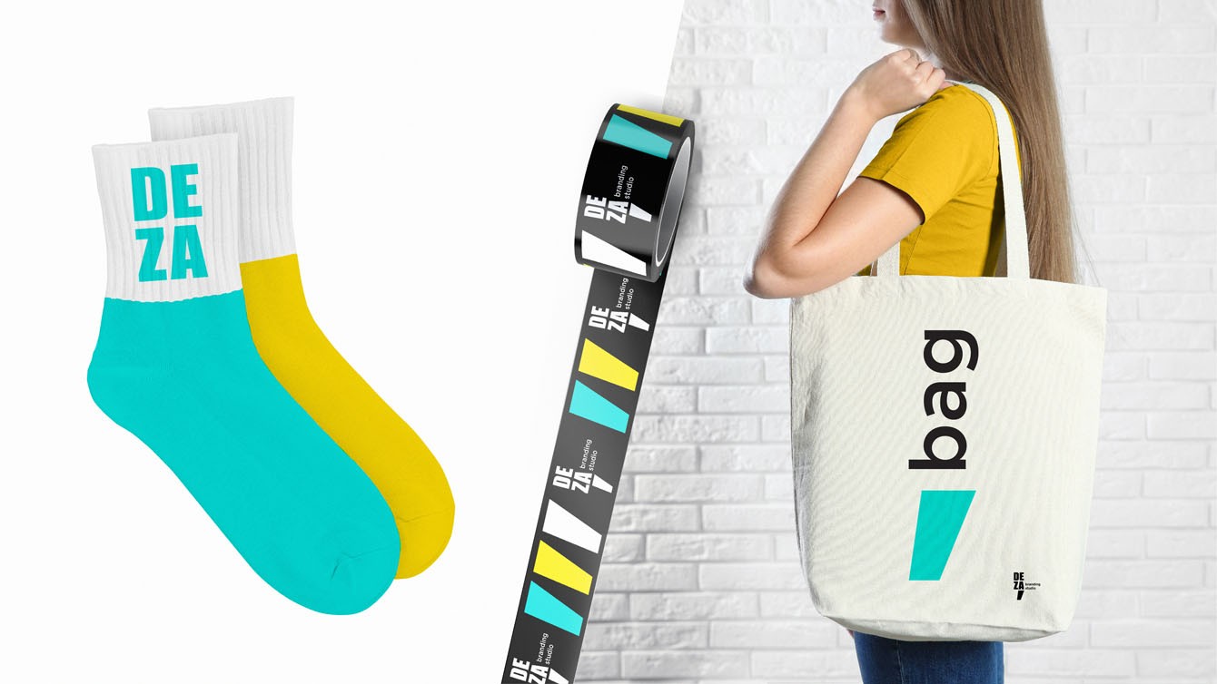
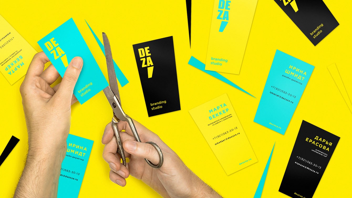
The updated studio identity has been moved to business cards, presentations and corporate merchandise, which our team members are happy to use in everyday life, conveying the essence and values of the renewed DEZA brand.
Renewed, and good. It's been a while. We stayed at the yellow house. Let's hope it brings about other changes, too.
Irina Shmidt, Design Director
Creative team
Ilona Koltinyuk
Art-director
Irina Shmidt
Brand Strategist
Daria Erasova
Maria Mergabyan
Copywriter
Anton Borisov
Designers
Andrey Chigarev,
Sergey Samofalov,
Olga Samofalova
Roman Titovec