
Choose industry from list
Refresh packaging of dairy products
At the strategic session, we worked with the client to define the project tasks:
- actualize brand positioning;
- create a zoomable brand architecture (to launch new brands);
- update the packaging design of the two product lines.
As customers have loved and known the brand products for more than 10 years, saving visual recognition was a priority.
Audience
The target audience of the brand is mothers of small children, pregnant and lactating women, women 20-35+. They care about healthy and varied nutrition not only for babies, but also for the whole family. They care about emotional support, so they are more likely to choose a brand that shares their ambitions and values.

Positioning
Based on the analysis of the market, trends, and competitors, we have concluded that naturalness, utility, and safety are what must be in the dairy market. It was difficult for the CPS brand to adjust itself to the federal brands, as its positioning was based on market qualifiers:
Therefore, we have carefully analyzed all product features, company values and formulated positioning accents:


Logotype
We found that the most recognizable accents in the logo are the three colour spots, so we decided to keep them, but to give them a different character. We got rid of the too narrative image by placing letters inside the squares.
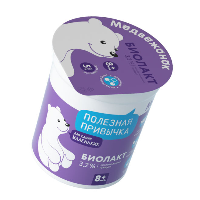
But most importantly: we brought the brand to life and gave it a character by giving it a voice. The brand spoke to the audience through a key message in the bubble - "Useful habit". This element became a united, reflecting the essence of the brand.

"Medvojonok" (little bear) and "Milochka" (pretty cow)
The next stage of the project was the development of a clear system of differentiation of products within each brand, considering the updated positioning of the parent brand. The product line "Medvojonok" is designed for the babies, and "Milochka" — for children from 3 years and more.

The main identifications of the lines are brand characters. We have updated their appearance: made them more lively, voluminous, textured, removed too much static and added emotionality. The work on updating the brand characters was practically jewelry, as saving recognizability was the client's maximum priority.


Главные идентификаторы линеек — бренд-персонажи
Lines are also differentiated by color coding and bubbles with messages that are broadcast by characters from packages. Behind the "Medvojonok" is a basic blue color, and the character tells about the daily benefits of products for the youngest ones. The main color of "Milochka" is red. The character tells about good habits, promising beauty, and health for the whole family.

As a result, using brand characters, color and "talking elements", we have combined the two lines both visually and meaning. This allowed the packaging to work as a one-spot on the shelves and to stand out from the competition.

Conclusion
Through updated positioning and additional visual attributes, we have been able to express the company's ambition to convey to consumers the maximum quality and benefits that dairy products can provide. And the combination of visual and text communication creates a strong emotional connection between the audience and the brand. The result is a lively, bright, friendly, and energetic brand that takes care of the health of all generations every day.

Creative team
Ilona Koltinyuk
Art-director
Irina Shmidt
Brand Strategist
Irina Mokrousova
Designers
Ekaterina Starodumova,
Olga Samofalova
Roman Titovec
Project Manager
Albina Shornikova
Another projects for this client
