
Choose industry from list
Refreshing the corporate identity
Prerequisites and tasks of the project
At the strategy session with the client, we found out what were the prerequisites for refresh. First, the corporate identity has been developed for a long time, and the company is already closely associated with it. Secondly, Neftetransservice is actively developing internal and external communications, but there is no relevant identity that would support them. And finally, it was difficult for the company to separate itself from its competitors and not to blend in with the mass of gray-and-red colleagues in the industry.c
Project tasks:
- сreate a new identity while keeping or updating the main sign and logo of the company;
- make the visual identity of the brand fresher and more modern.
- сreate a guideline for corporate identity.

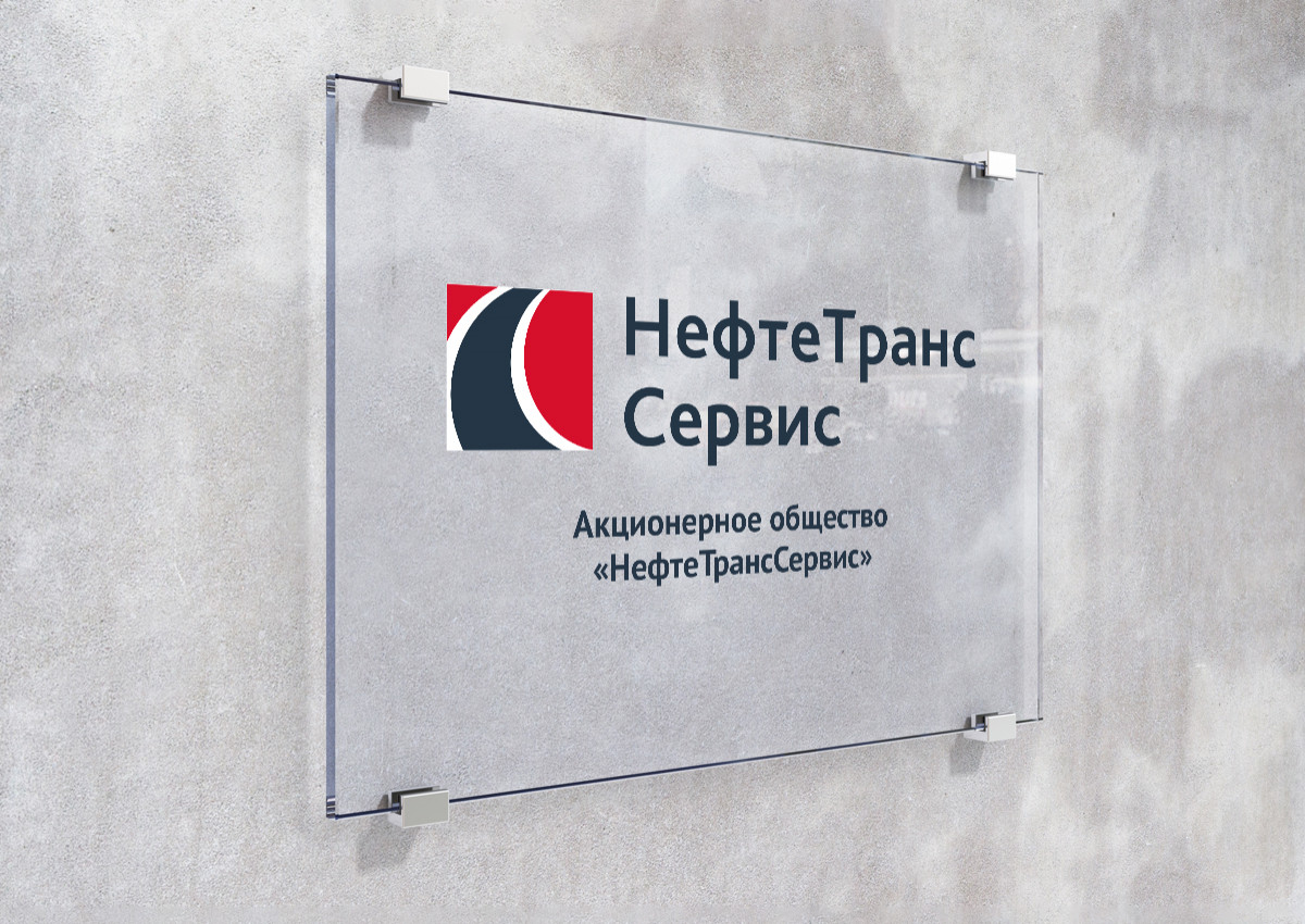
Having analyzed Neftetransservice's corporate block, we found a few problems. For example, it is composed in such a way that it creates a feeling of tightness and lack of dynamics. And the logo needs correction of the space between letters and lines. Our designers offered four concepts for the logo update, the client chose the most conservative one.
In the sign we refined and strengthened the corporate colors, made them more intense and modern, reflecting the values of the company: the dynamics and development, leadership and professionalism, stability, and drive for the new. The sign became more stable, and the whole brand block became more balanced.
We also introduced additional colors that can be used as accents and rubrics. They help visually reinforce company materials, help their perception, structure, and classify information.
Neftetransservice's identity is based on the zoom of the sign. For presentation, advertising, and image materials, curved shapes can be used, such as the road image embedded in the sign. And clearer modular solutions are designed for more formal information. At the end of the project, we designed various branded media, assembled a guideline, and put the updated style in the hands of the client.


The result is a careful redesign of Neftetransservice: with jewel-like changes the brand image has become fresher and more modern, it is more in line with the strategic ambitions of the client. The updated brand identity is already being used on the company's website.


Creative team
Art-director
Irina Shmidt
Copywriter
Anton Borisov
Designers
Sergey Samofalov,
Olga Lyashenko,
Oleg Matcuev,
Valeriy Golubcov
Project Manager
Natalia Keil,
Alya Kryachko