Choose industry from list

Refreshing the Milardo sanitary brand
Smart choice
for practical people
The basis of the Milardo assortment is the faucets trade group. Due to the new items the range will expand from the economy to the middle price segment: cheaper models and more expensive ones will appear.
The basis of the Milardo assortment is the trade group of faucets with lines for the bathroom, washbasin and kitchen. Due to the new items the range will expand from the economy price segment to the middle: there will be cheaper models, as well as more expensive ones.
A brand can have product lines in different price segments, but in terms of image it should be focused.


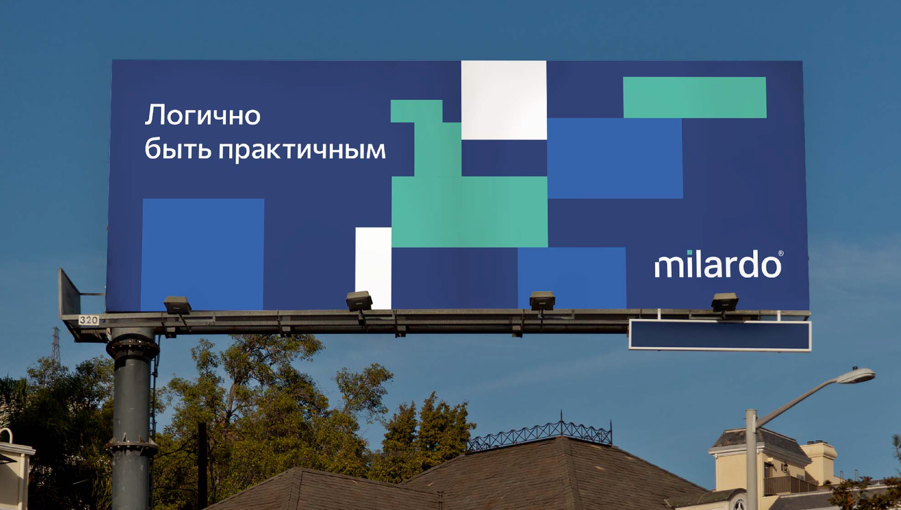
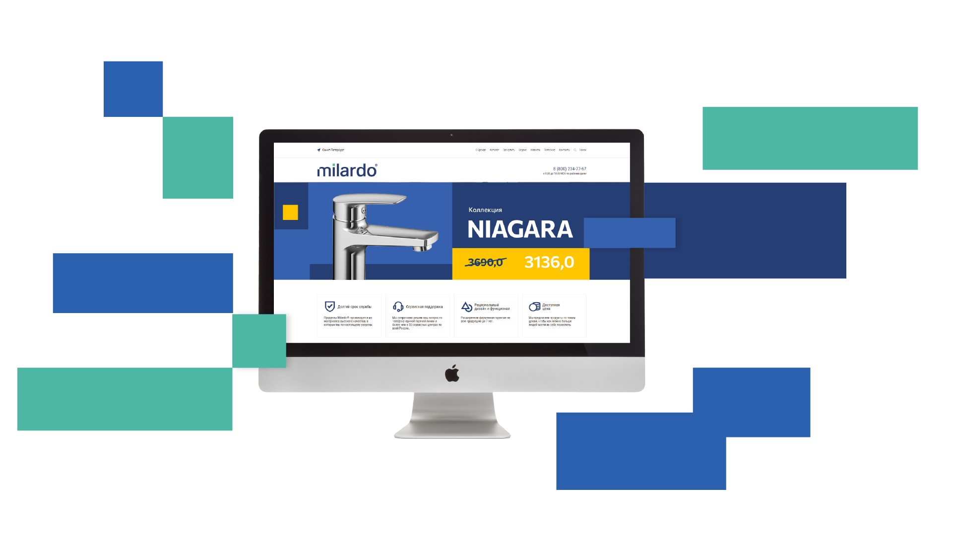
New identity: blocks, logic, structure
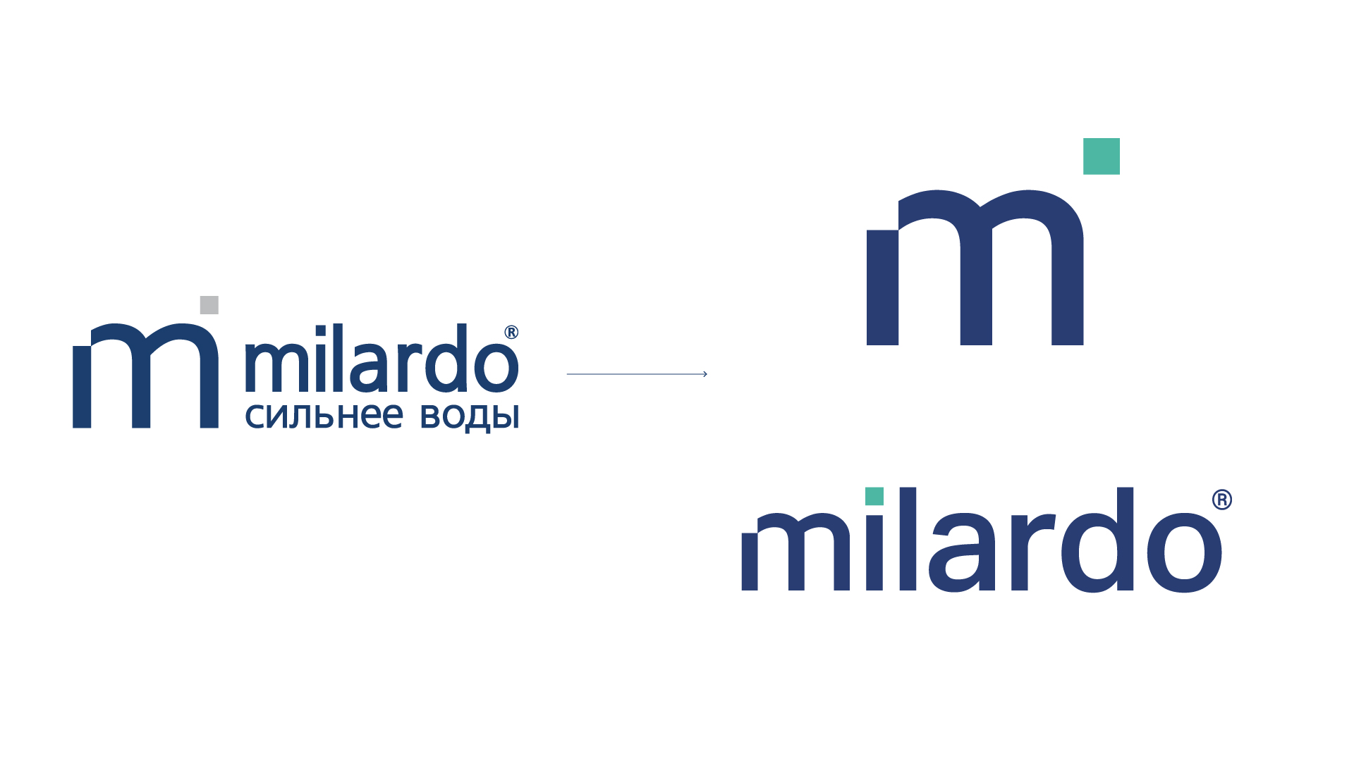
While working on the sign and logo, we strived for laconism and harmony. First of all, we removed the slogan that weighed it down. We also abandoned the idea of using the sign and the logo in one block to avoid visual tautology.
The sign, as an independent element, can now be used for branding products or small media.
When we worked on the design, we solved a difficult problem: the brand had to look modern and serious without creating high expectations for the traditional retail audience.
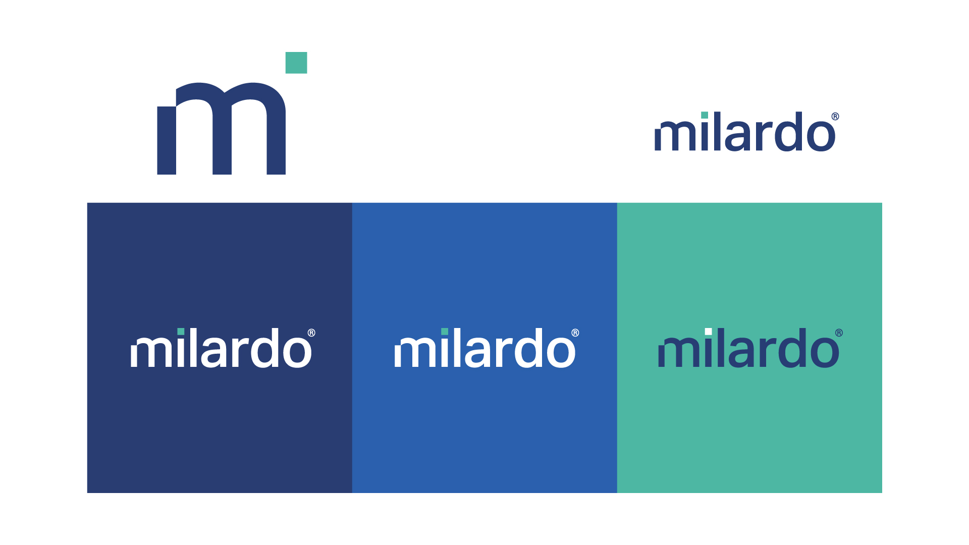
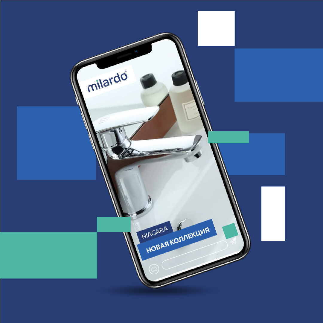
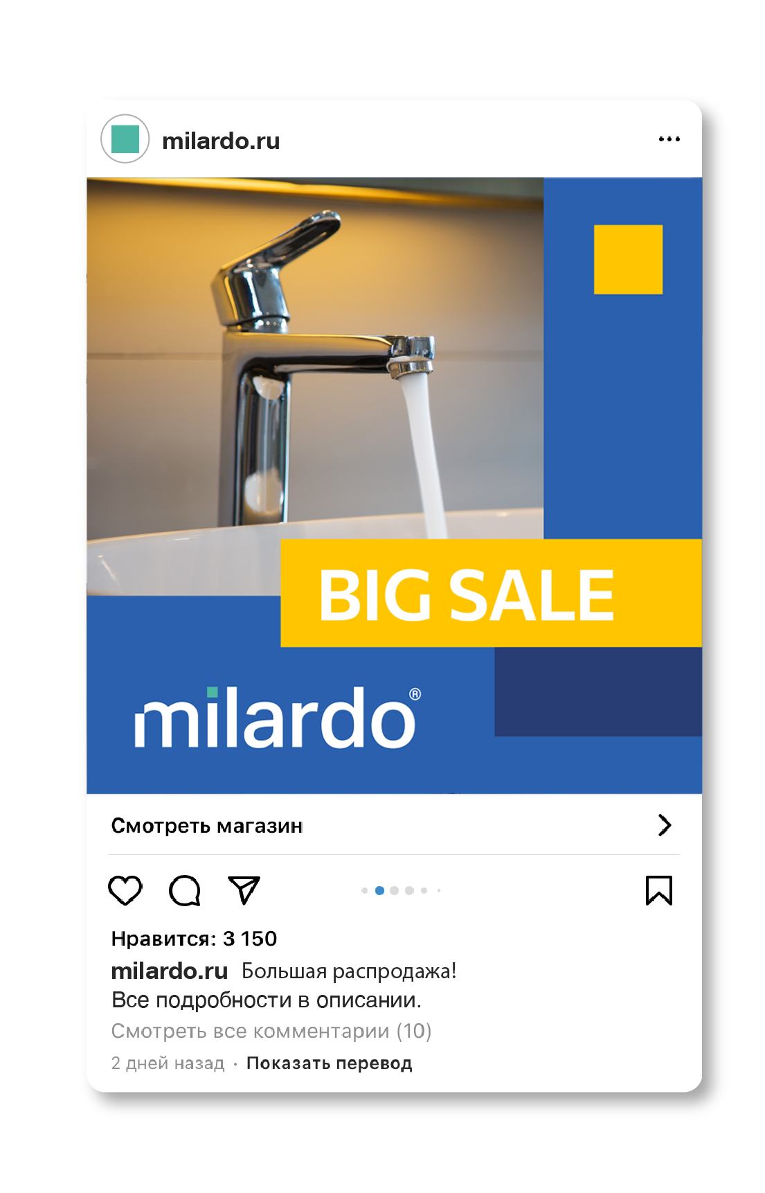
Two new shades of blue and additional colors were added to the basic color scheme to help accentuate promotional materials and diversify content.
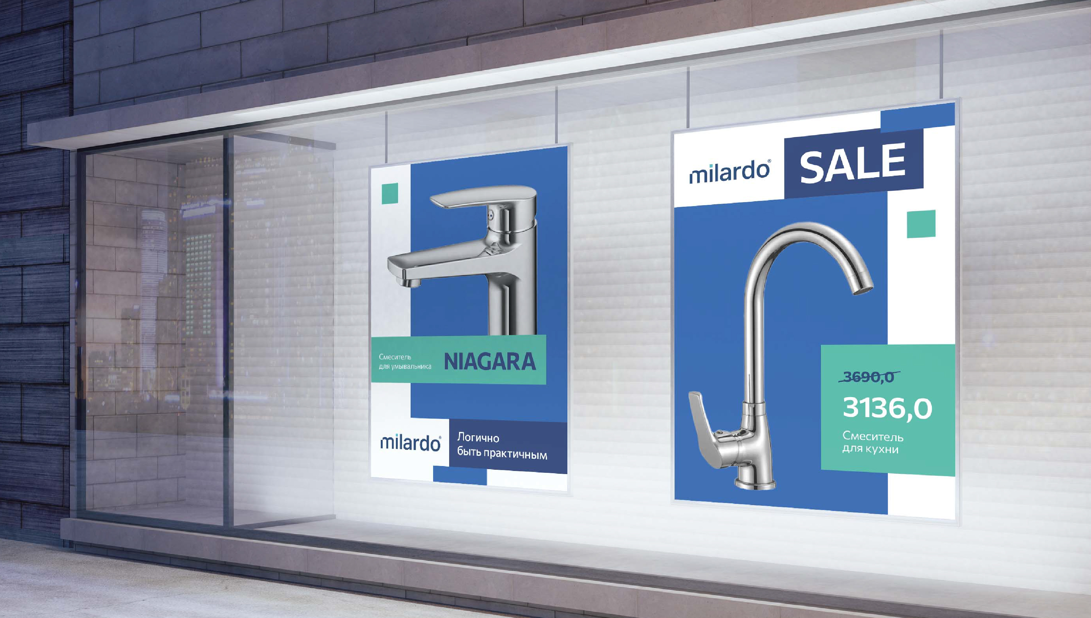
The block graphic is a visual metaphor for systemic, logical, rationality.
It can be used to structure the information on the media, emphasize the message or highlight a photo image.
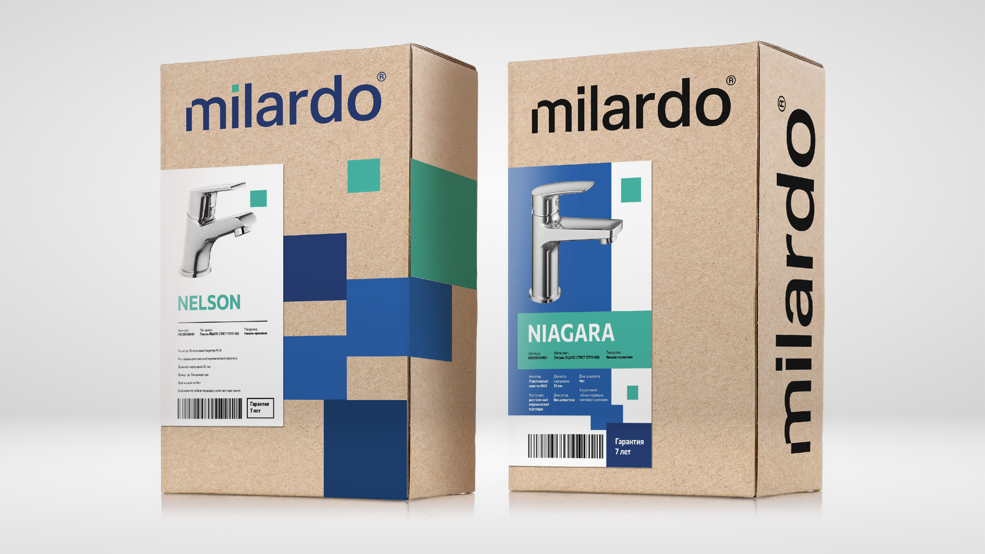
Packaging is a kraft box with a color sticker. The sticker has all the information about the product - from the name of the collection to the packaging. Nothing extra, everything is simple and to the point.
This approach shows the principle of practicality and rationality for the sake of convenience and saving the customer money.
Milardo — is the brand, which helps the customer to feel like a well-thought-out person, who knows how to take benefit where most people do not.
The updated brand identity shows the brand's message of rationality and practicality through graphics, and due to the font and color solutions it looks diverse and unconventional.
Creative team
Art-director
Irina Shmidt
Brand Strategist
Irina Mokrousova
Designers
Olga Samofalova
Project Manager
Anna Artemova
Another projects for this client