
Choose industry from list
Сontext. A new brand of notebooks

Brand positioning and advantages
The target audience of the brand is b2b-clients who order notebooks as business gifts for their employees, clients, and partners.
The new brand will be universal and basic, so the positioning sounds like this:
"a modern Russian brand of basic products for writing."
We formulated the emotional advantage of the new brand. The appearance of digital devices has influenced the market for writing products. People now do business, write, and plan on the run, on smartphones and tablets. But gadgets don't provide that sense of pleasure that comes when you open a blank sheet of paper to write down your thoughts with your hand. We are left with the need for a pen and paper.

This is the added value of the new brand. The diary is a space for reflection, search, innerdialogue, which everyone needs. It gives a special pleasure, the very value of feeling like a creator.
Naming
Brands of writing and planning products often use Italian names to attach their positioning to the global brand "made in Italy". From the beginning, client decided he didn't want to go this way — he needed an understandable Russian-language name.
Of the options we offered, the client's team chose — Сontext. You could say that the Сontext of a person's life and work becomes the text in the Сontext diary.
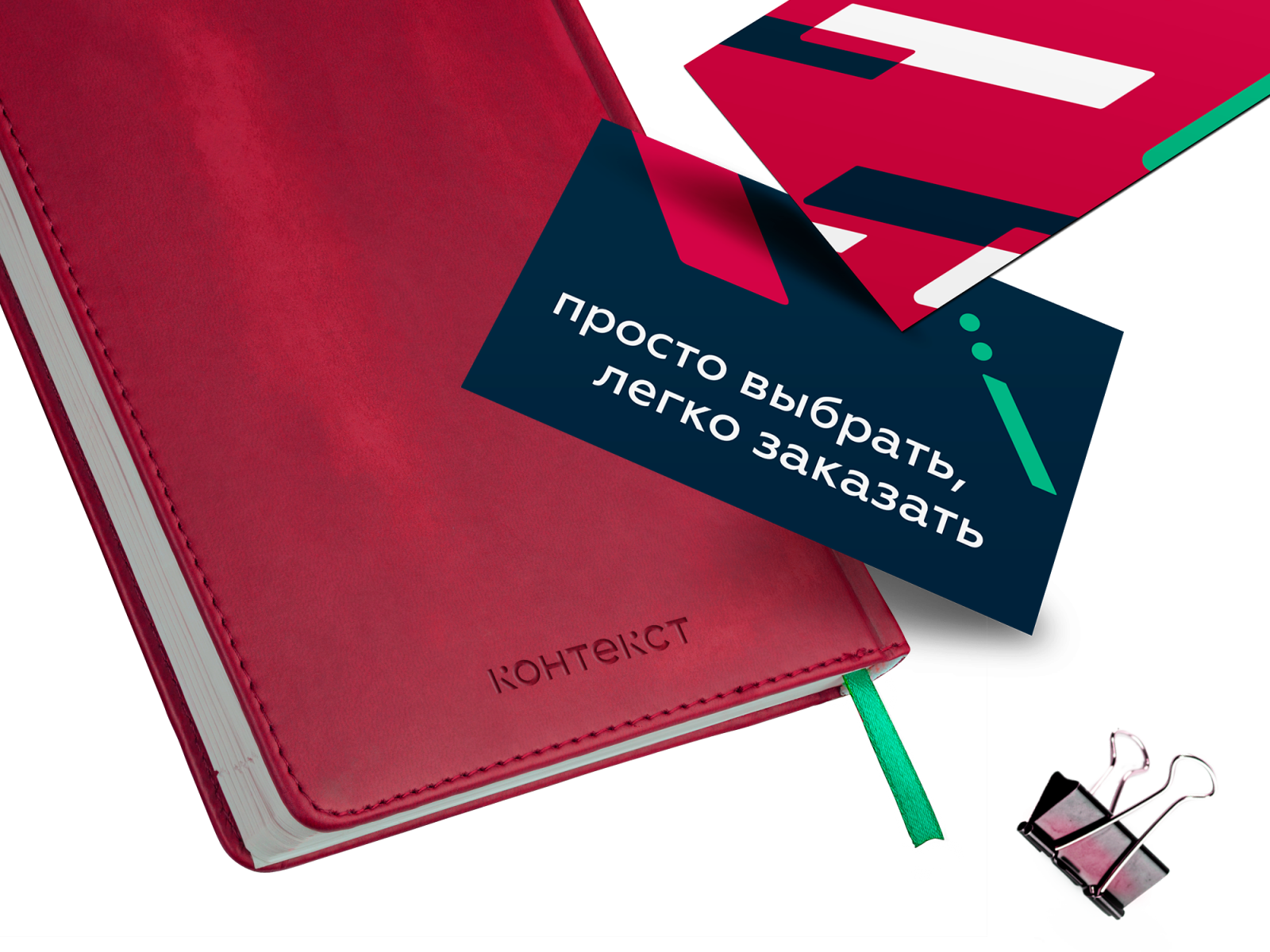
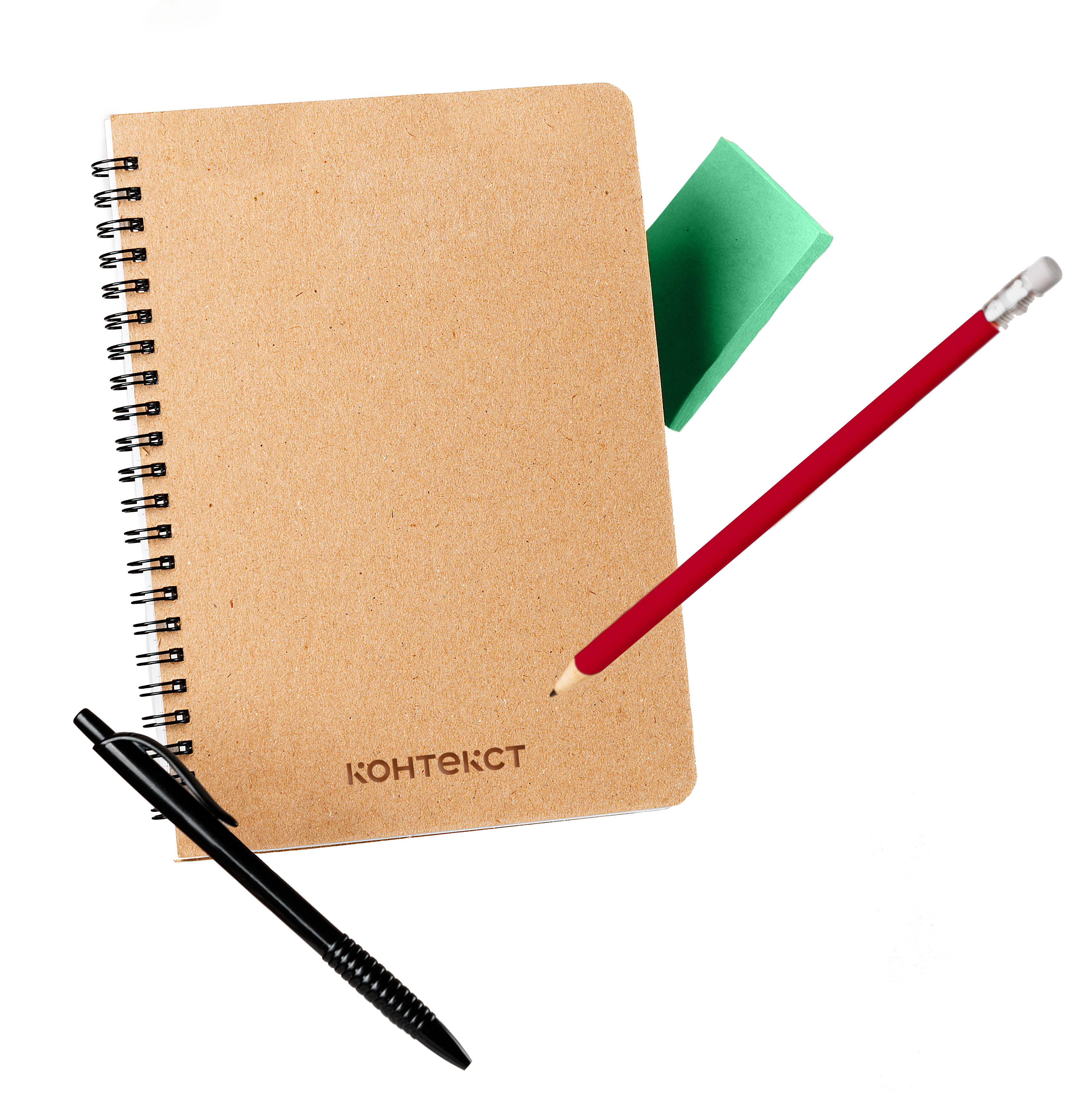
Logo and identity
The logo is characterized by the letters "K." They consist of separate elements, but the context, that is, the rest of the letters, helps to read the name without difficulty.
"K" can be used as a self-sufficient element, for example, for branding carriers. Such a sign combines both classic character and modern simplicity — just like the new diary collection.
The brand graphic roots are in the diagonal elements of the logo. It reflects the dynamic environment, the unified flow, the speech, and event context.


Conclusion
The new diary brand is the result of collaboration between Project 111 and the factory Adjutant, Russia's largest diary manufacturer. In this project we tried to combine the vision of the two partners, and not only to give the new brand of diaries its own identity, but also to help it inherit the values of the two partner brands.

Creative team
Ilona Koltinyuk
Art-director
Irina Shmidt
Brand Strategist
Irina Mokrousova
Copywriter
Anton Borisov
Designers
Ekaterina Starodumova,
Olga Samofalova,
Irina Shmidt
Project Manager
Marta Bekker