
Choose industry from list
In the style of development and leadership
Solution: corporate block
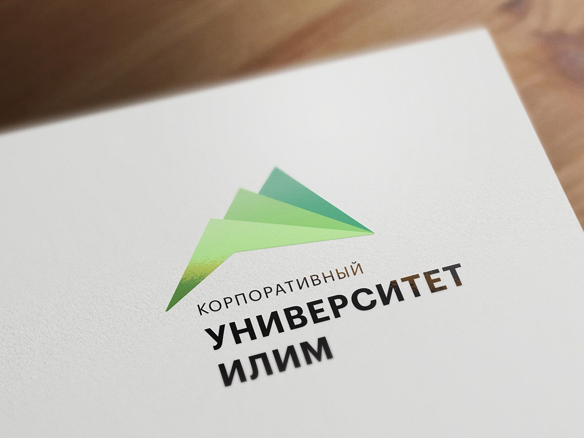
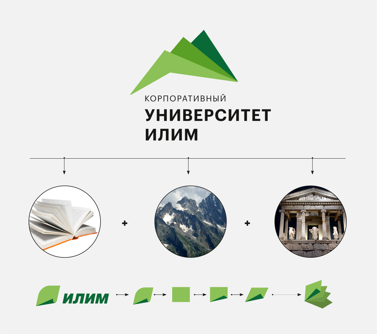
The starting point for the creation of the university's corporate block was the sign of Ilim, in which a folded sheet is evident. If you combine several such sheets – we get the image of an open book, a synopsis, a classic source of knowledge. In the sign of the Ilim University this image is read in the first place. No less expressed here is the image of mountain peaks – a symbol of career and professional heights. In addition, in the brand name there is a reference to the porticos of ancient Greek buildings and architecture of the oldest European and world universities.
The palette of the corporate university sign is successive to the colors of the sign of Ilim. The same goes for the title: the font, chosen for the basic writing, complements the block and does not contradict the logo of Ilim.
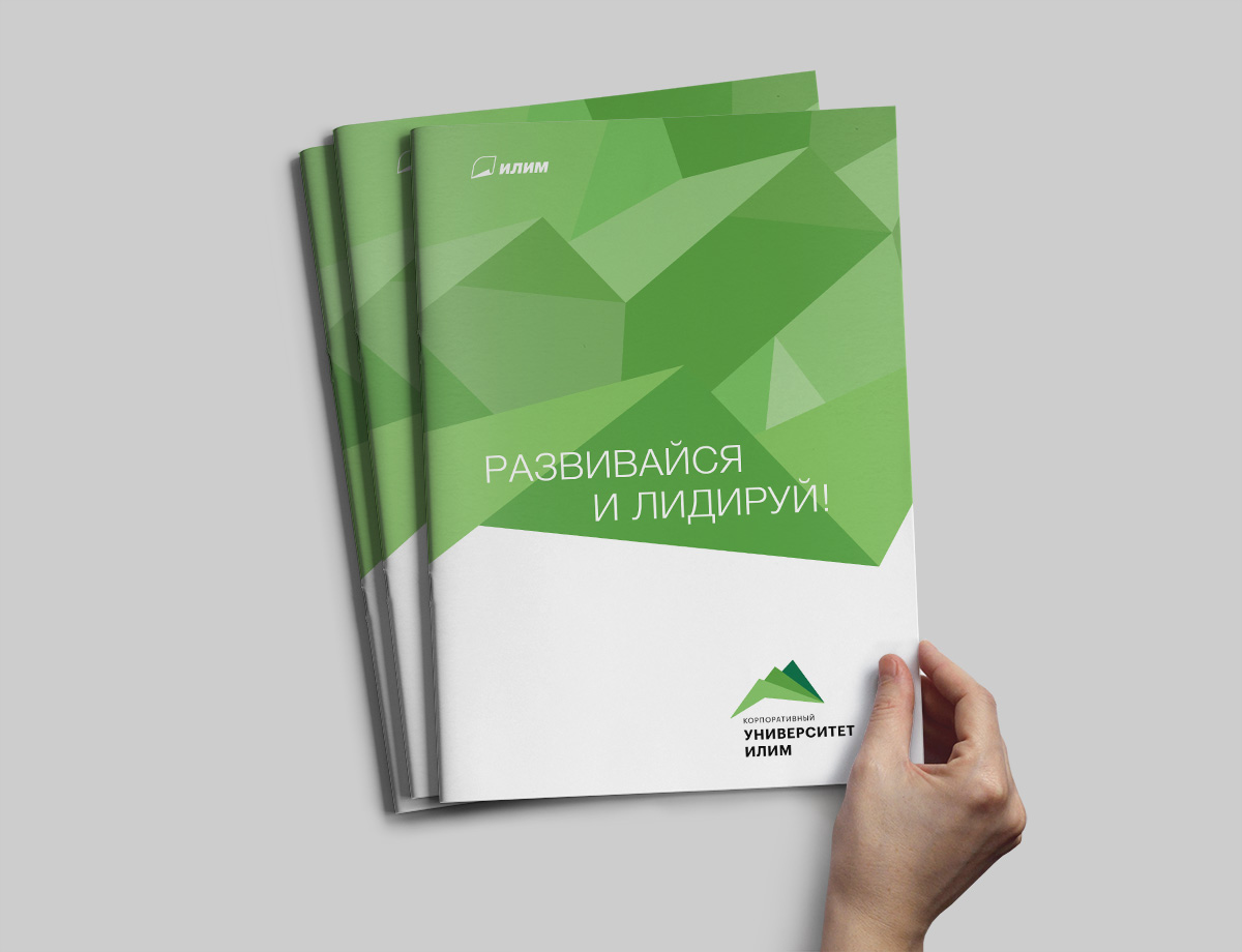
Solution: corporate identity
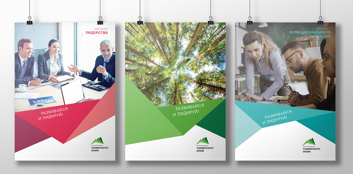
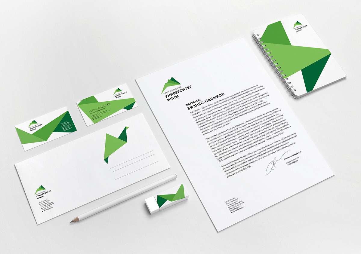
Further development of the graphic design of the university's corporate sign was given in its corporate style. Styling elements were geometric figures and compositions, reminiscent of origami, stairs and airplanes. Add to this the own color range of each faculty of the university – and form a dynamic flexible identity, holistic and recognizable, informing about diversity, energy, search and constant development.

Creative team
Art-director
Irina Shmidt
Brand Strategist
Daria Erasova
Copywriter
Anton Borisov
Designers
Elena Ivanova
Nadejda Polomoshnova
Roman Titovec
Project Manager
Marta Bekker