Choose industry from list
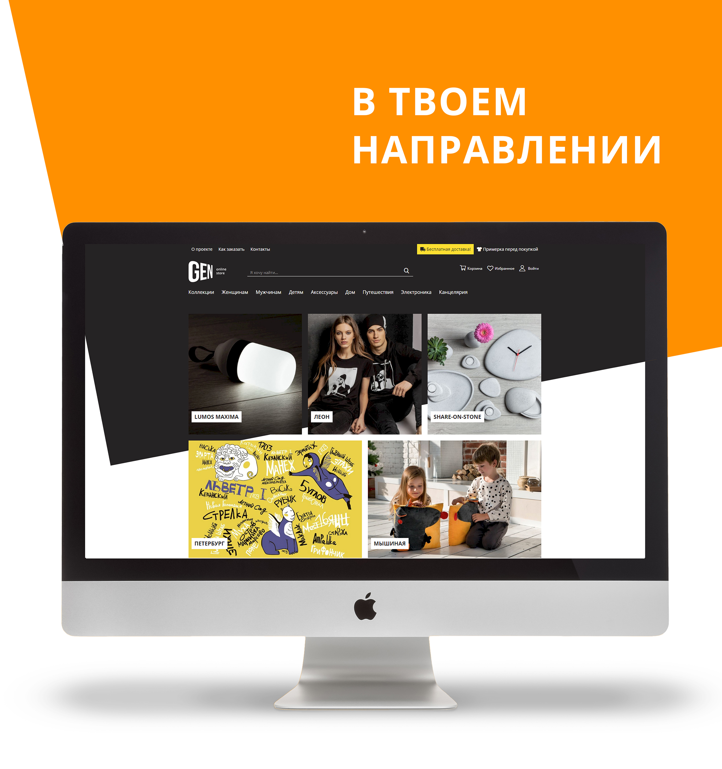
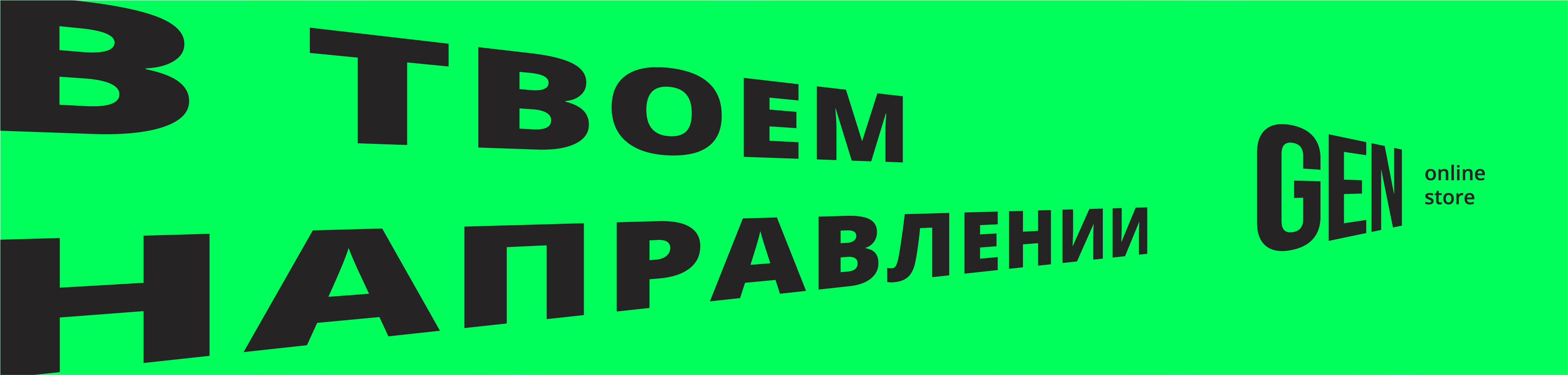
In your direction
Gen is focused on advanced and thinking young people, millenials who are interested in current trends and events. The audience is characterized by a wide range of interests and a desire to be part of a certain cultural layer, and it is important for them to find ways to express themselves. They are not affected by the magic of big brands - they choose those brands that carry close to them emotional messages and evoke an internal response.
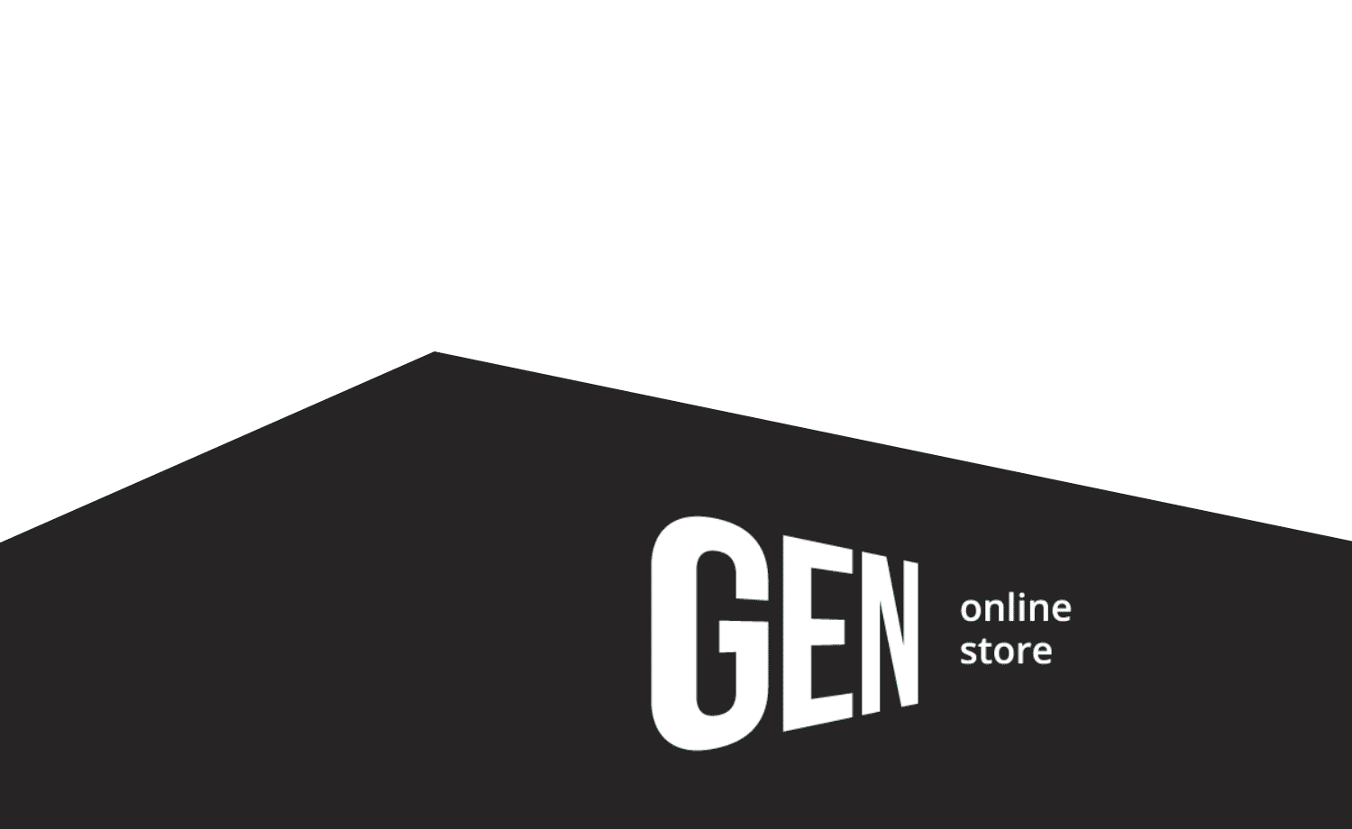
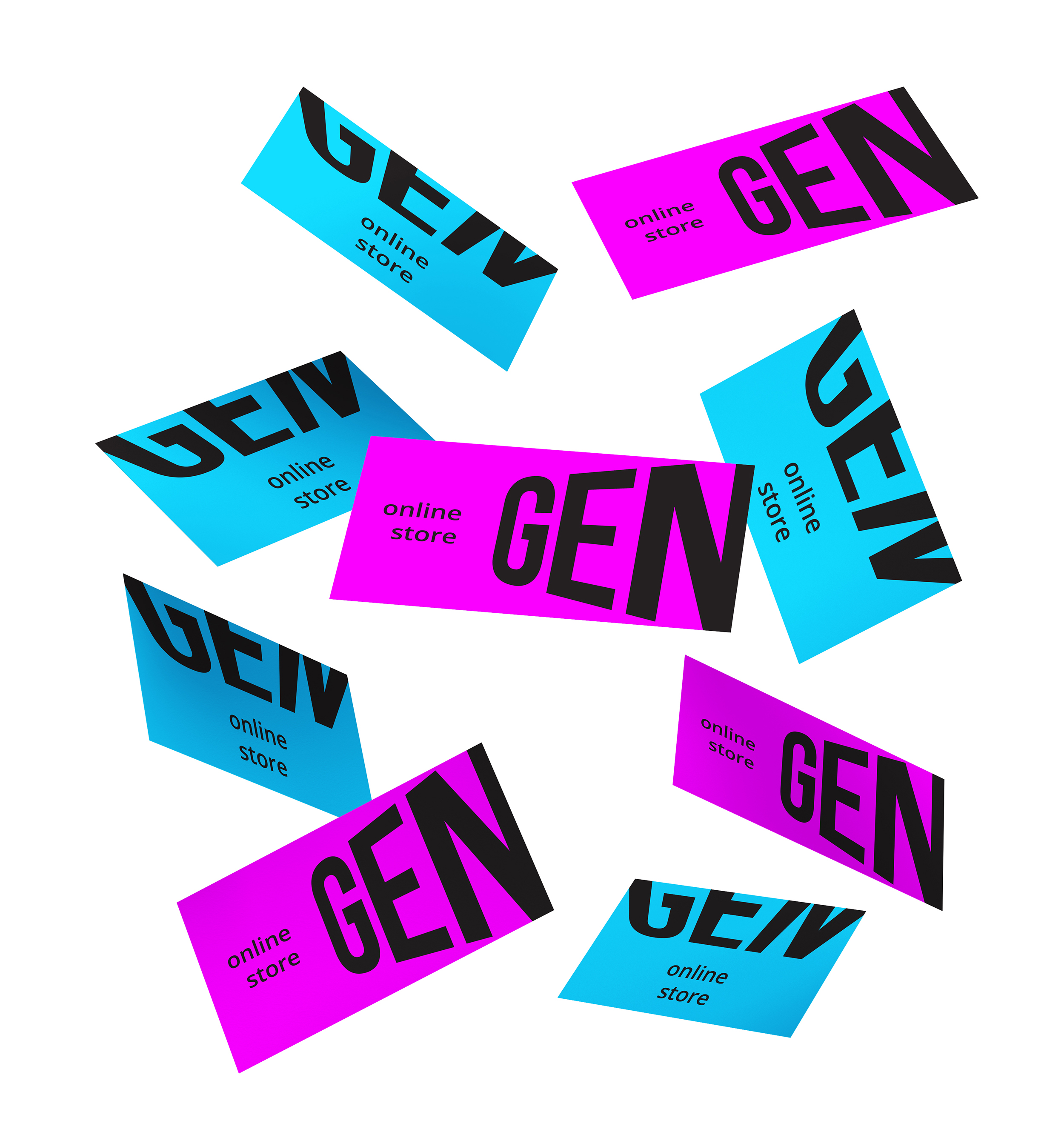
Logotype
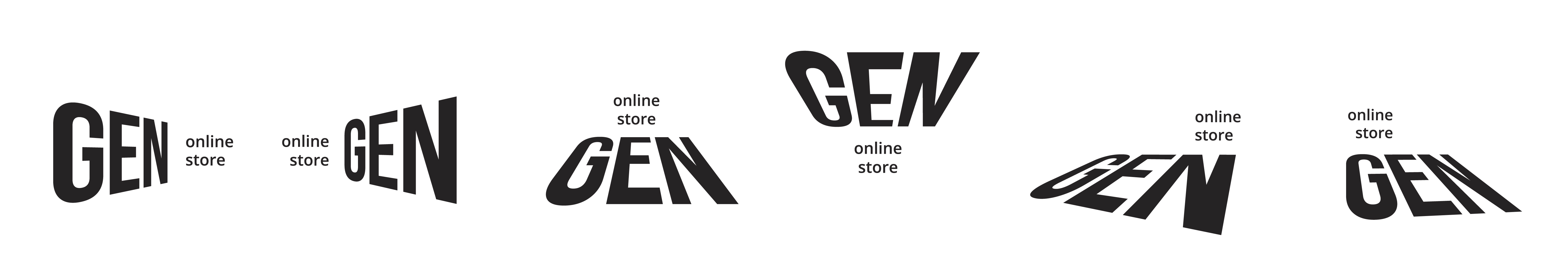
The concept of the logo is explained by the dynamics and continuous movement: when the perspective of the logo changes, the focus of the key message changes as well. The logo reflects the brand's positioning, emphasizing the diversity of the audience's views and directions. Bright, catchy additional colors have increased the activity and energy of the logo.
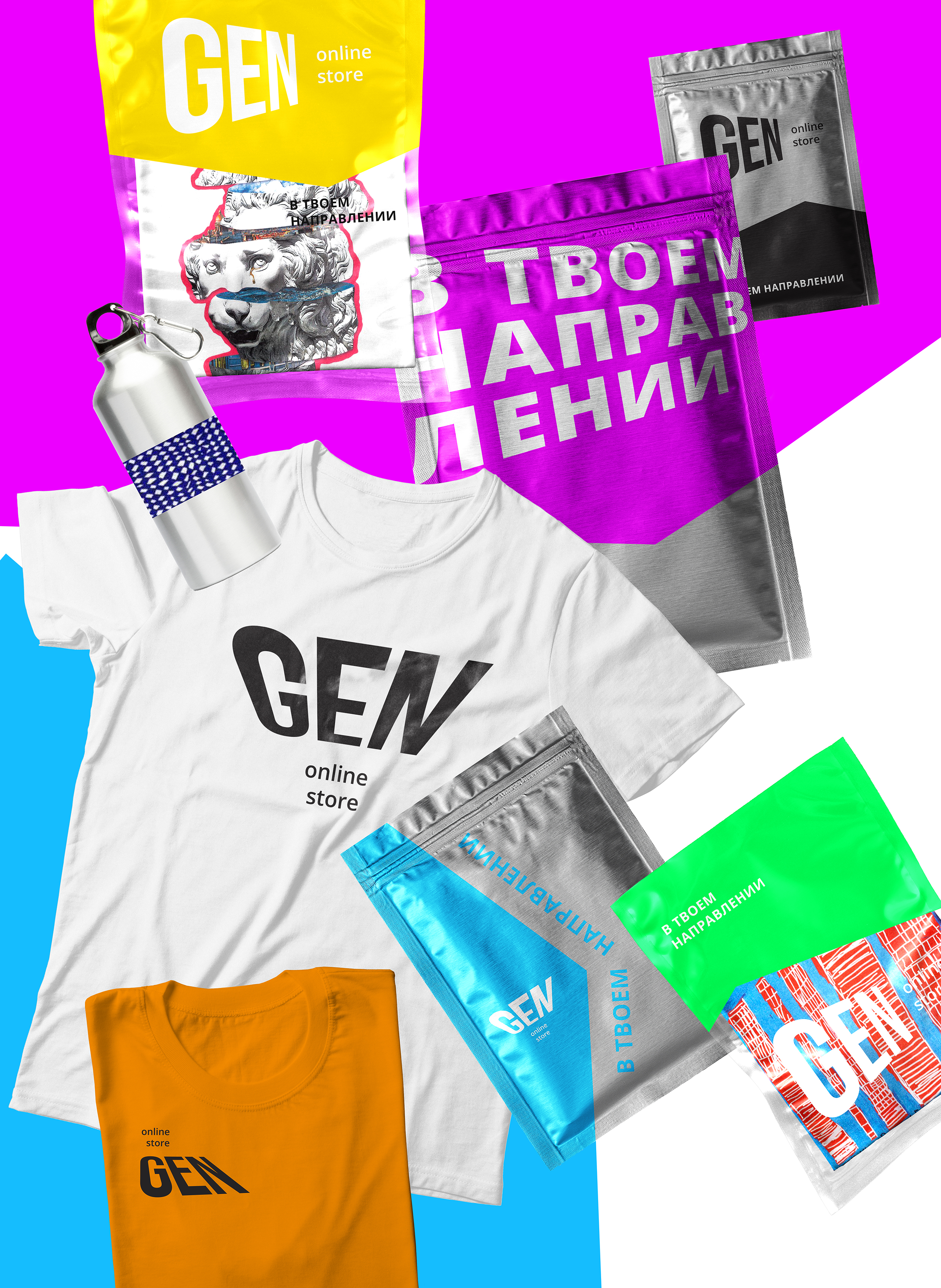
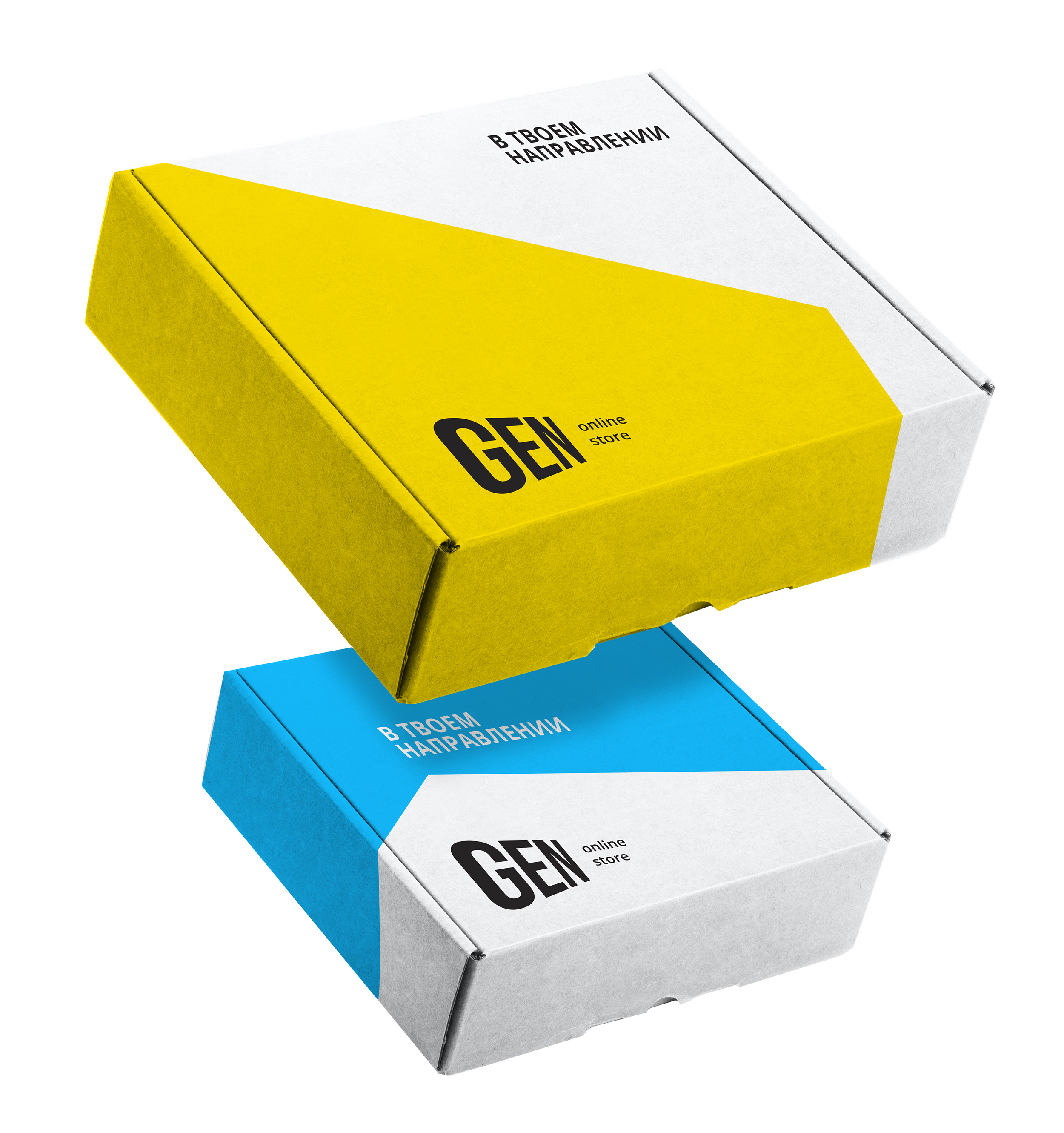
Corporate identity
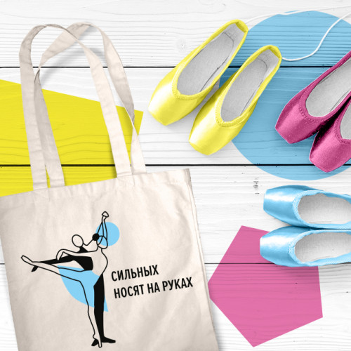
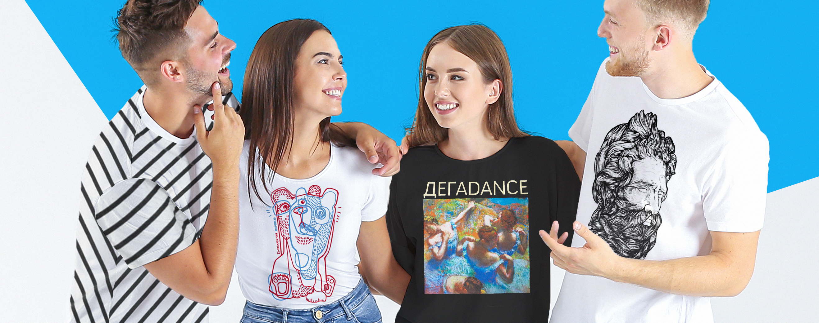
Identity continues the dynamic idea behind this logo. Bright contrasting figures are used to support and continue the principle of transformation of the logo. Such a graphic solution highlights the most important thing — the product with its unique print. Due to their mobility, the logo and the identity easily adapt to any new trends and set new vectors themselves.
In the Gen store, everyone who has the same gene will find something new and actual for themselves. Whether it's a bright, creative wardrobe item, news about the latest trends and significant events or meeting interesting people and their creativity. The result of the work is an expressive and modern image of GEN brand. The new brand identity is already implemented on the company's website and adapted to different items.
Creative team
Ilona Koltinyuk
Art-director
Irina Shmidt
Brand Strategist
Daria Erasova
Designers
Olga Samofalova
Project Manager
Marta Bekker
Another projects for this client