
Choose industry from list
Rebranding of the international channel RTVI
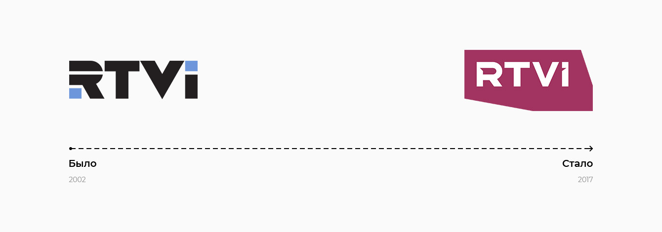
The most important tasks of the rebranding are to support the strategy of the channel development, promote the youthification of the RTVI audience, increase the interest and loyalty of the audience, attract new content consumers, gain new competitive advantages, increase brand value and brand awareness. All these tasks formed the basis of the actual restart of the channel. The renewed brand symbolizes activity, objectivity, aspiration to novelty.
“Significant changes of the audience and qualitative renewal of the RTVI content needs total change of visual language and image of the channel. Besides, the competitive field of the news media is diverse and fulfilled as ever, and it is impossible to solve our tasks without strong, recognizable brand. It is not just a change of the logotype, it is the most important part of full of value restart of the channel”, – said Alexei Pivovarov, general producer of RTVI.
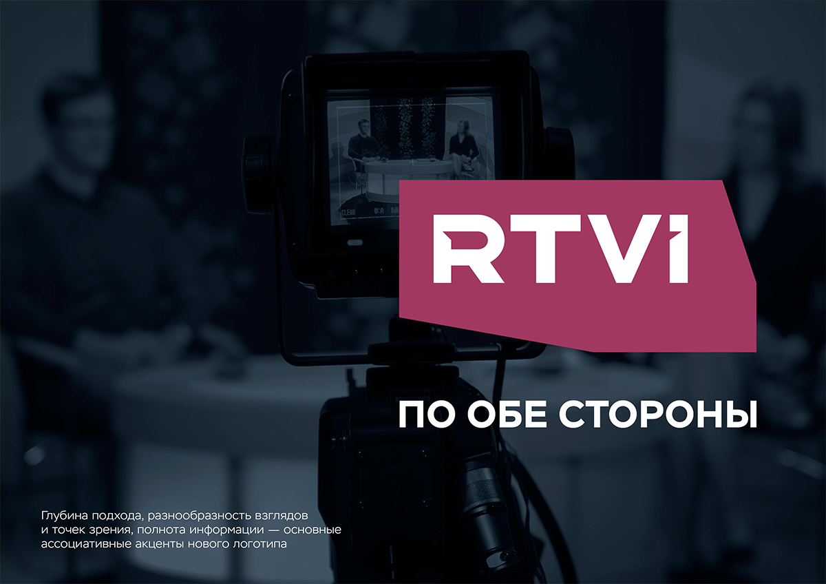
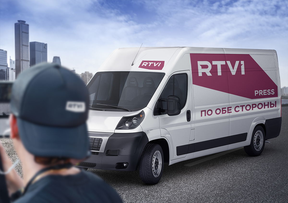
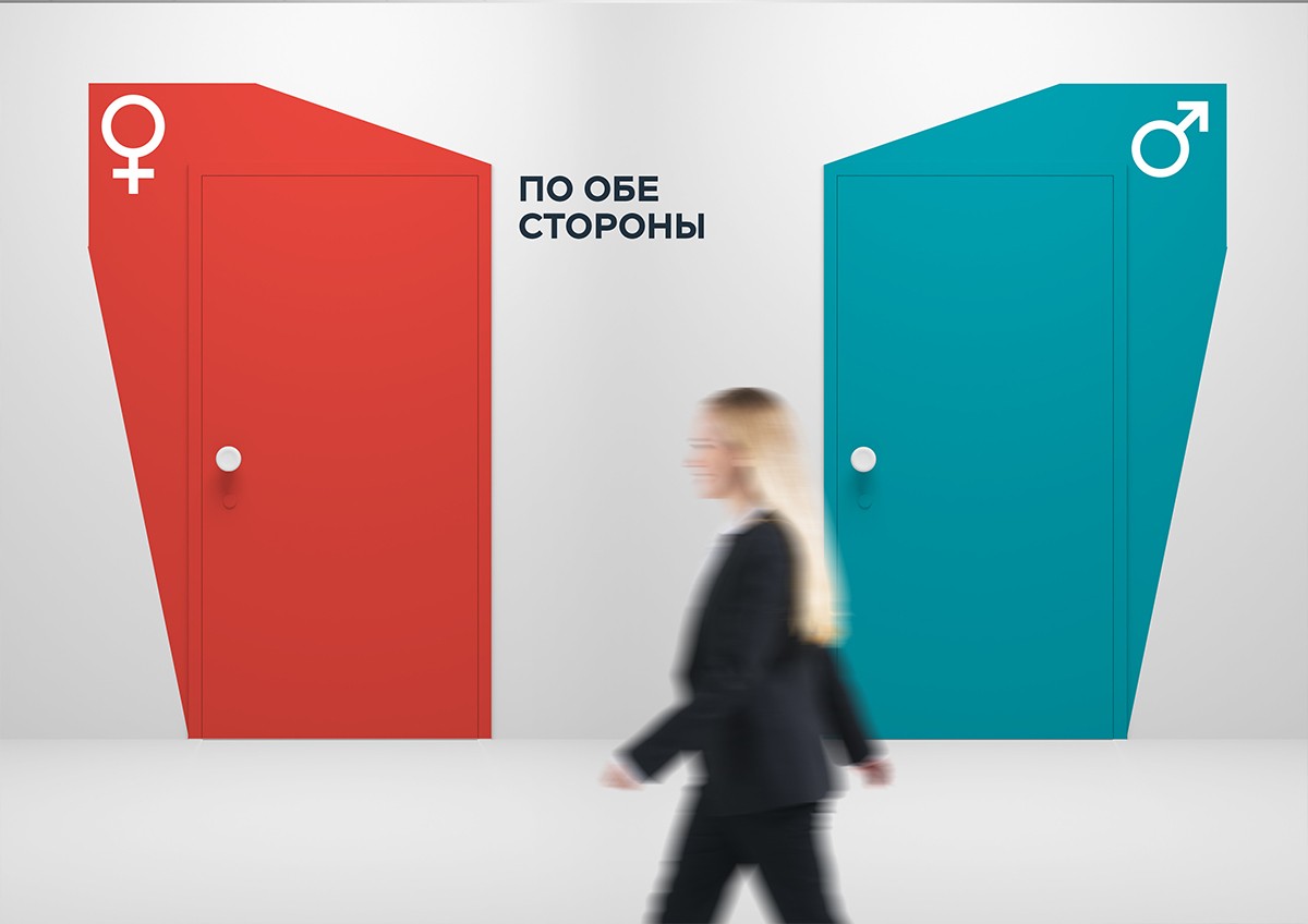
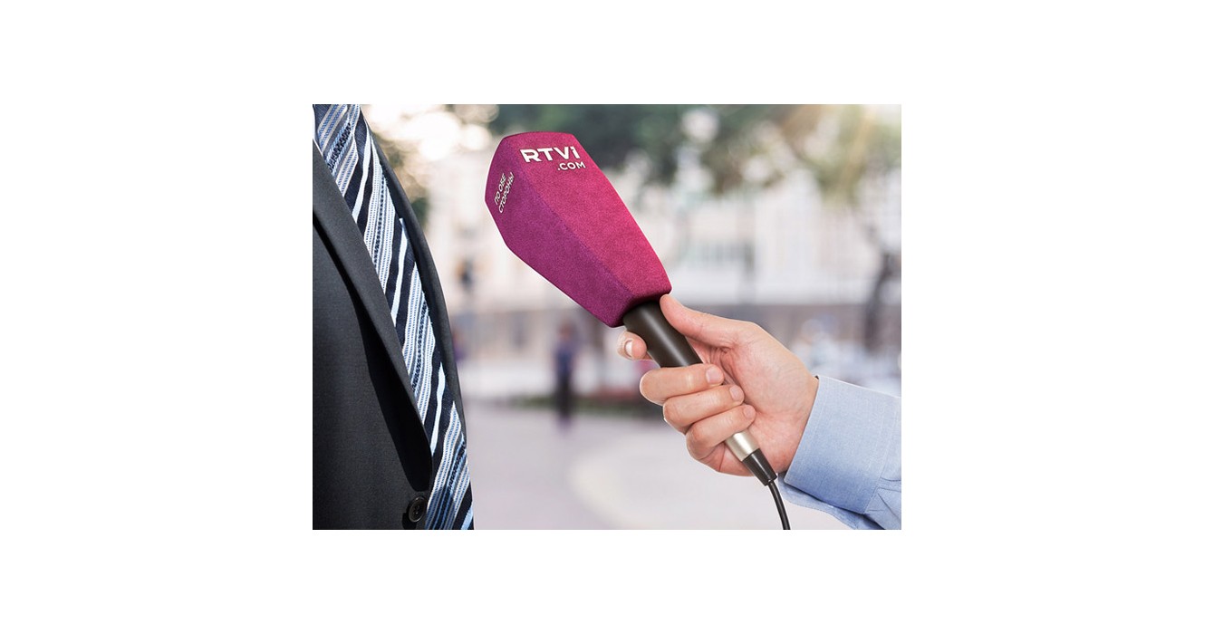
“On both sides” is the new slogan of RTVI which reflects key characteristics of the brand. They are “fact-based journalism” as opposed to “opinion journalism”, impartiality and objectivity. The brand is based on the idea which is uniting Russian-speaking audience all over the world.
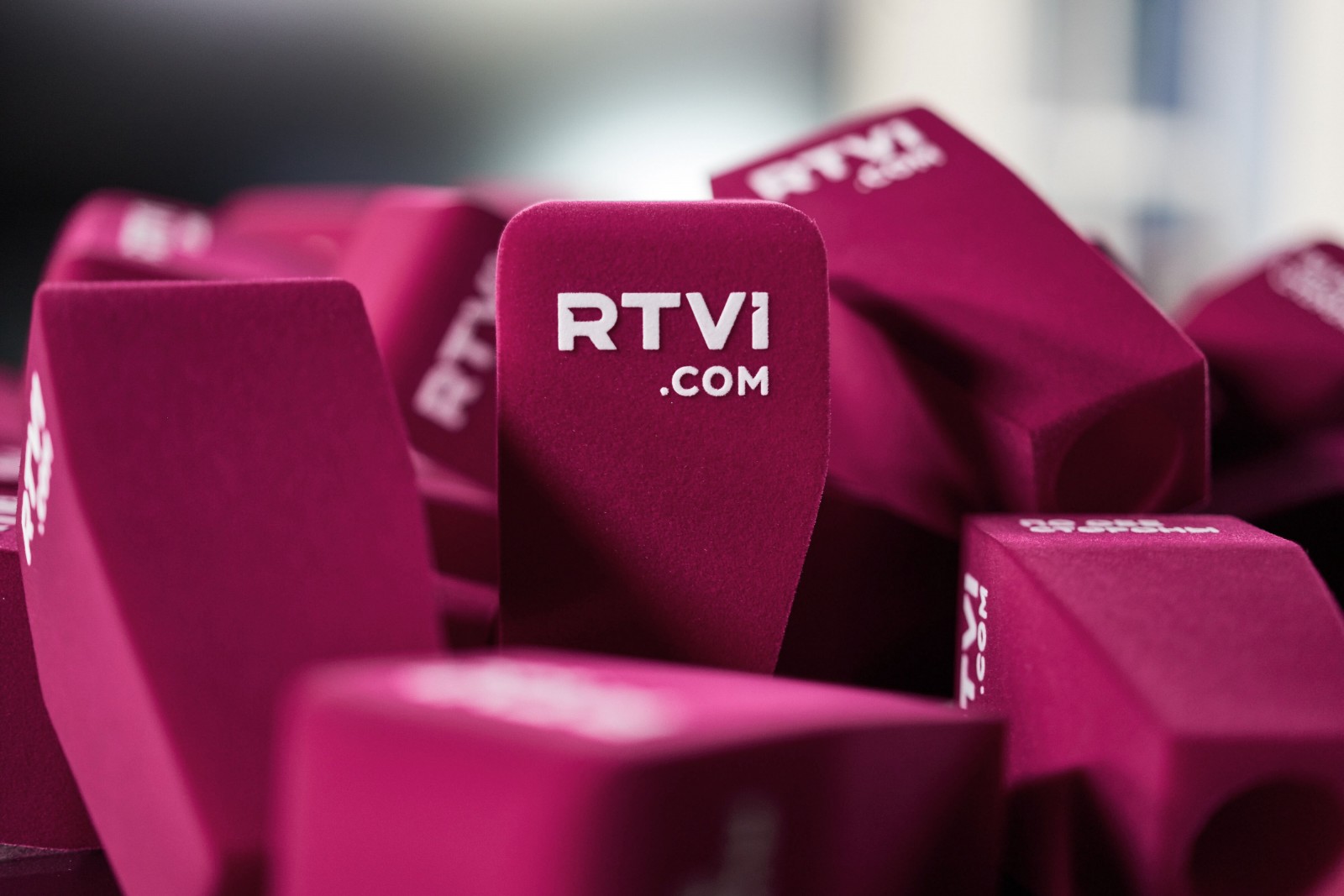
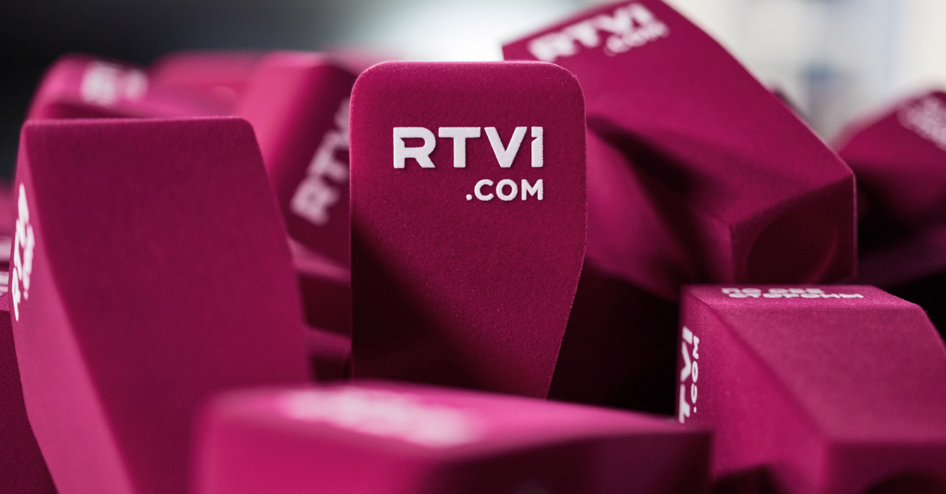
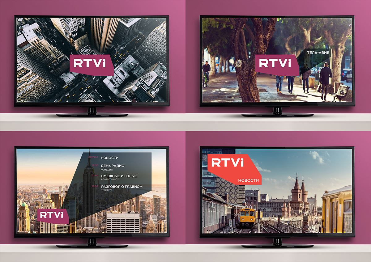
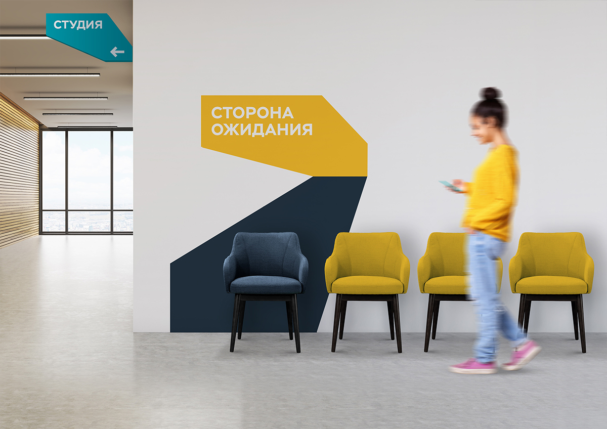
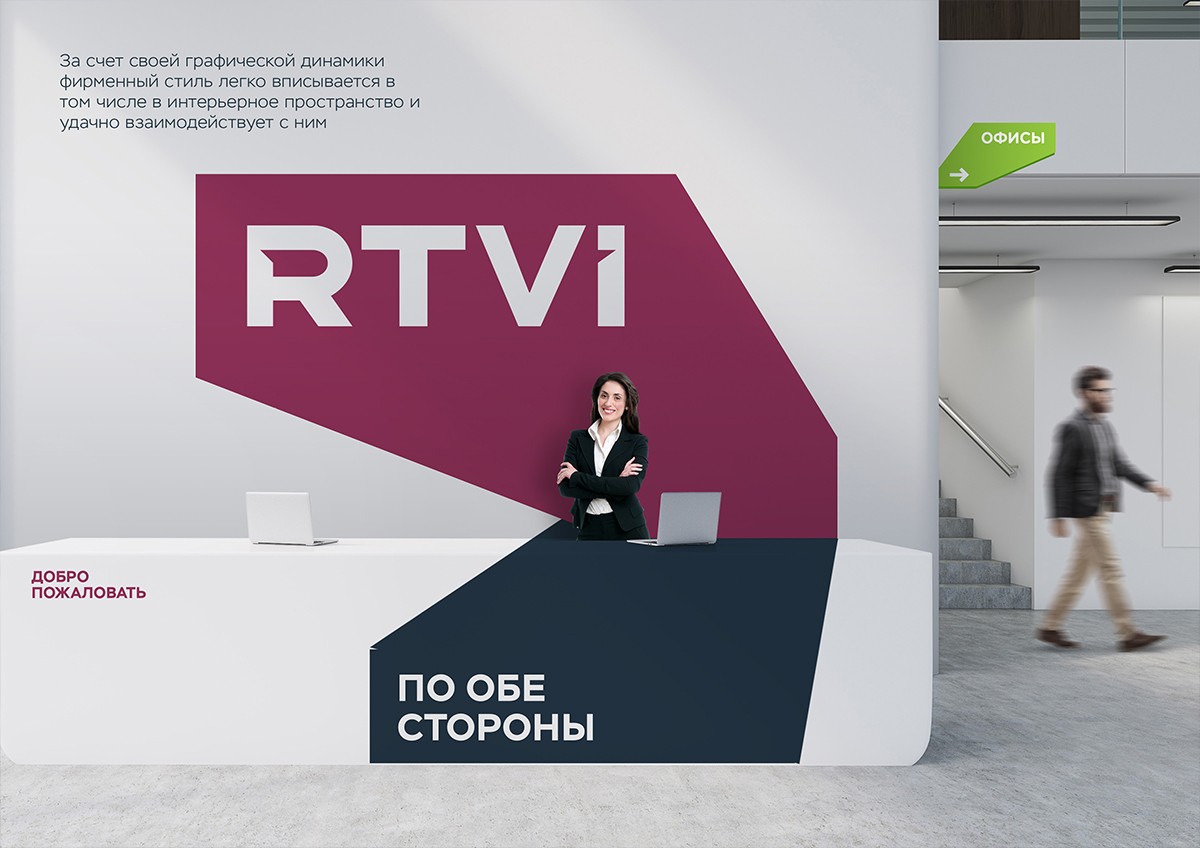
The basic idea of the new brand and the slogan of the channel (“On both sides”) is respect to the viewer, his possibility to estimate different events minimum from two different points of view, meaning to be maximum objective, without one-side view on the events and heroes. Changing of the logotype form can be used also for animation effects: approximation-removal, volume changing. This dynamical graphics and unformatted color palette, rare among TV-channels, favorably distinguish the identity of RTVI on a competitive field.
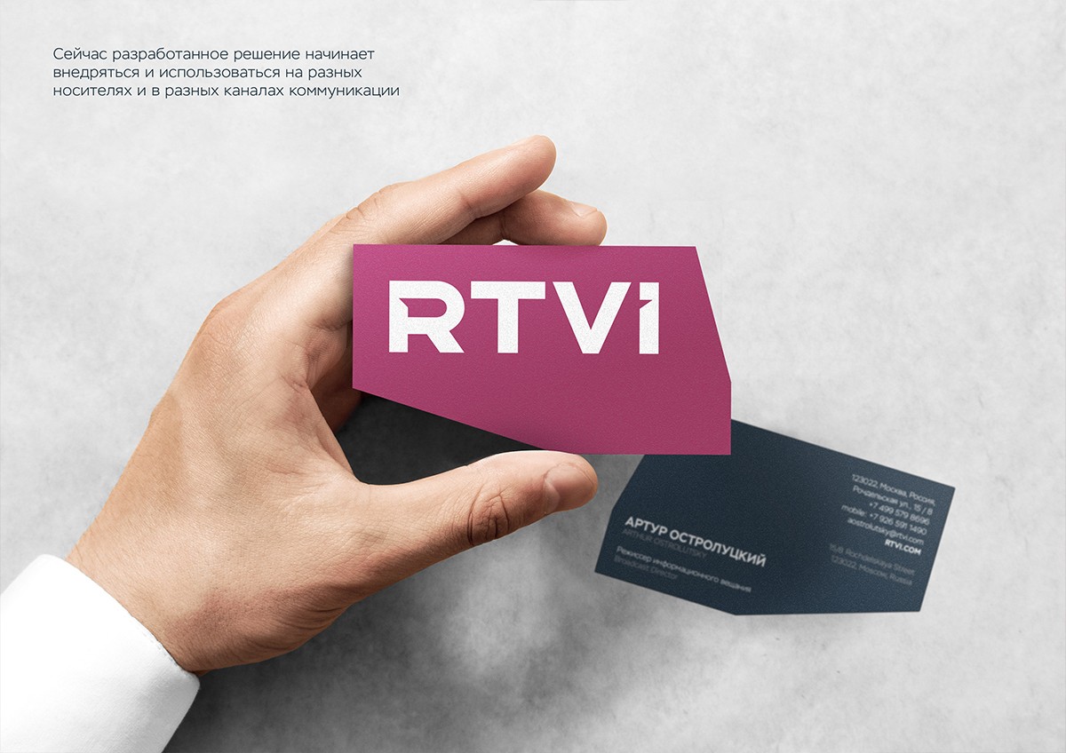
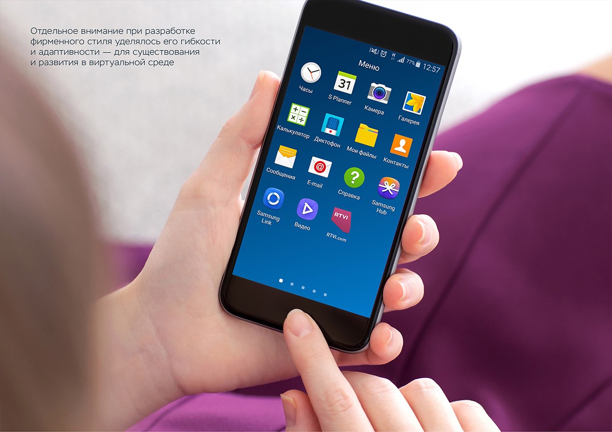
Echo of the names of brand and title creates the feeling of dialogue, being on both sides. Which of the notes is situated on the leading edge of the figure, and which is on the back edge, depends on the viewer’s position. We paid special attention to make the suggested solution plain and understandable while creating the new style and logotype. But at the same time we wanted it to be with numerous quantity of modifications and possibilities of using. The special meaning has big potential for implementation and development in digital-field, as RTVI brand will be integrated to other platforms in future: social media, mobile applications, messengers, photo and video sites.
Creative team
Ilona Koltinyuk
Aleksandr Suvorov
Art-director
Irina Shmidt
Daria Erasova
Copywriter
Anton Borisov,
Ivan Kvasov
Project Manager
Anna Dokunina,
Aleksandr Petrosyan
Особое спасибо
Алексею Пивоварову, Артуру Остролуцкому и команде RTVI