Choose industry from list
Folk recipes of Taiga Herbalist
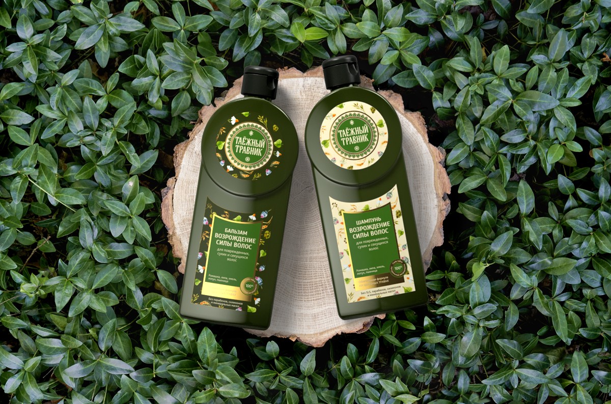
“Taiga Herbalist” is the cosmetics based on folk recipes and primordially Russian natural components. Its name refers to traditional Old Russian book with the description of medical herbs.
The target audience of the cosmetics are women after 25, that prefer products with natural ingredients. That is why it was important for us to unite esthetics with functionality in the design – to make the product trustworthy and understandable, to give clear information about natural composition.
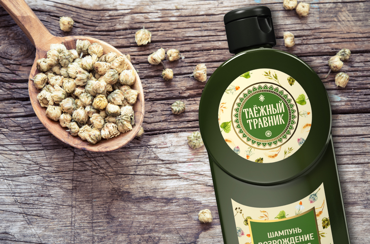
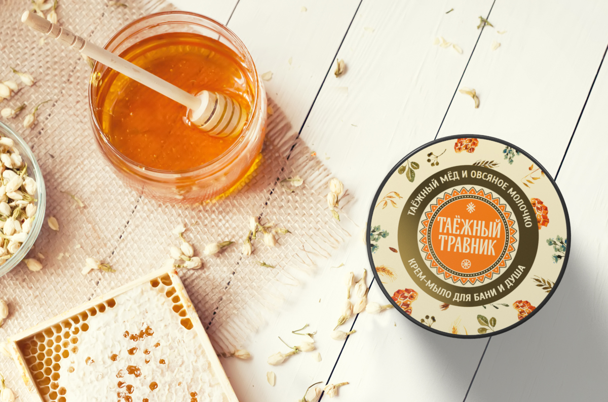
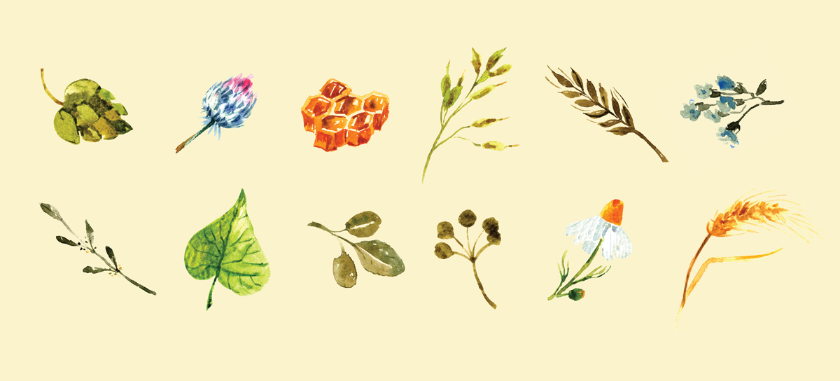
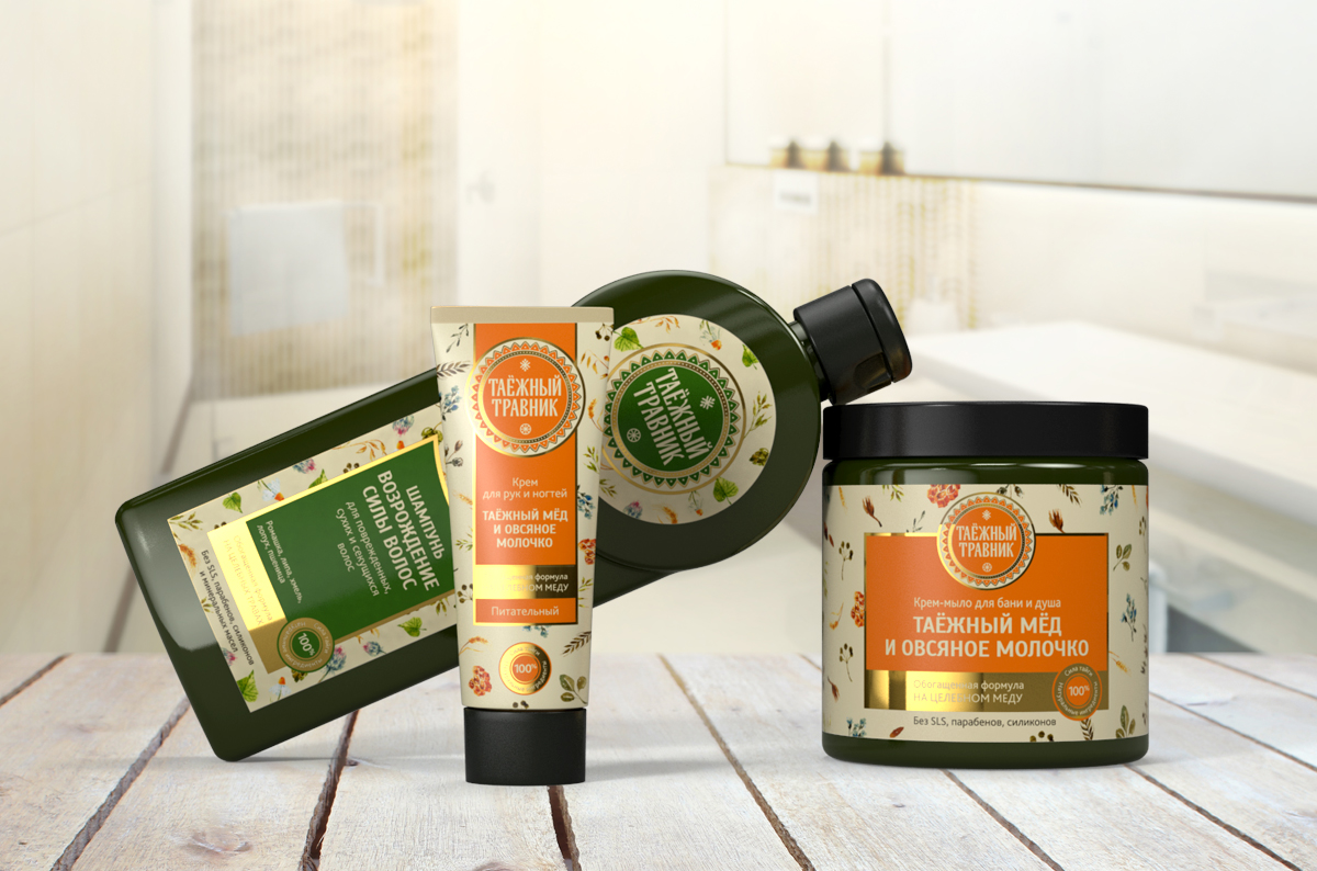
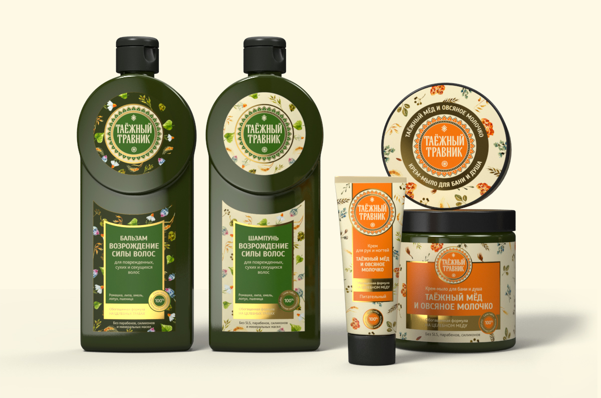
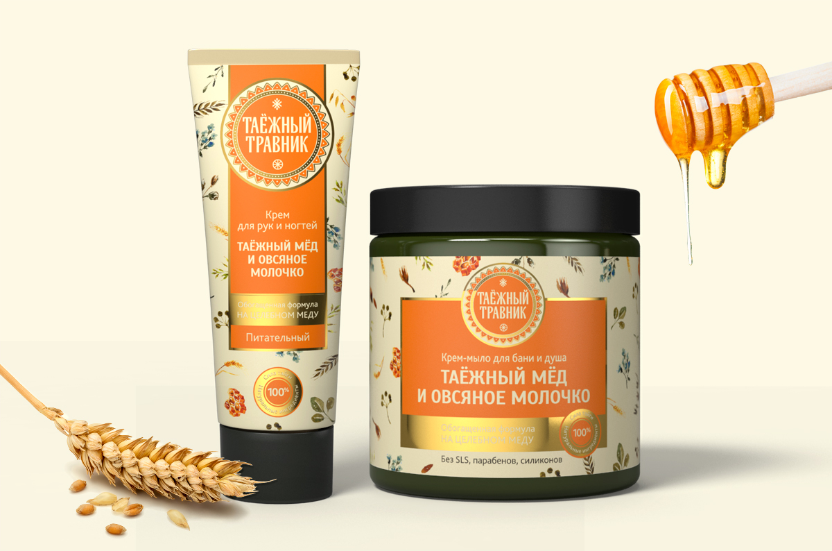
For the series of packaging we used illustrations with natural components in the technique of watercolor. The drawings are painted on a light background, which gives a feeling of lightness, airiness and natural purity. The main identification element – the circle of the logo – changed the color of the substrate, due to which the entire label was perceived to be lighter. Information about the components is structured through the layout, it makes easy to identify the exact product.
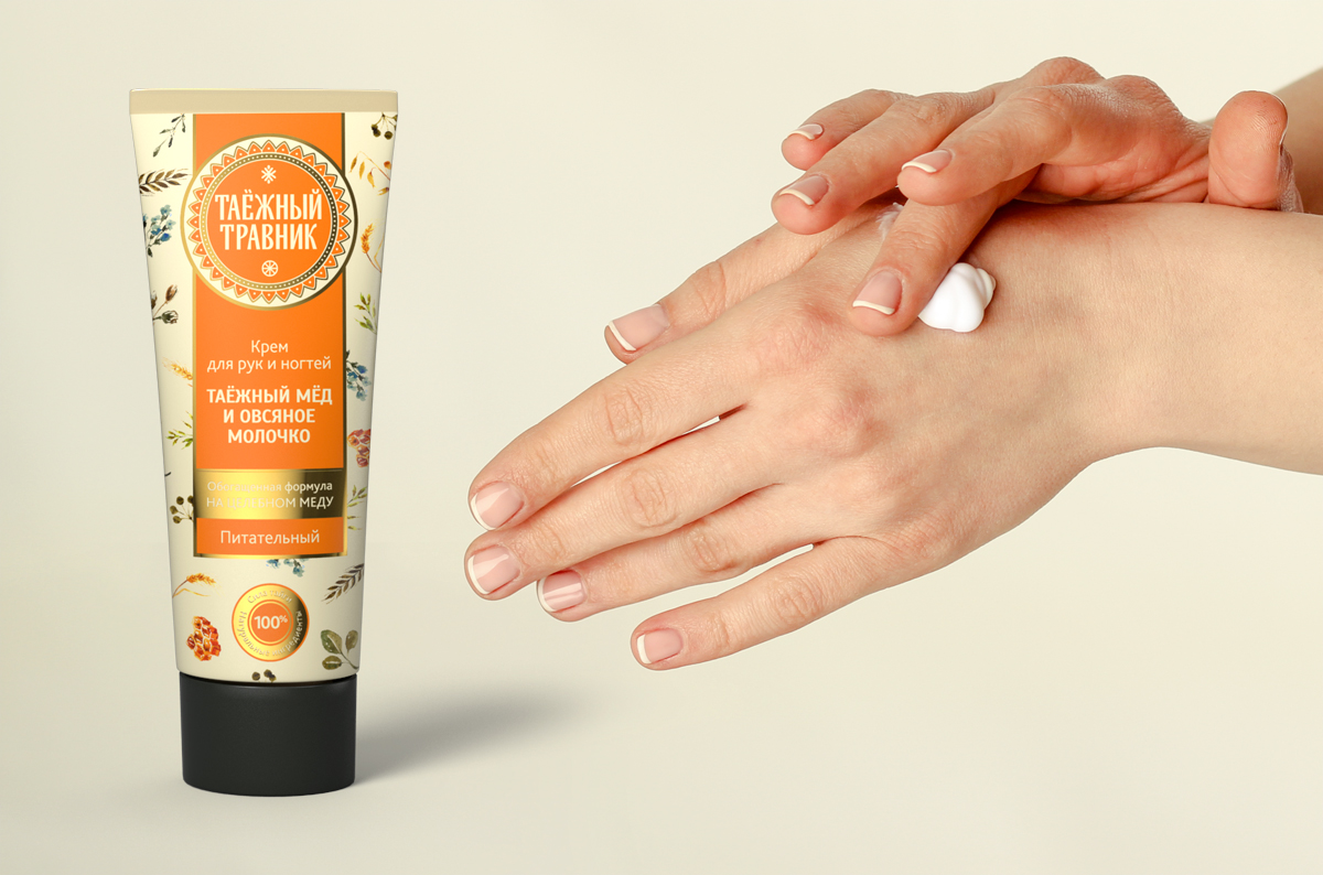
We have developed the principle of adapting the design to different forms of packaging: a bottle, a jar and a tube. In the future, it will be translated to various product lines of cosmetics.
Creative team
Art-director
Evgenia Dzhurinskaya
Copywriter
Yulia Bibisheva
Illustrator
Olga Bool
Project Manager
Ekaterina Saburova,
Alena Nurtdinova


