
Choose industry from list
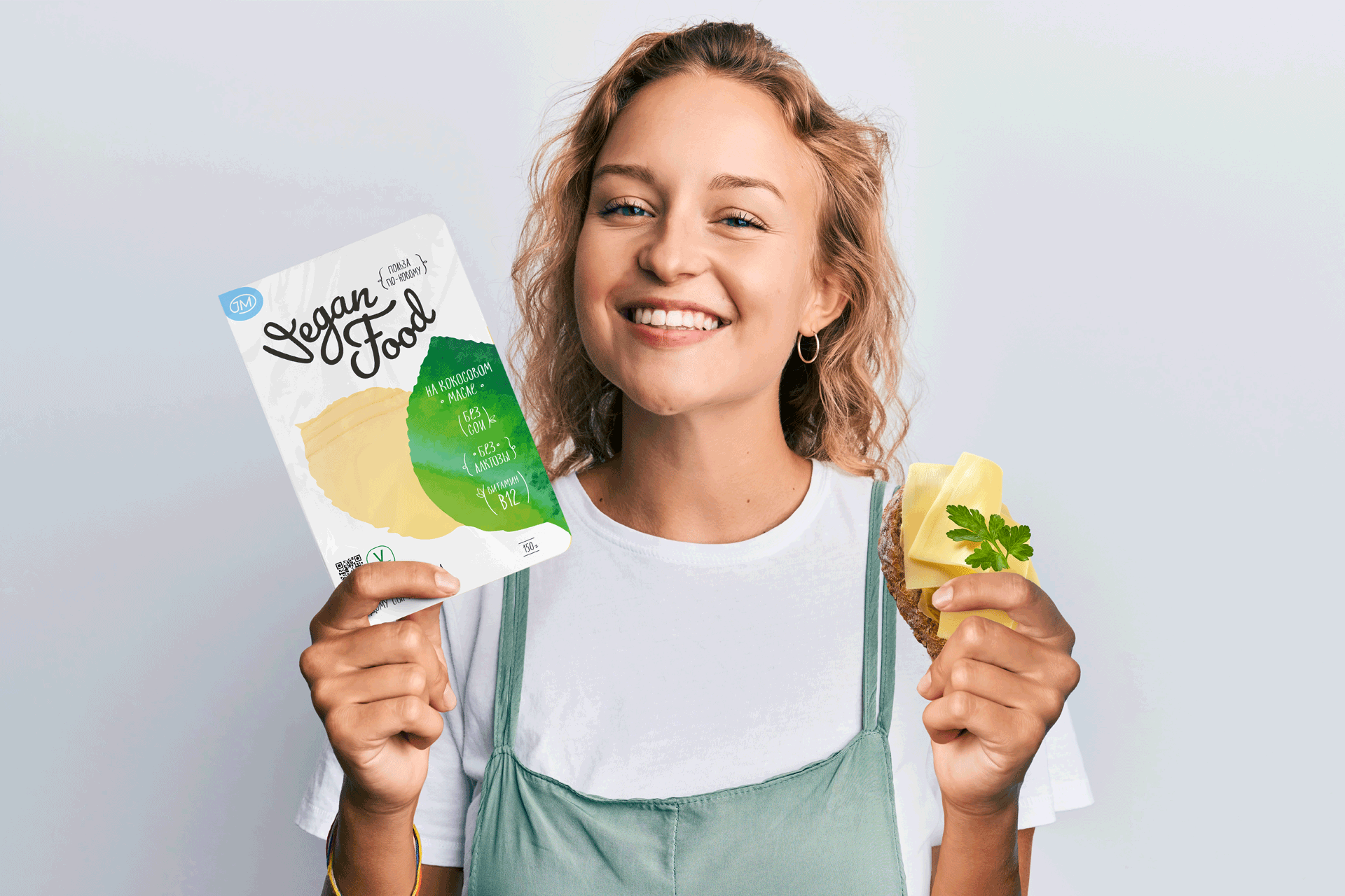
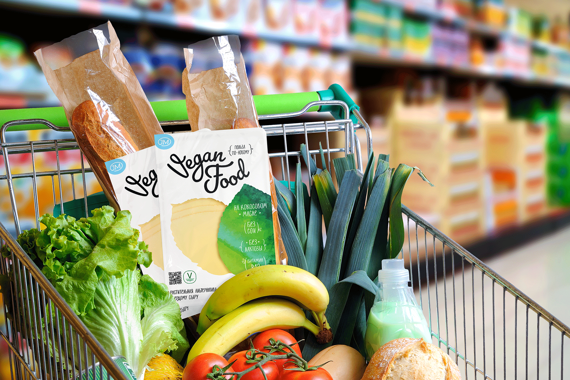
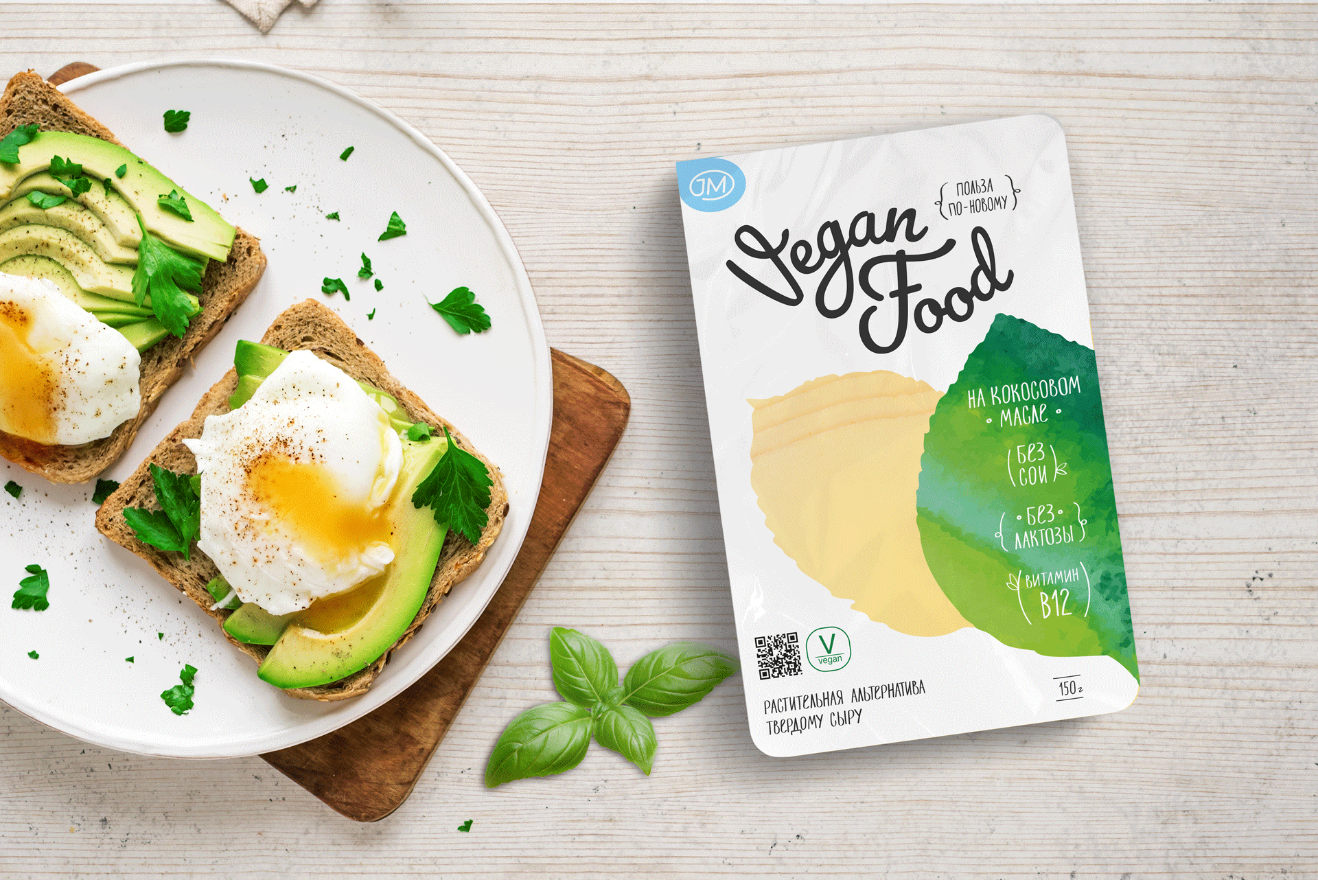
Vegan cheese packaging design
The company approached us to develop a brand logo and package design for one of its lines, Vegan Food.
In the design it was important to reflect naturalness, freshness, without using traditional visual category codes (meadows, fields, cows, dairy rivers).
Before we started the creative development, the design team analyzed the design approaches in the category of vegan cheeses. We identified several major trends:
- clean lable;
- the use of colors referring to images of a healthy product;
- сreating through design an unusual visual rhythm on the shelf, which looks like an alternative to the monotonous stain of competitors;
- in addition to the bright and appetizing foodzone, other expressive means are used: for example, large typography, bright graphic and color accents.

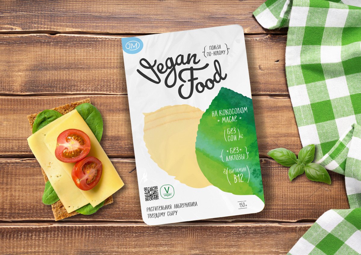
The basis of the logo is a monogram of the initials of the project ideologist — Julia Martynova. Playing off the natural theme, we placed the JM monogram in an element similar in shape and color to a dew drop.
JM brand logo on the top as if titling the package — it becomes an accent blue spot, in addition, it indicates the place of opening.
JM brand is about health benefits, good mood, excellent health, herbal products, European standards and Russian origin.
Developing the theme of health benefits and naturalness with the help of plant images, we make a neat accent on the country of origin of the product and brand, using the birch leaf outline.
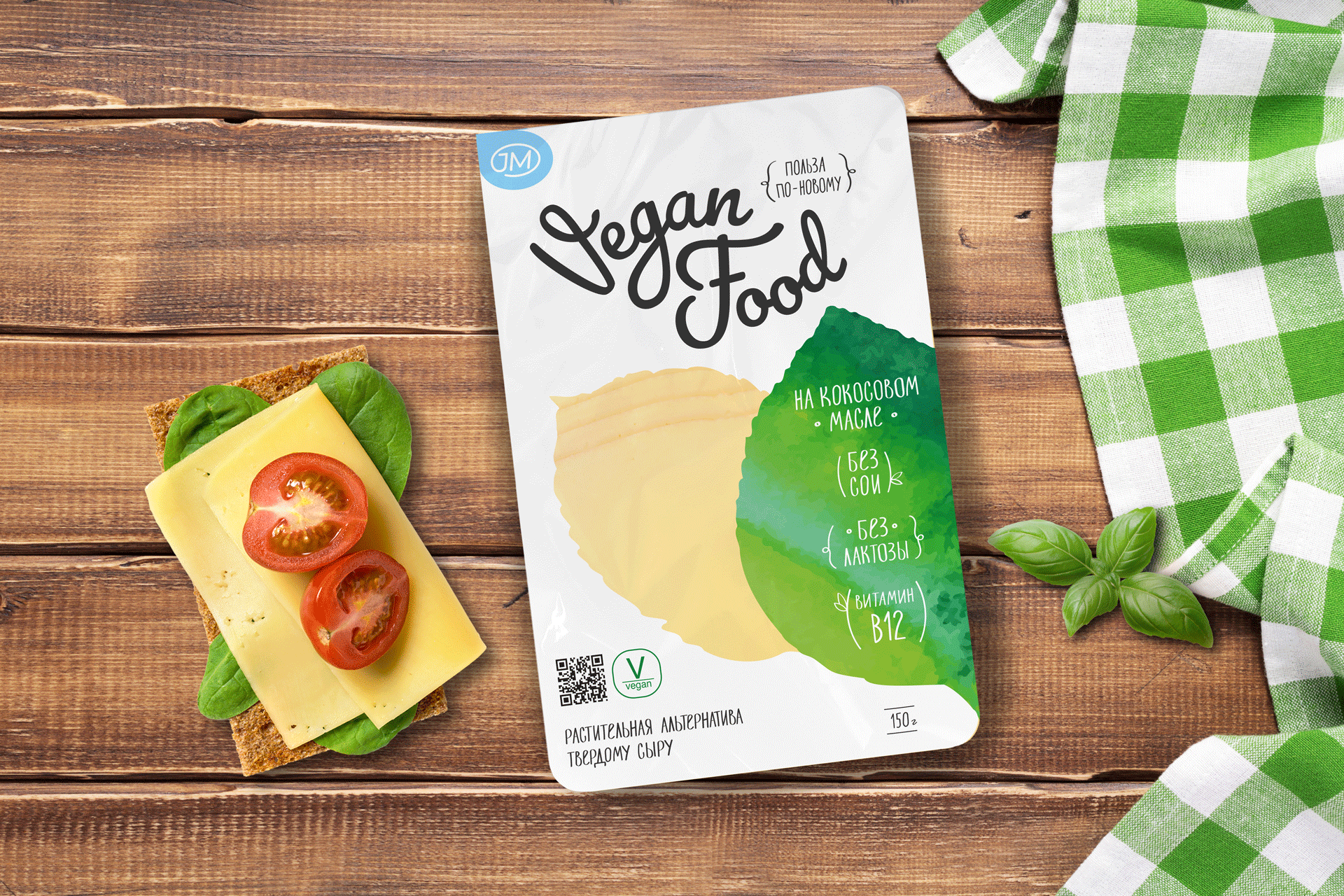
With watercolor motifs and a shaped window that repeats the shape of a plant leaf, we created the image of an ecological and even farmer's brand. The gradient of the main element, tending from deep green to light, reflects the theme of freshness, growth, renewal.
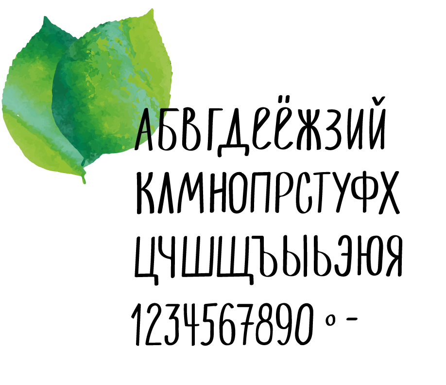
The feeling of a quality farm product is reinforced by the details: the use of lettering for the slogan and the design of the product's benefits.

As a result, we have a modern, clear and ecological brand,
which will soon appear on Russian shelves.
Creative team
Art-director
Sergey Samofalov
Brand Strategist
Irina Mokrousova
Designers
Natalia Lytkina
Project Manager
Anna Artemova