
Choose industry from list
Identity for a chain of trade-in stores
After the session with our creative team, the client took a break for a month. And he came back with the idea of creating another, completely new brand. After thinking over many insights, the team decided to launch a new business format — a network of trade-in stores under the brand name Plan B.
In the name the team reflected the idea of the brand: it is not necessary to play by the rules of large retailers. There is always a plan B that will bail us out. We had to create a logo and corporate identity for the new brand.
An oppositionist or a newcomer
Plan B — is the first chain with unique trade-in conditions.
- Нет привязки к товару и даже к категории. Можно обменять что угодно на что угодно (в то время как
у крупных ретейлеров телефон, например, обычно можно обменять только на телефон). - Количество сдаваемых и покупаемых товаров не ограничено. Можно обменять айфон на тостер и фен или наоборот.
- Всегда выгоднее. Цена по трейд-ин в «Плане Б» ниже, чем цена на тот же товар по трейд-ин у ретейлеров.
One of the emotional benefits of the brand was the freedom without limitations, the ability to not adjust to a prepared scheme, but to decide for yourself how to act.
In addition, the terms of trade-in network Plan B are simple and clear. In this way the brand gives buyers a sense of their rationality and intelligence — as opposed to a sense of naivety, which can be caused by relationships with big brands.
Plan B is not afraid to play with the big players in the industry. It is in its nature to compete, to challenge, to be in opposition.
These meanings became the main ones in the brand platform. And they also set the vector for the creative ideas.
How we created thrash identity
It was clear from the start:
that we would have to develop many elements of the identity and mix them intelligently to make an effect.
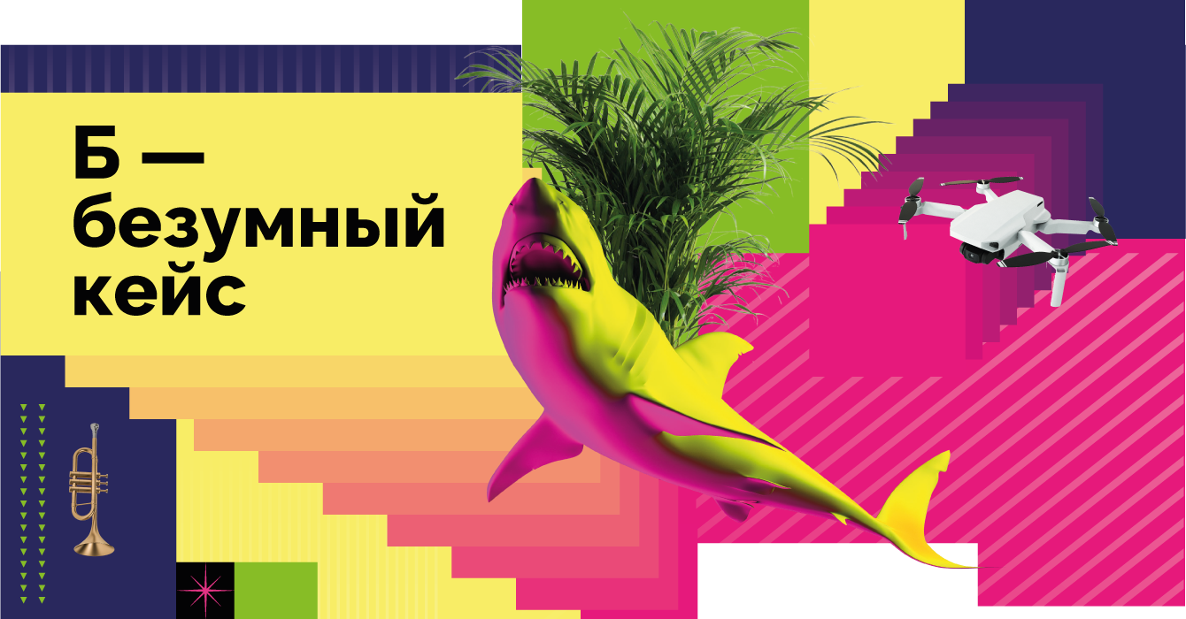
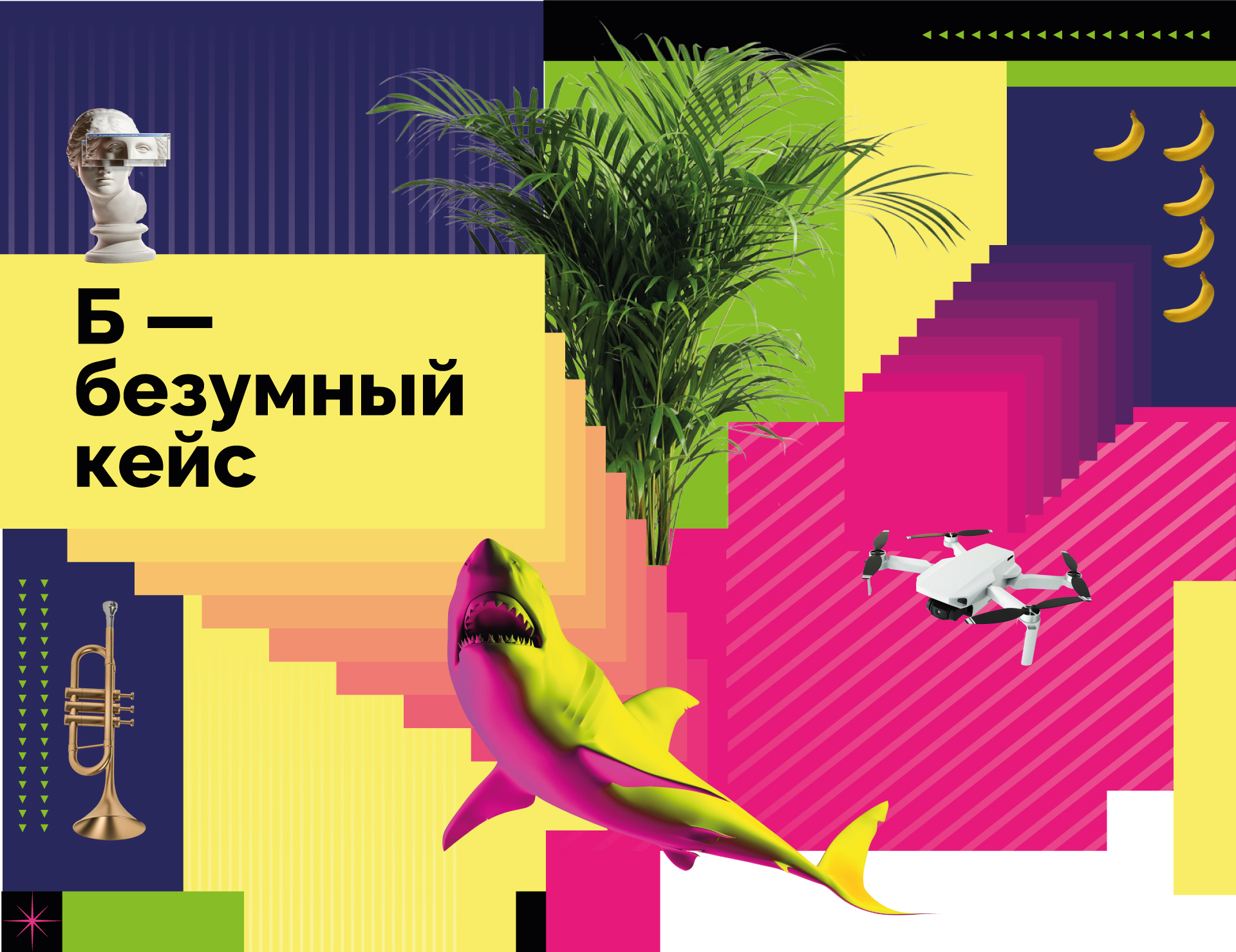
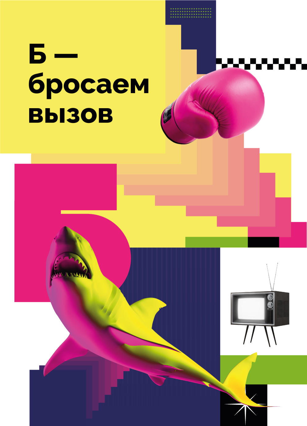
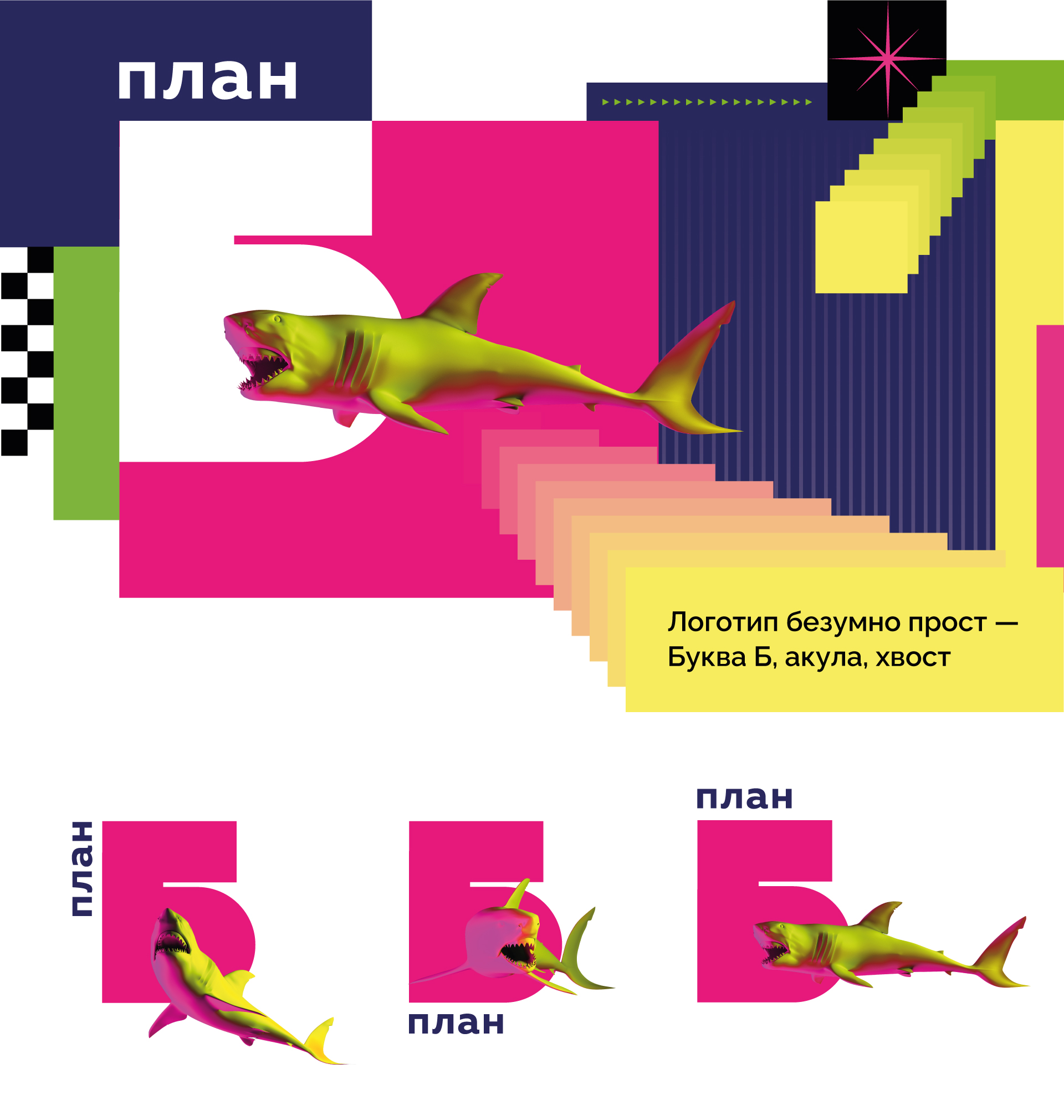
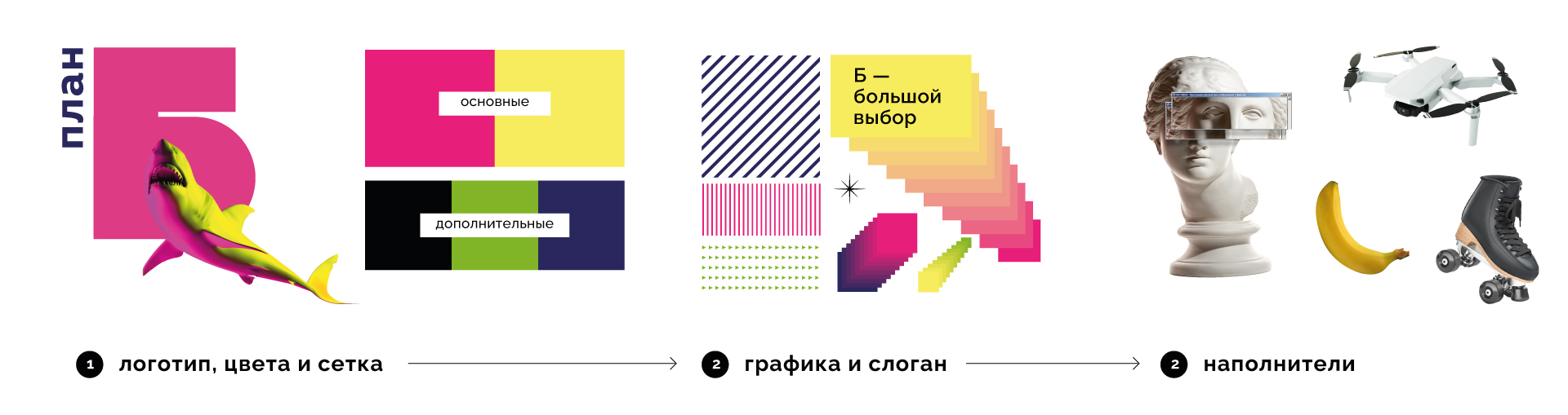
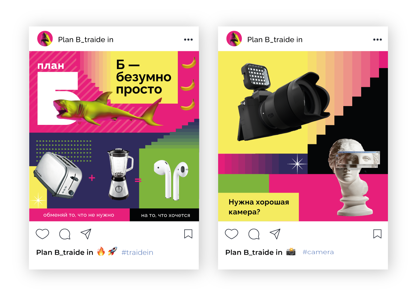
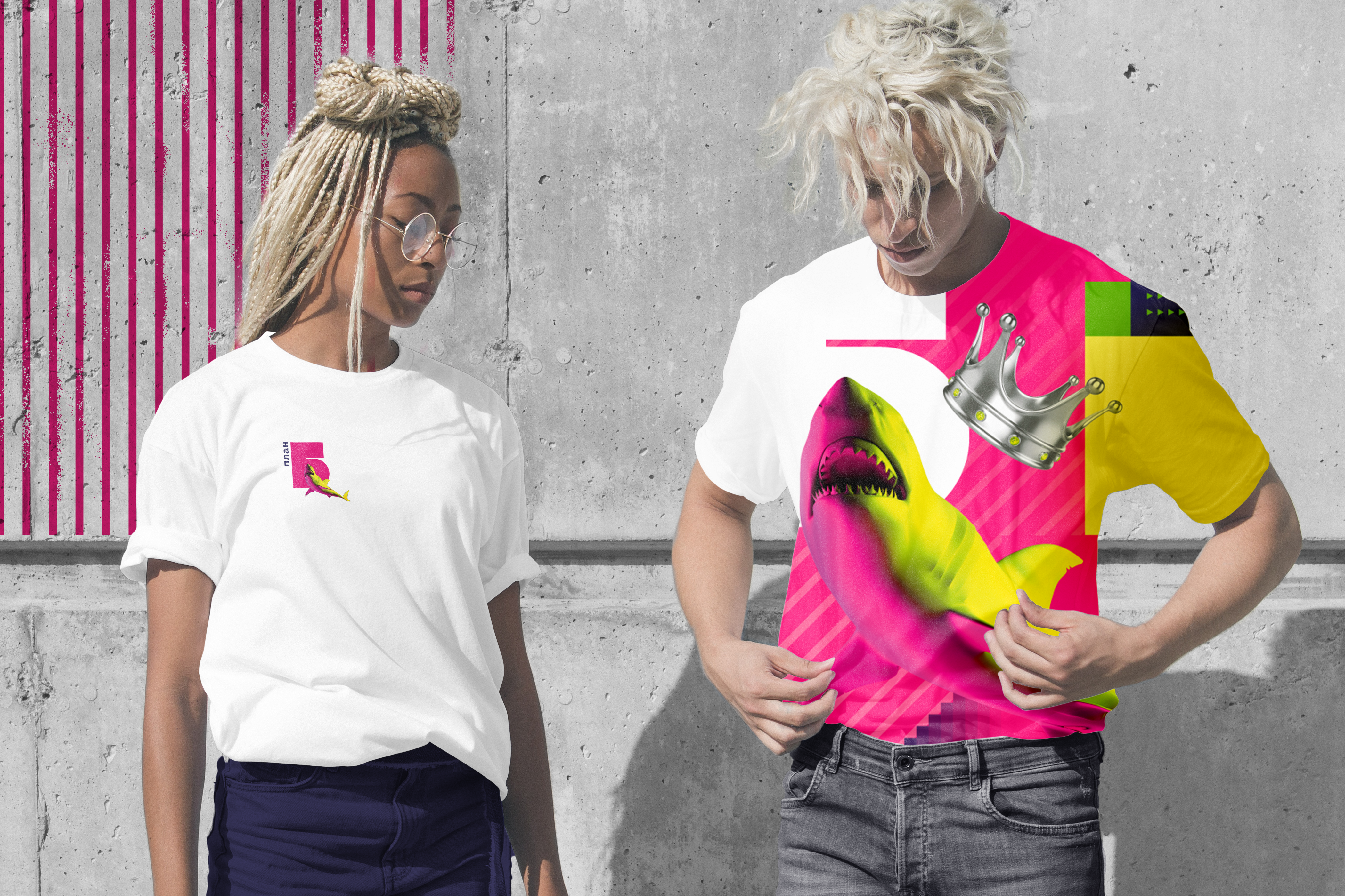
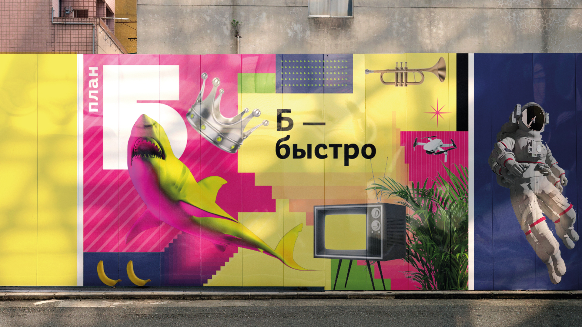
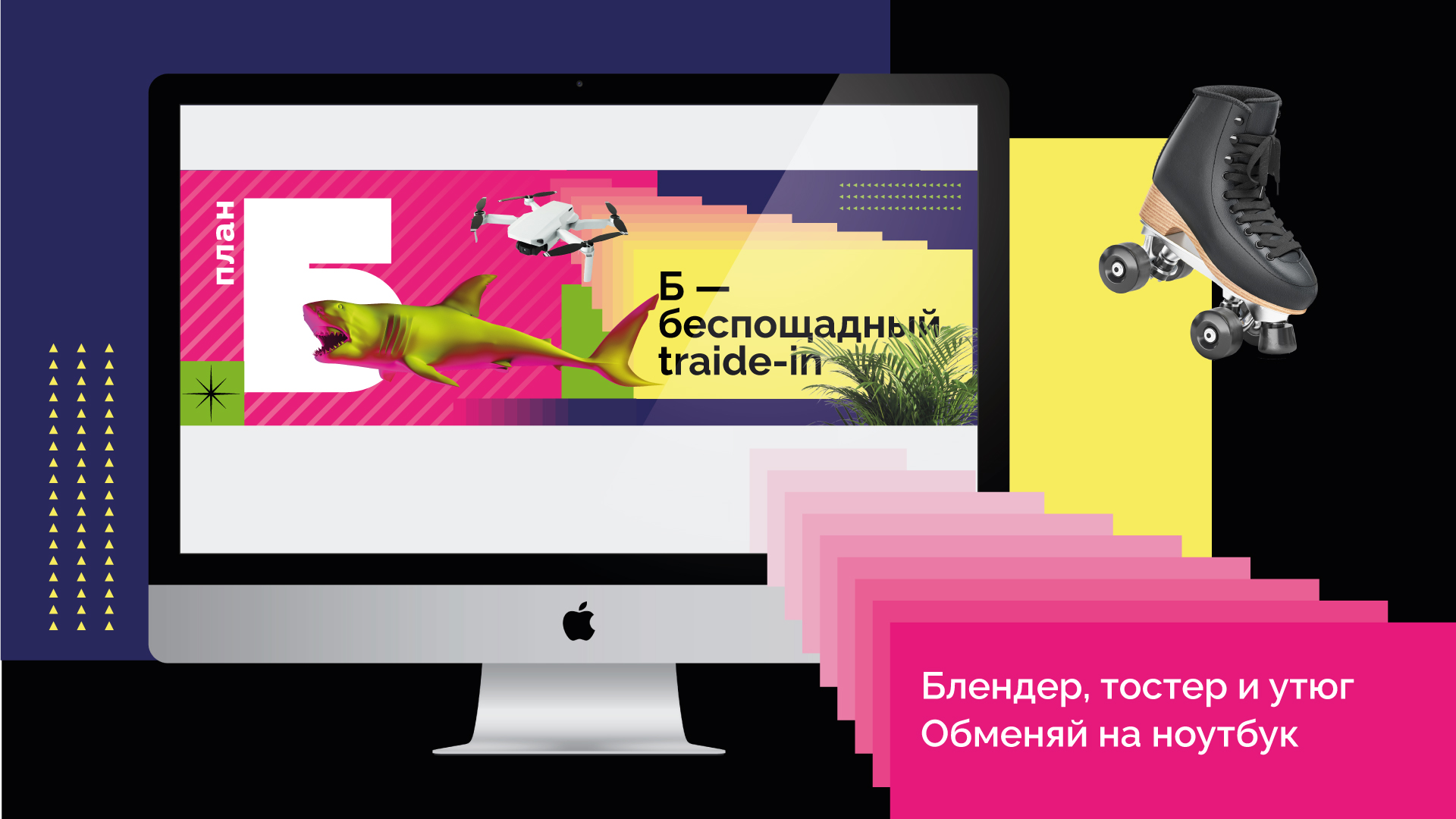
We chose four corporate colors and created stepped gradients. We made a steady and brutal capital letter B as a sign. It is a formative element in the design and a semantic one in the communications.
Communicating with the client's team during the project, we decided that the brand character should be ... a shark! It would let the competitors know not to underestimate the daring newcomer, and would be another recognizable image for the audience, untypical for the industry.
Slogans created according to a single principle became a necessary element of the corporate style.
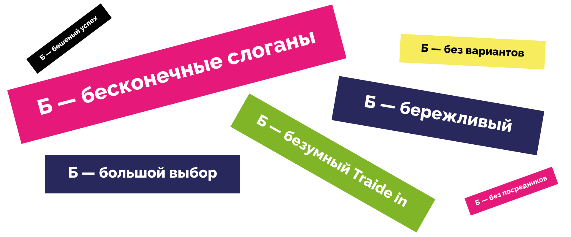
So, we had a giant letter B, a pink and yellow shark, four signature colors, and a lot of different objects that catch the eye due to the absurdity of the combinations. As well as additional graphics and slogans.
As a result, we built the corporate identity on a combination of several components.
The first and second layers are strictly regulated. The third layer can be infinitely filled with different objects. Such objects in each layout are expected from three to seven.
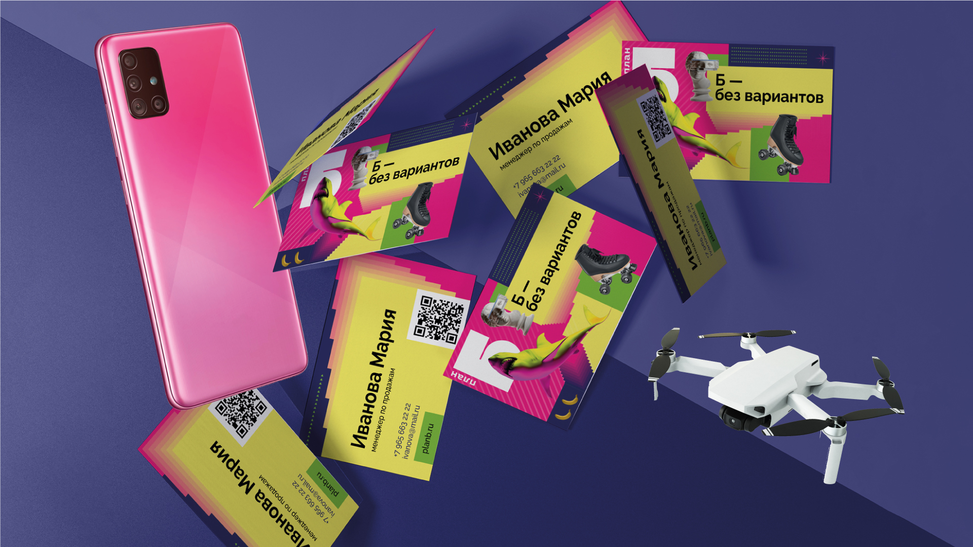
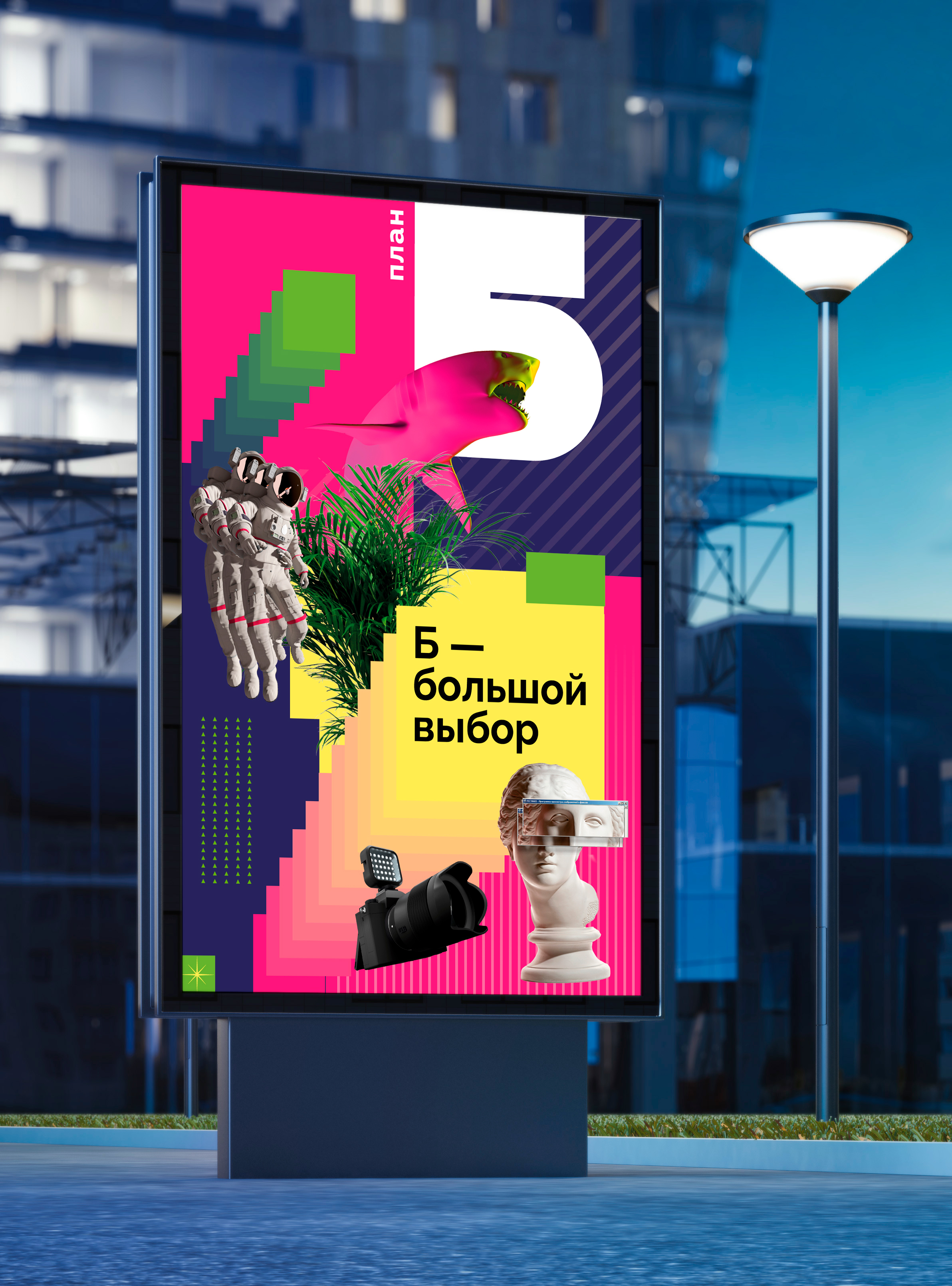
On the one hand, such an identity carries rational messages; on the other hand, it reflects the nature of the brand and sets its communications in a catchy, bright, memorable style.
The degree of thrash can be adjusted by mixing different amounts of components into the design of communication materials. The principle of corporate identity allows the brand to work with different media, remaining recognizable at any point of contact.
The vision of the brand in the client's team was incredibly harmonized even in the beginning stages of the project. Everyone wanted to see the brand as crazy, provocative, breaking stereotypes, and memorable. And that's how it came out.
Creative team
Art-director
Irina Shmidt
Brand Strategist
Irina Mokrousova
Designers
Ekaterina Starodumova
Project Manager
Marta Bekker,
Anna Artemova