
Choose industry from list
Vimax identity: write as you hear
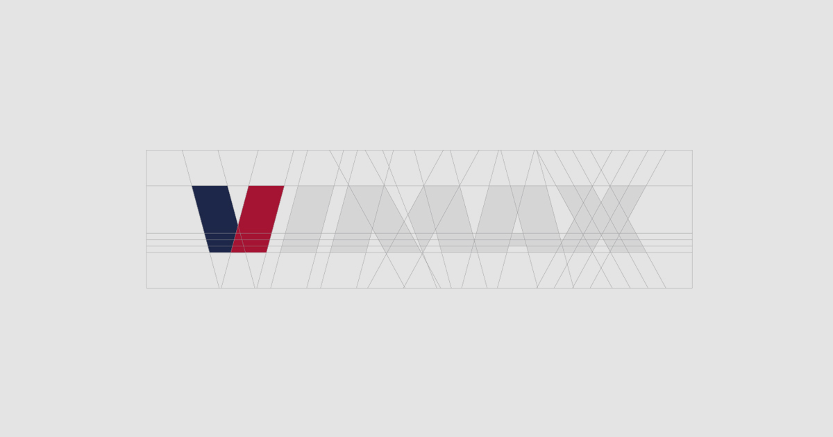
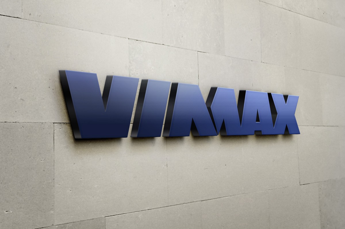
Creating a logo, we remembered the sound of building electrical tools – for example, drills or perforators. When such a tool is turned on, immersed in the material, and then turns off - it's just like that: viiiiiiimmax. We expressed this idea of the vibration of a working powerful instrument with a corresponding "vibrating" inscription of the letter M of the logo. The splitting of M is not accidental also because it is really double, common in the name, consisting of two words: Vim (head, power, energy) and Max (maximum effort).
As a result, the sounding of the name and its meaning united in a logo - strong, confident, impressive, demonstrating a pronounced rhythm and dynamics. All these qualities are inherent in the topic of construction / repair in general. An additional reference to the topic is the font plastic, reminiscent of one of the main building symbols – a drill.
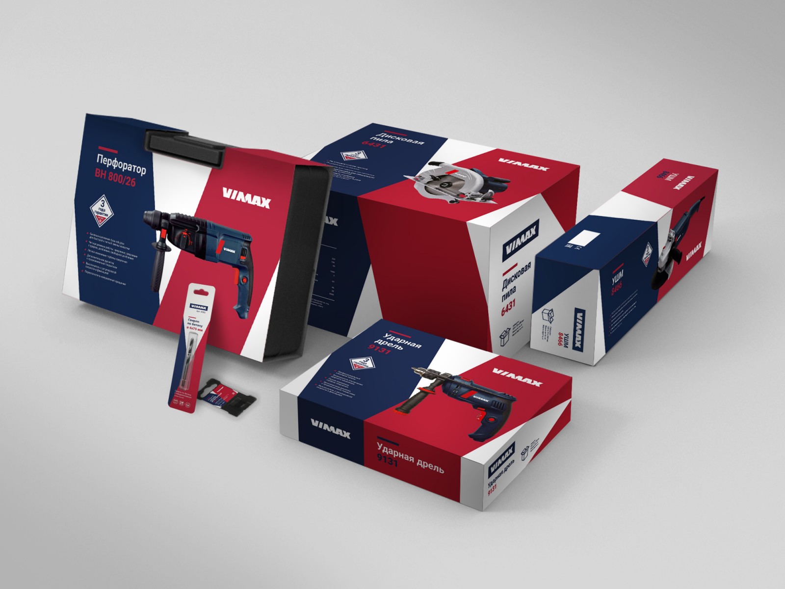
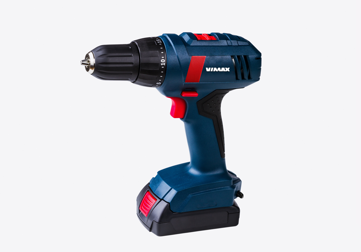
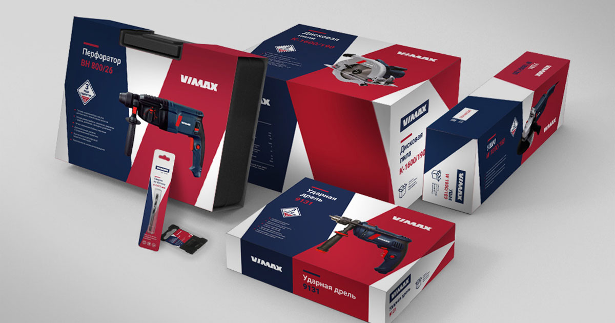
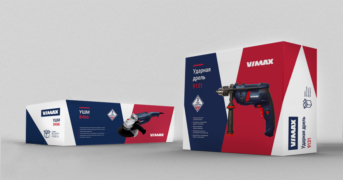
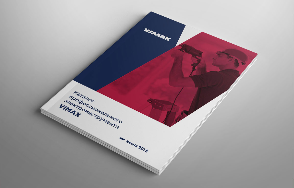
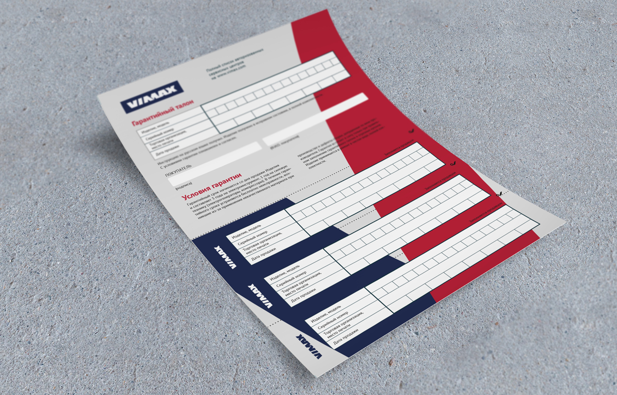
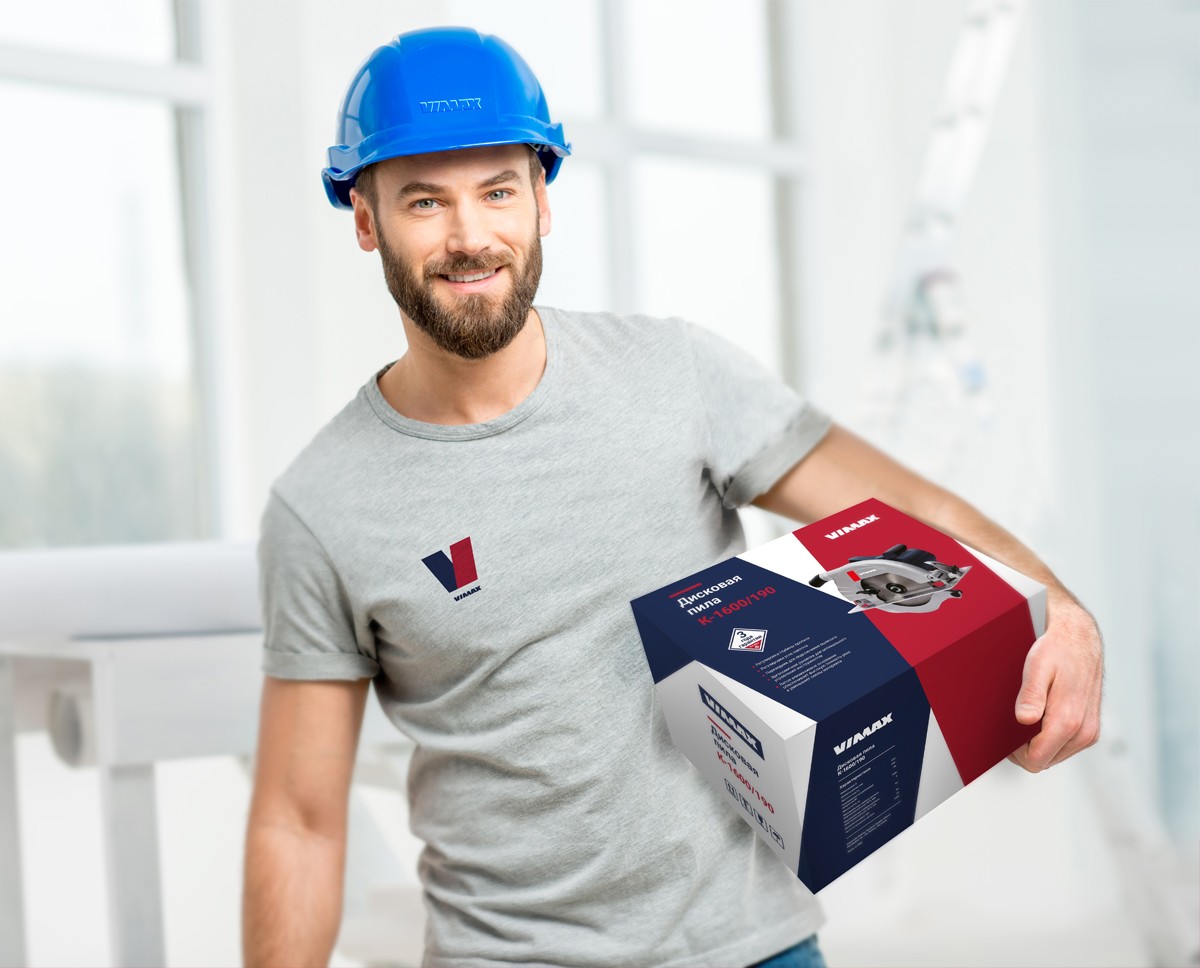
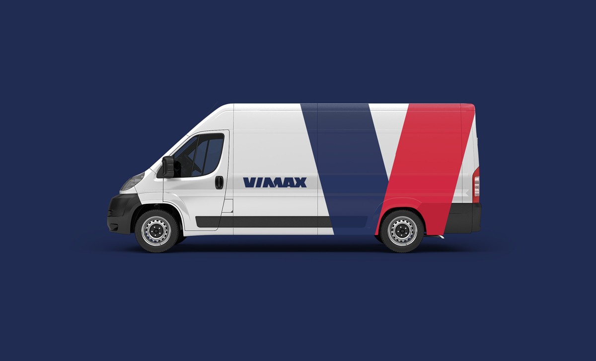
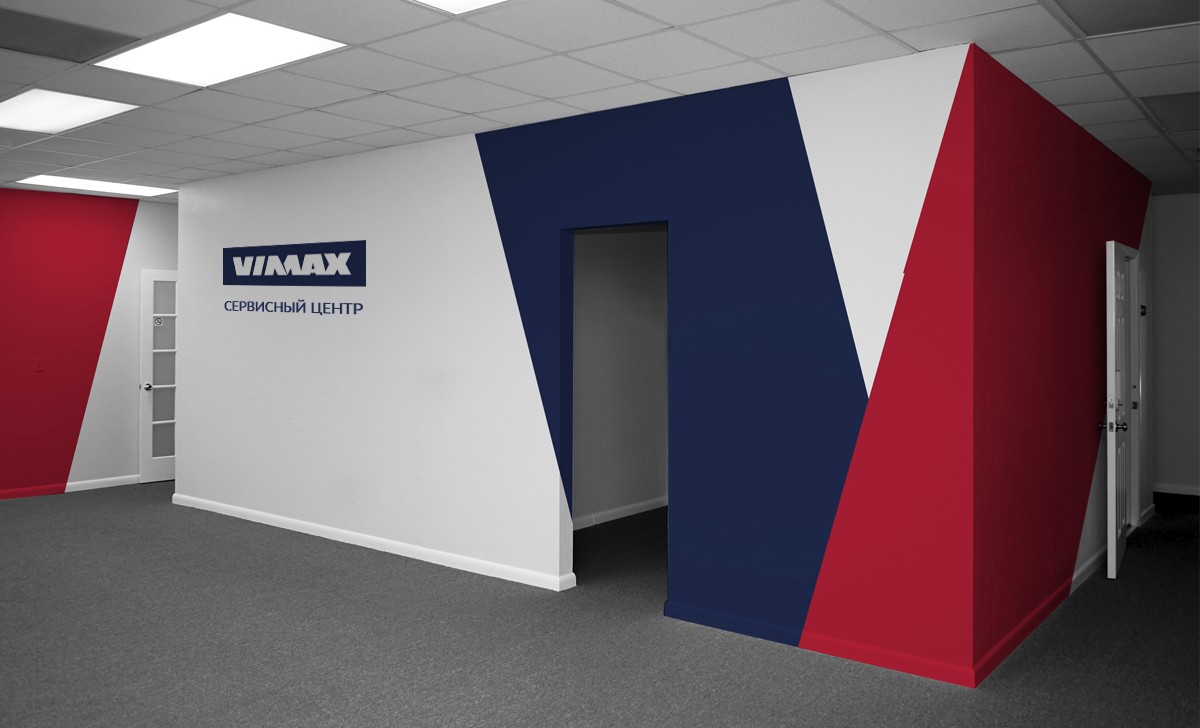
The identity of the trademark, based on the rhyming elements of the logo, supports and develops the given symbolism of power, confidence and energy. Laconism, simplicity and clarity, structured and graphically pure information, active color accentuation of the most important – all this is evident in the design of information, advertising and promotional products of the trademark, in the design of packaging and the Vimax tools themselves.
Creative team
Art-director
Daniil Yarcev
Daria Erasova
Designers
Olga Lyashenko
Project Manager
Anna Dokunina