
Choose industry from list
Analytics as brand alphabet

Brand Analytics and its services are now in a trendy, highly cited and influential position. The problem was that the existing identity looked outdated, did not reflect the current activities of the company, neither visually nor ideologically conveyed the emotionality and energy of the brand. This was the reason the company turned to us.


From Brand Analytics rebranding release:
"Brand Analytics has rebranded: updated the logo, corporate identity and restarted the website. Everybody ran, and we ran? Everybody rebrands, and we're in the same place? Yes! Because we've changed, you've changed, the environment around us has changed and we're communicating with you. Everybody needs simplicity and speed. In you and your product. In design and the message. In the identity, finally. Maybe someone wants to exude conservatism and confidence, but we work in the fast-growing social media market with users who once define "their-own". And yes, we want to be ours. We want you to feel the energy of our team."
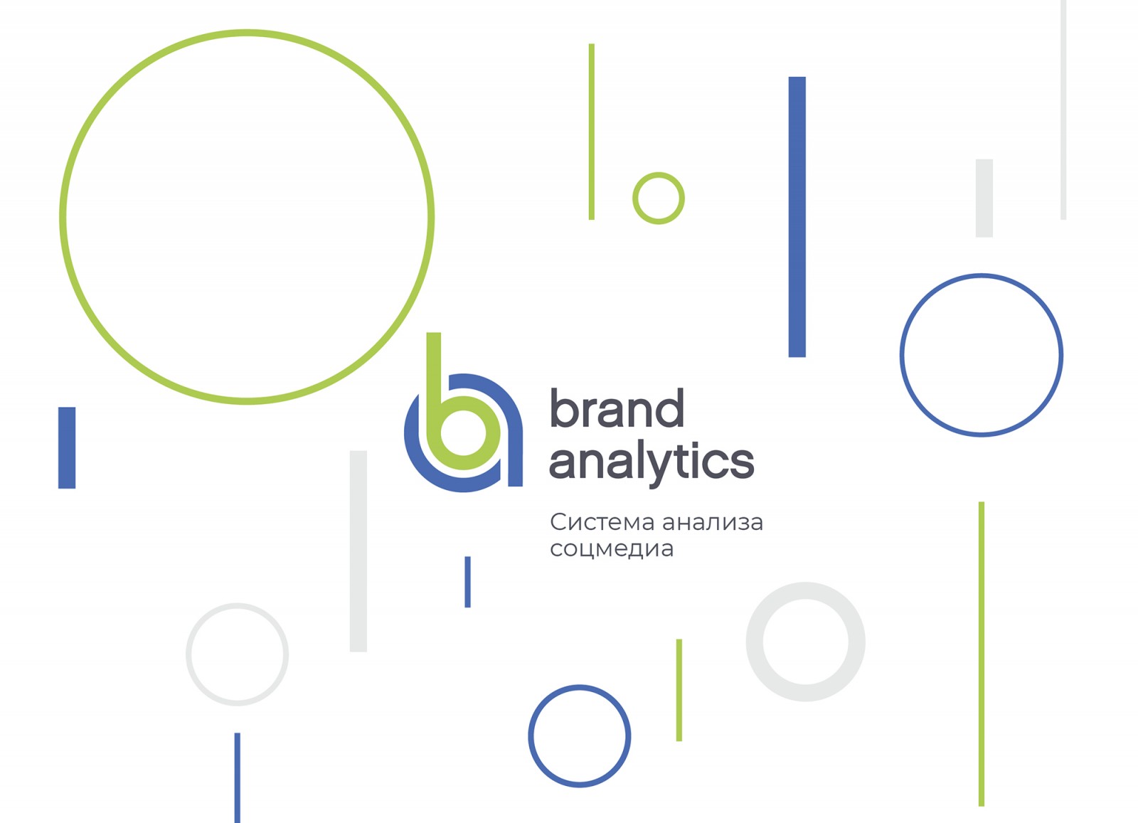
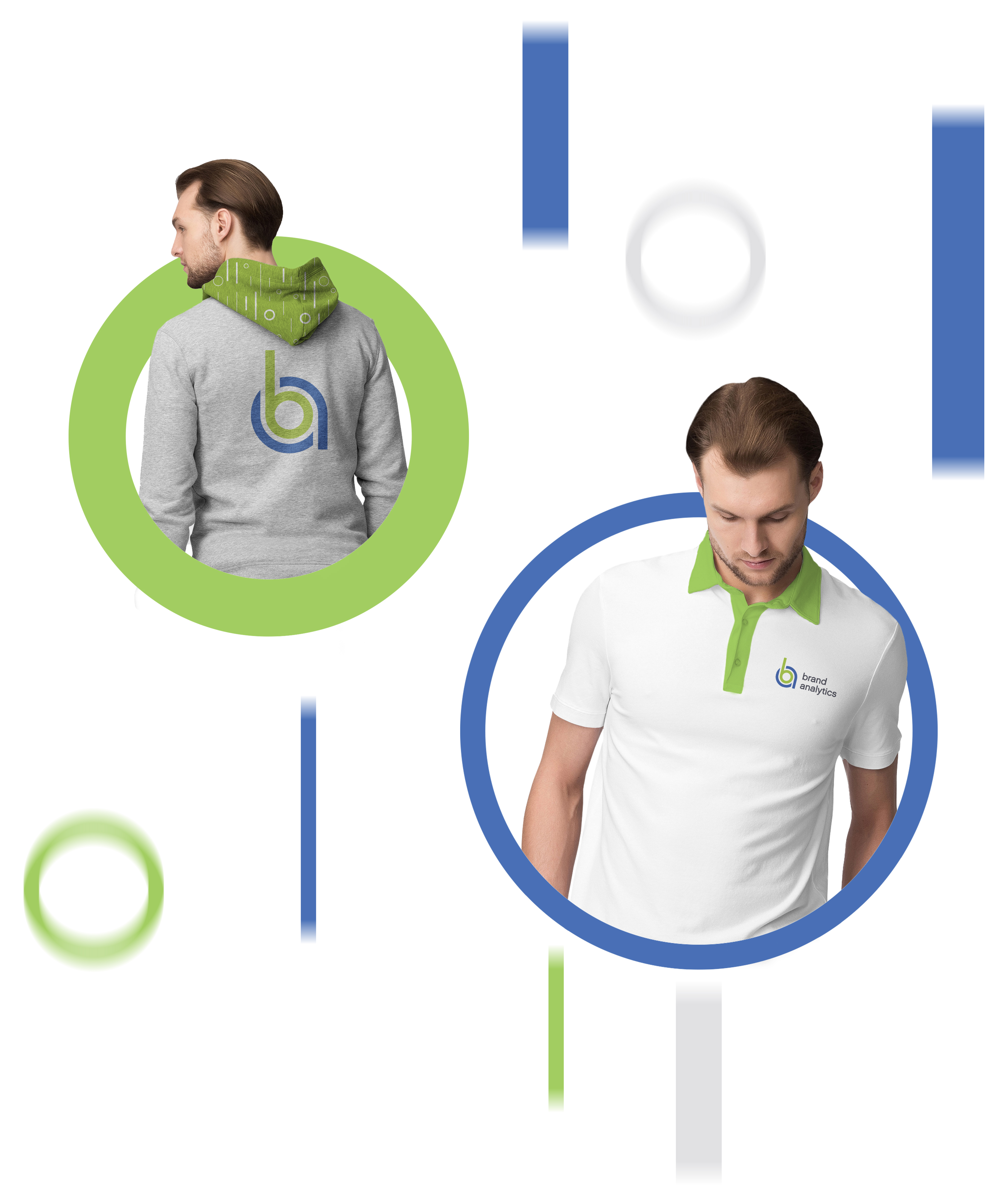
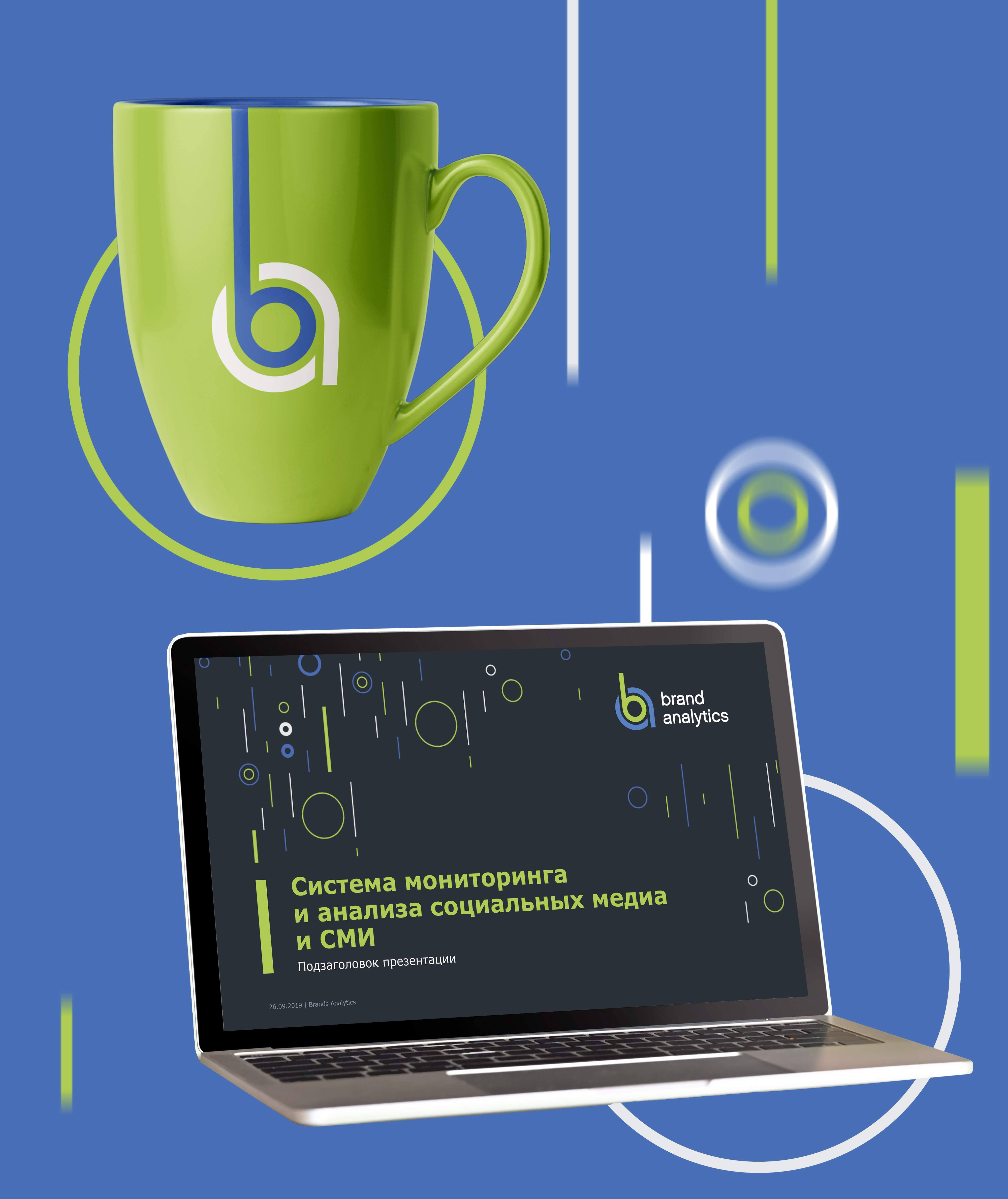
New sign
The new sign is a monogram of capital letters in the company name. The main idea of the mark is the special meaning of interaction between the brand and analytics. Analytics shapes the brand, emphasizing its advantages and disadvantages, encouraging it to improve. A brand cannot exist outside the information field, it is in this field that it grows, develops, shapes its image and earns its reputation. And quality analytics helps these processes go well.
We have changed the colors of the sign to a more saturated shade. Juicy green indicates development and performance, blue indicates confidence and stability. In addition, we have developed a dynamic system of sign colors, depending on the company's product and its functional features.
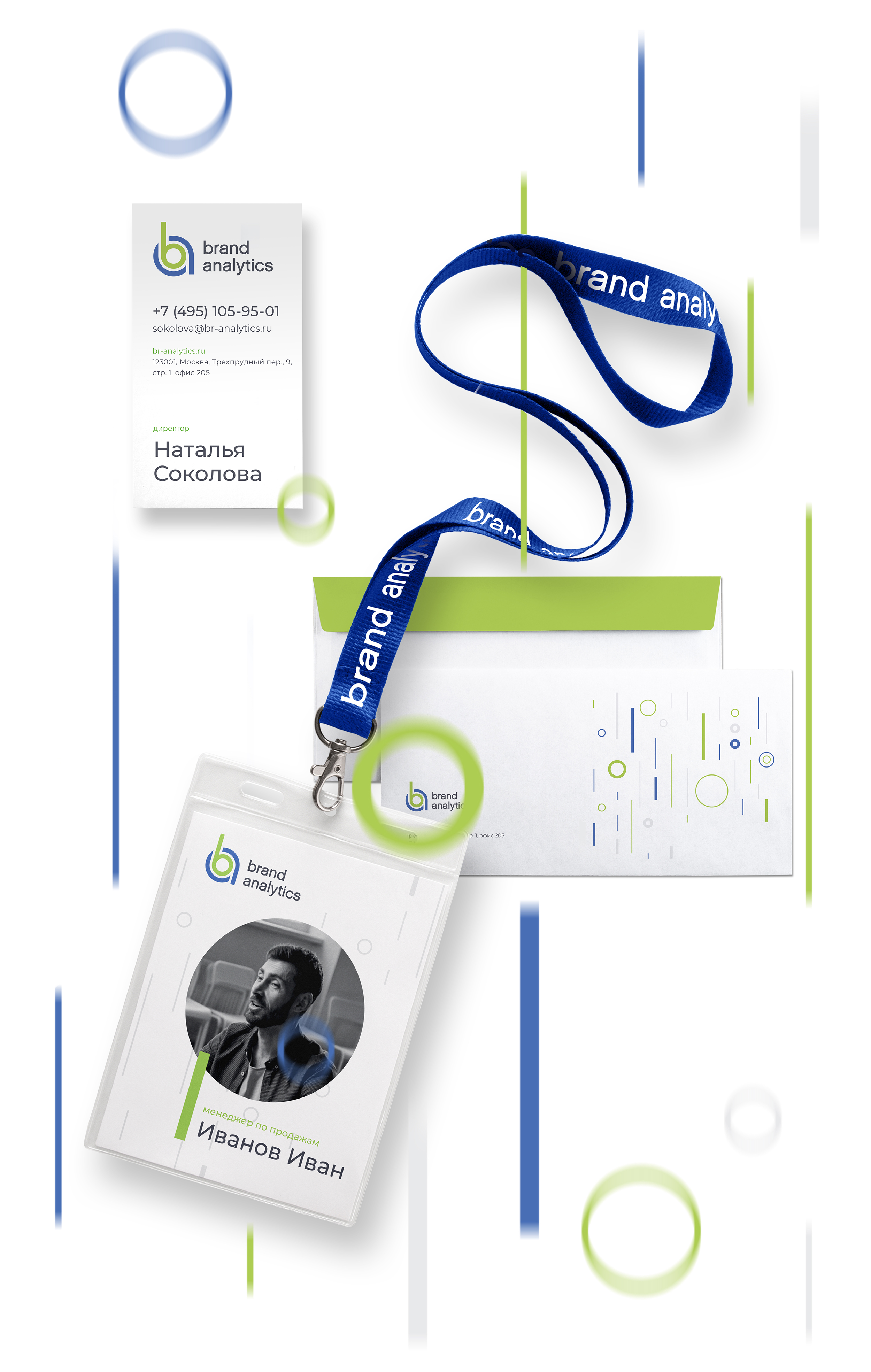
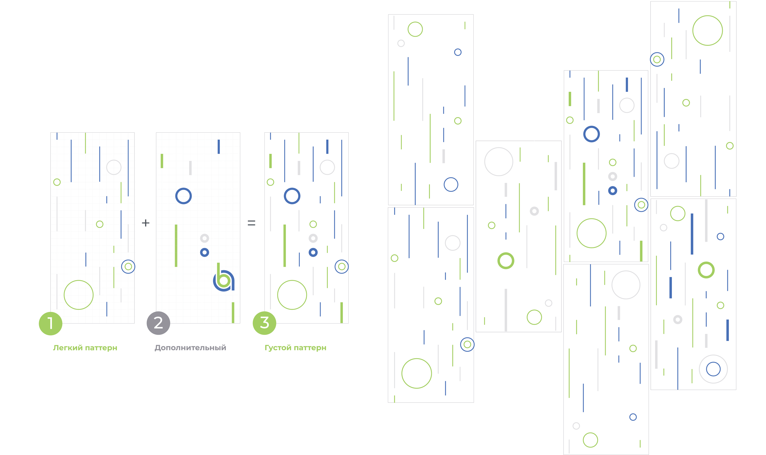
It is the sign that becomes the semantic core of the whole corporate identity. Around the sign - elements that represent the particles that form a common information flow. Combinations of modules can constantly change, while maintaining recognizability. This is how agile and dynamic style is formed. It is adapted to different media and is already available on the updated Brand Analytics website.
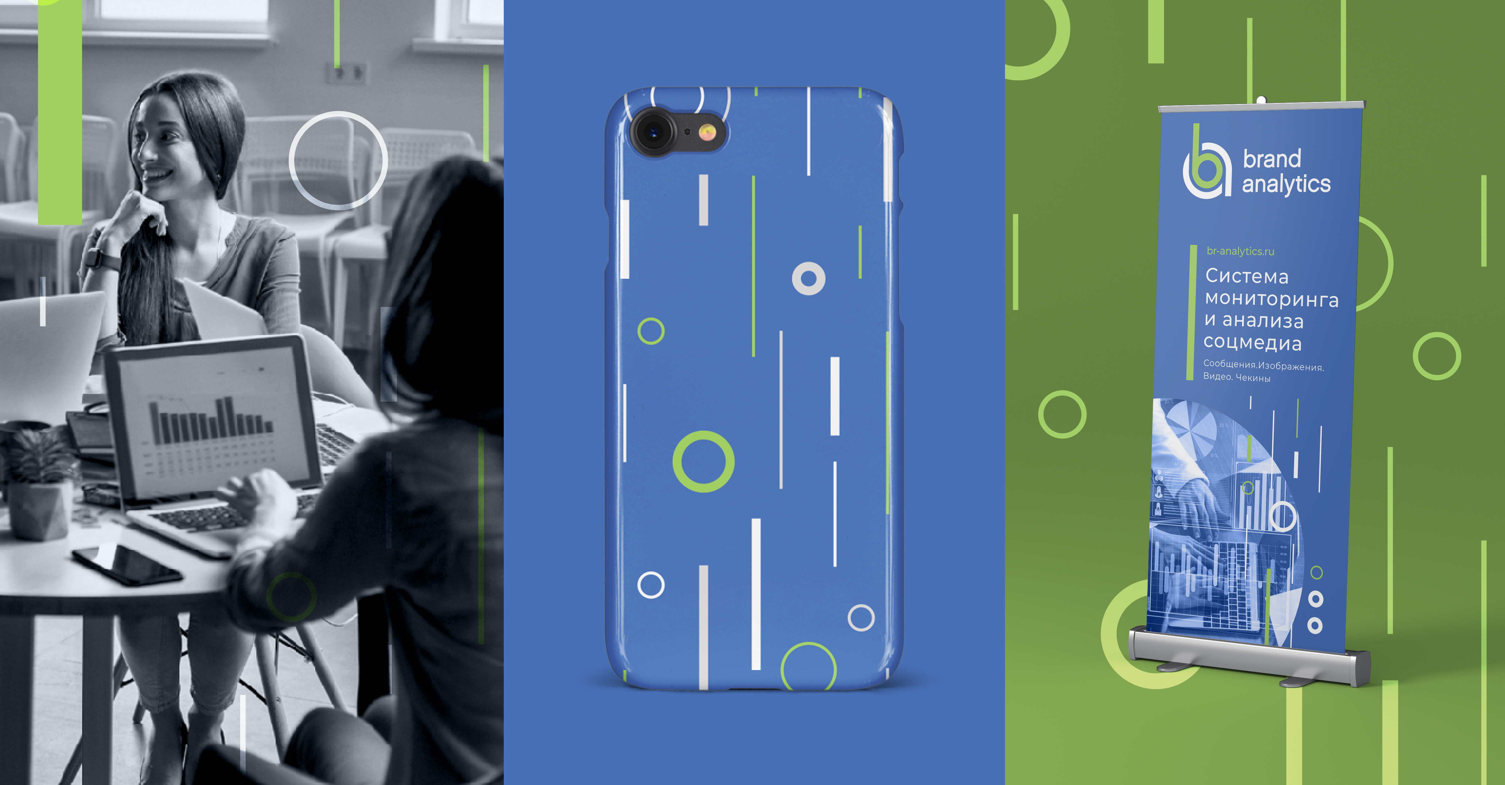

In addition, the company has recently moved and decorated the workspace, organically combining the new identity with the classic loft style. As a result of the project Brand Analytics has found a bright, energetic, trendy image, consistent with modern innovative business.
Creative team
Art-director
Irina Shmidt
Brand Strategist
Daria Erasova
Designers
Ekaterina Starodumova,
Olga Samofalova,
Irina Shmidt
Roman Titovec
Project Manager
Alya Kryachko