
Choose industry from list
Rebranding the Federal forestry agency

Manage and save
First, we organized the notional attributes of Roslesinforg. The essence, positioning, mission, and descriptor. Some brand essences were formulated practically from scratch. The rest were corrected — in the direction of greater ease, brevity, and clarity. The main idea remained everywhere: Roslesinforg acts for the effective management of forest resources, their reasonable use and careful preservation.

Technology for forest's life
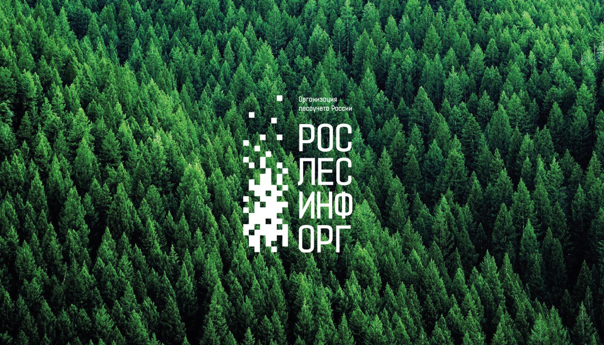
The relationship between digital information and nature. The key aspect of Roslesinforg became the basis for the idea of the sign and the brand identity.
The pixel composition is obvious to the theme of digital technology. The forest in the sign is digitized but remains alive. If you look at the sign from above, you can see a map of the forest, digitized forest data.


From the general to the particular
As for the system of brand signs for Roslesinforg branches, we have made it as simple as possible. In order not to overload the system with multiple identifiers. Therefore, the blocks differ only in descriptors - the names of branches.
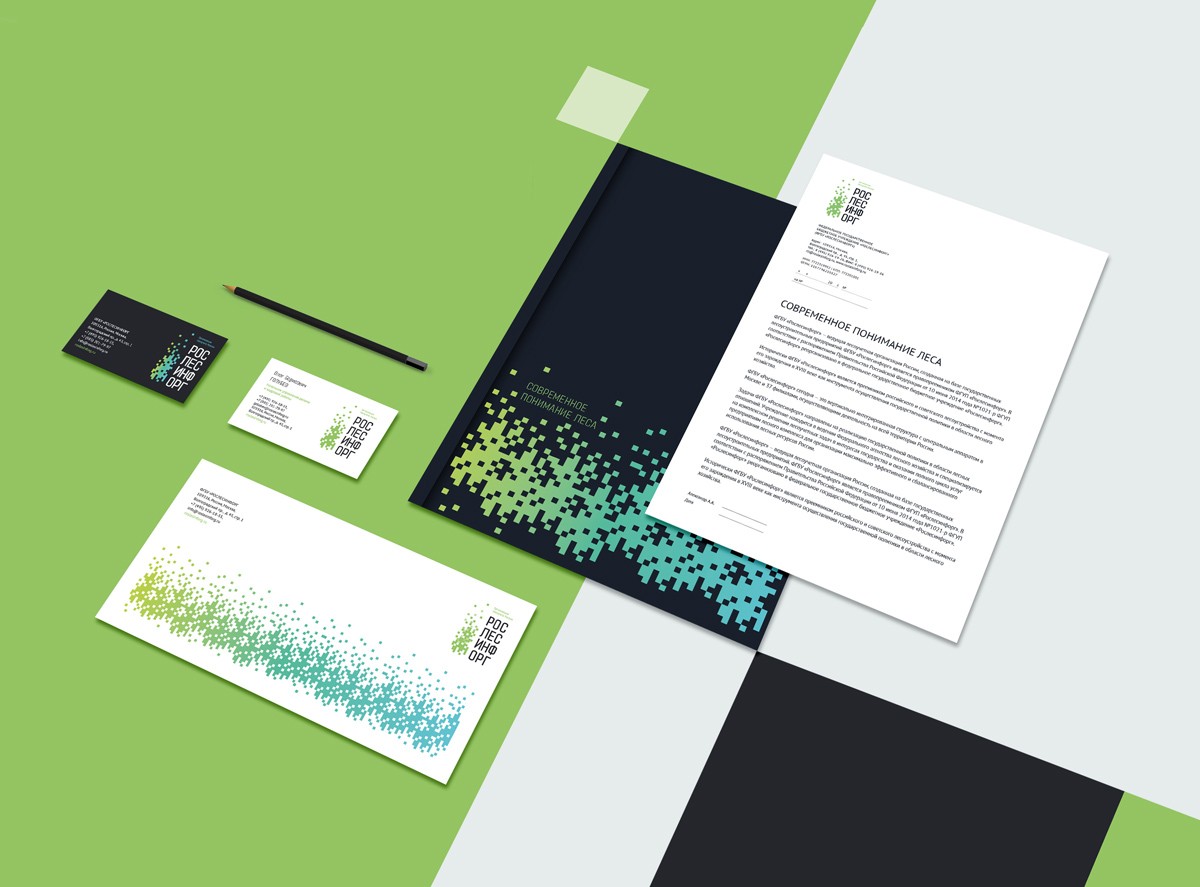
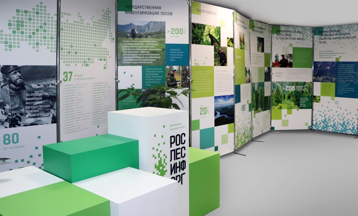
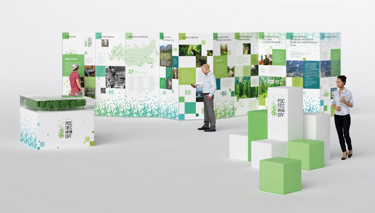
The flexible solution of the sign has developed vertically and horizontally — into a versatile graphic suitable for the design of a wide variety of materials and media. It supports the idea of the sign: digitizing the forest for forest's life.
Roslesinforg presents
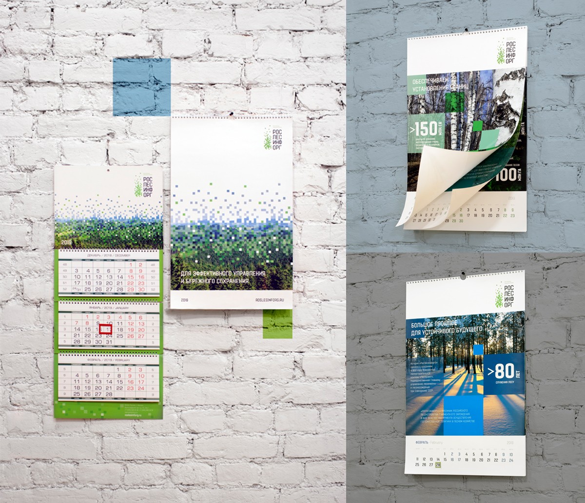
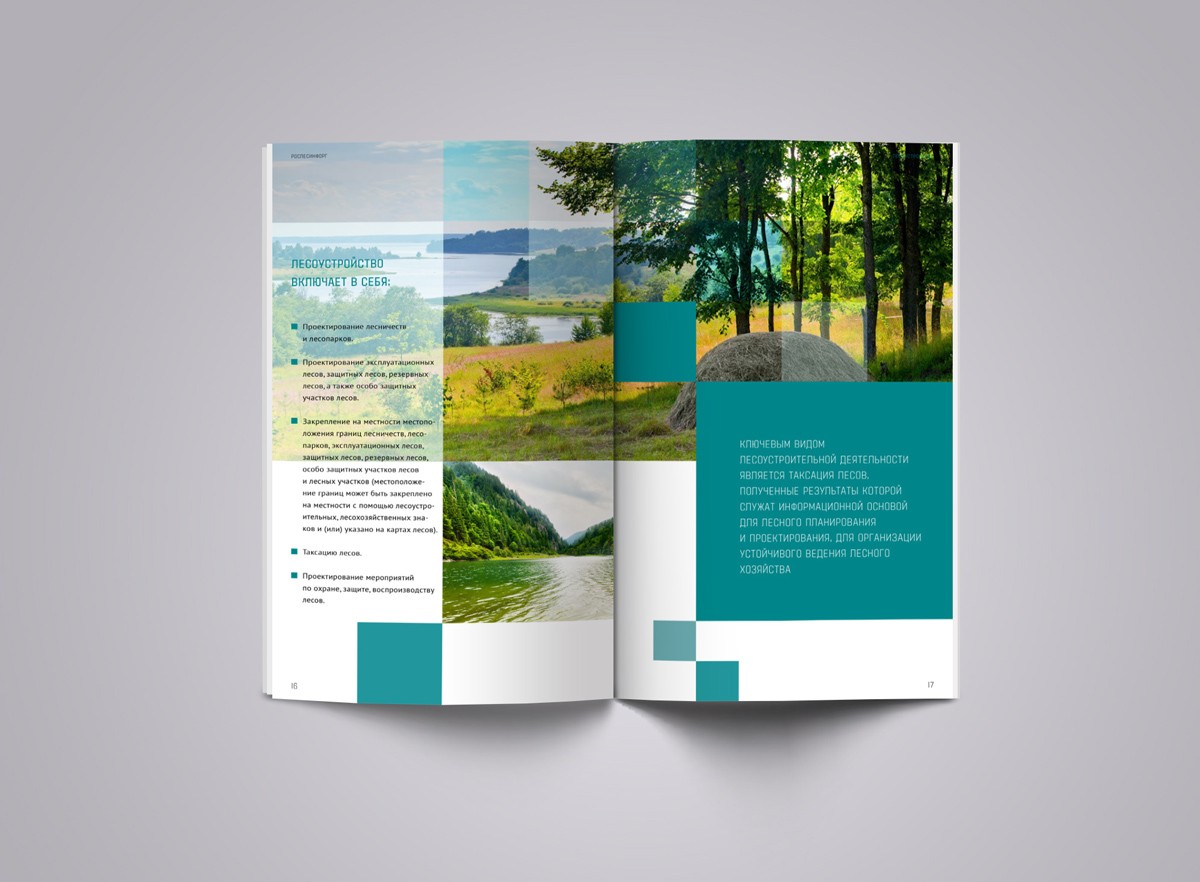
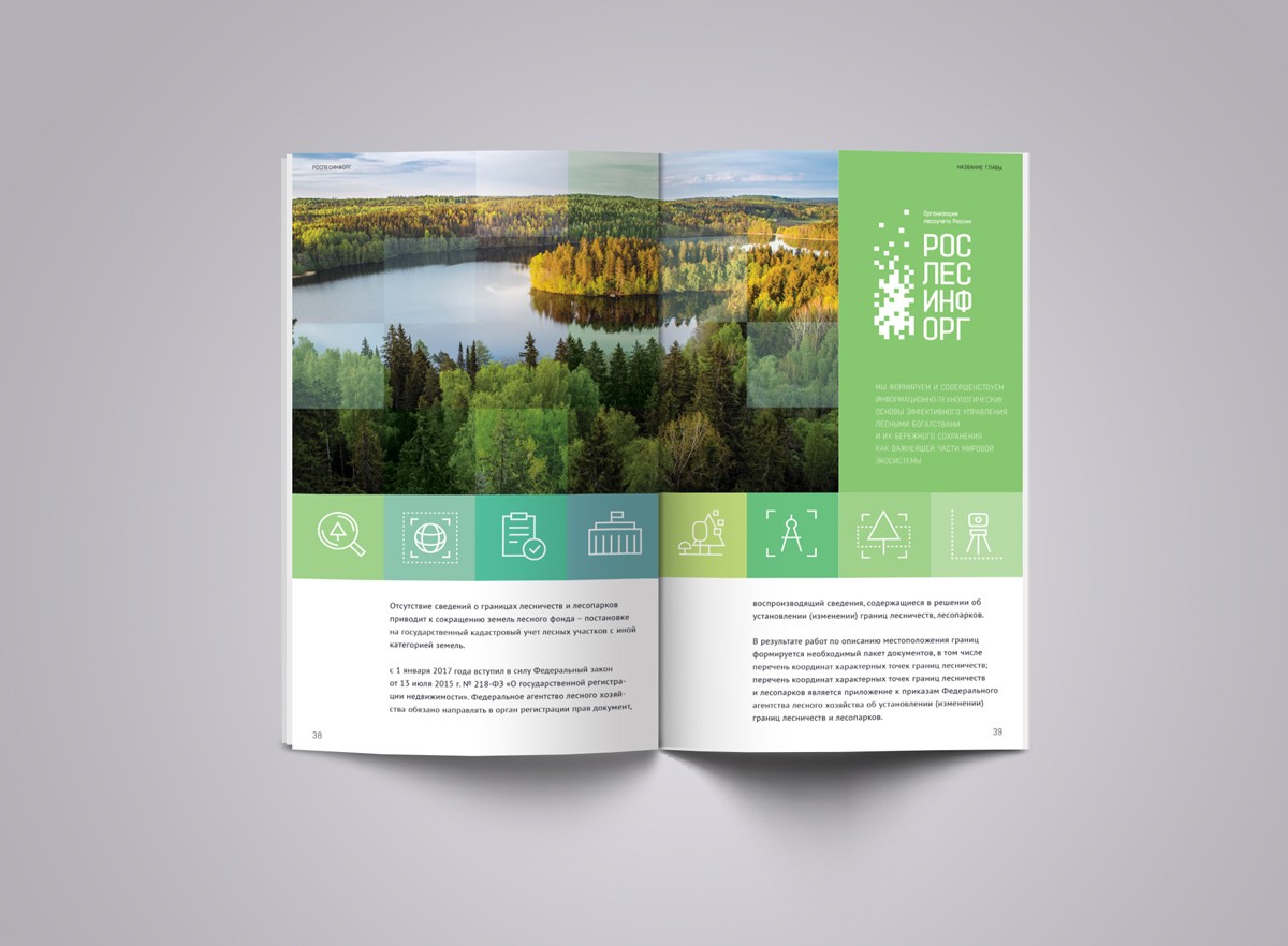
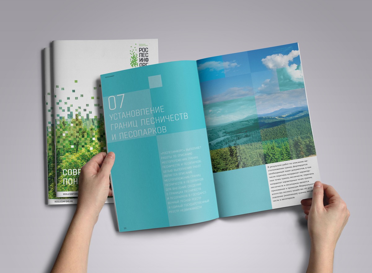
After the creation of the guideline, the new Roslesinforg identity was launched. Various conference media, office elements, a brochure, and a calendar have already been designed. We also made a video talking about the company and at the same time presenting its new look.
Creative team
Ilona Koltinyuk
Art-director
Irina Shmidt
Brand Strategist
Daria Erasova
Copywriter
Anton Borisov
Designers
Irina Shmidt,
Olga Lyashenko,
Yulia Lisenko
Roman Titovec
Project Manager
Anna Dokunina,
Aleksandr Golomolzin