Choose industry from list
Packaging design of dairy products "Useful tradition"

When launching a new line of dairy products targeted at the adult audience, the company decided to preserve the recognizable image of the bear among the Omsk people, changing it with our help.
What's important
- It is important to keep continuity, recognizability at the level of the manufacturer's brand, while being different from the children's line.
- Work on the character should be carried out with the aim of creating a new image that could be associated with traditional products for adults.
- The character should not just be on the label, it should take up a major part in the design. It should also express emotions, inspire trust and respect, and connect with the audience.


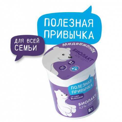
Bear cub has grown up
We decided to keep the connection to the children's product line with the character, but we changed his image. We turned the bear cub into an adult and kind bear that talks about healthy dairy traditions for the whole family.
We put the "Useful Tradition" logo in the branded bubble; and in the second, additional bubble, we placed the key message — "for the whole family".


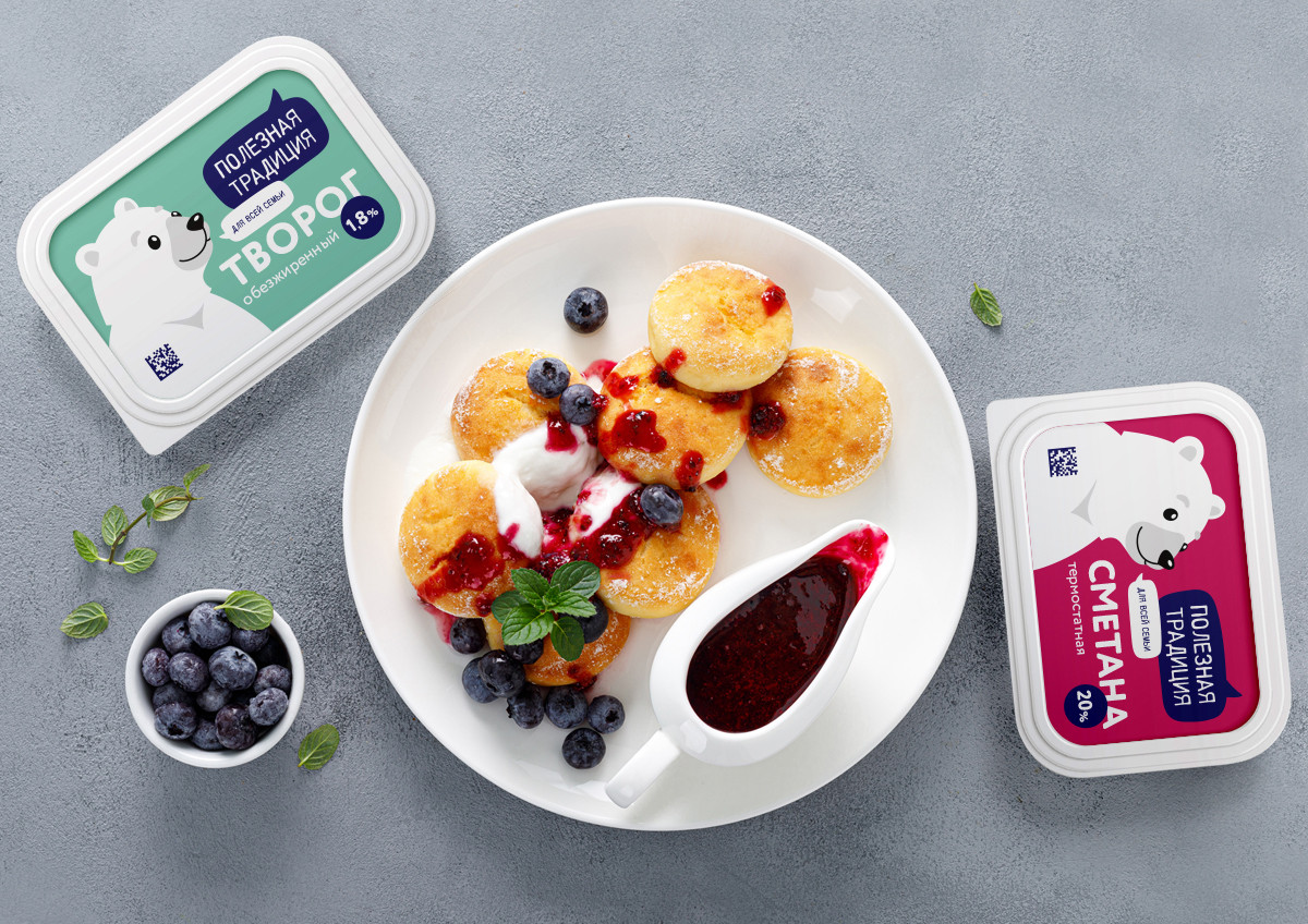
It was decided to build up on the shelf by contrasting the product line, where each product has its own bright color, the main one on the package. As a result, the unity of the product line is provided by the character and the bubbles, while the differentiation is provided by the bright background.


Very soon cars with a large bear avatar will appear on the streets of Omsk and will not only work perfectly for advertising the new brand, but also, we hope, create a good mood for the citizens.

Creative team
Art-director
Irina Shmidt
Brand Strategist
Irina Mokrousova
Designers
Olga Samofalova,
Valeriy Golubcov
Illustrator
Valeriy Golubcov
Project Manager
Anna Artemova
Another projects for this client